1stwebdesigner |
| A Complete Beginner’s Guide to Web Accessibility Posted: 06 Nov 2010 03:00 AM PDT
What is Accessibility
Image by: Yello-Dog Millions of people around the world have disabilities that hinges them from information. Some clients that developers and designers might encounter can be specific about projects that are for people with disabilities. Accessibility is simply defined that people of all sorts, regardless of disability, can access the information you provide in your website. There are many ways on how to make your information accessible to people, from simple language translation to transcribing audio or adjusting the whole design. You Are Not The DefaultThe interface is for the users. Always remember that you are not the default of things. There are many things that seem very simple to you but very hard for other people. Time to see what works for who. Things to Consider
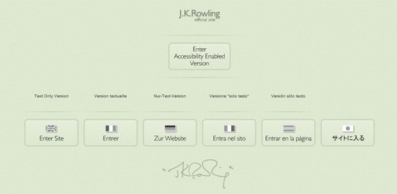
Image by: Svilen Milev 1. Placement of ThingsPlacement of things in your website is important. Most of the people I know, and those I don’t, start looking for the “Search bar” of each website on the upper right corner or at the center top, and if is not there the reaction would be “huh, there’s no search?” before finding it on the left or right panel. This is because people are used to seeing the search bar there. This apply to Register, Login, and Logout too. 2. Present Content in Different WaysWhen using images, provide ALT attributes to describe the image. For audio recordings and videos, you may provide transcripts for people who have disabilities with hearing. Although design, aside from content, really gives a website it’s life it is important to consider those who can’t load all that images, or flash, quickly because of slow internet speed. JKRowling.com has multiple language versions for her website, it also has a Text Only version since the main website is flash-based. Dissemination of information through audio and video is a good way of being more expressive to your audience, but what about those who can’t hear? In this case, providing transcript is a good take. However, it might be too taxing to transcribe a one-hour video, just provide a summary or a list of important things mentioned. 3. Provide Easy Navigation
Image by: Pawel Kryj
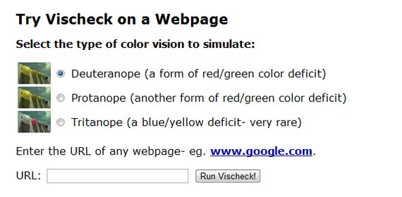
4. Use HTML Tags AccordinglyThere are cases when instead of adjusting font size, header tags are used. This might cause complications with devices or applications that rely on tags for parsing. 5. Do Not Rely on Colors AloneVischeck simulates how a colorblind may see images in your website. In this case, text colors might have a negative effect. Better stick with black for texts since information conveyed in colors will cause problem for colorblind visitors. There are also instances when a person with Photosensitive Epilepsy should be considered when designing flash banners as they are sensitive to visual stimuli with certain patterns and flickering. More tools for accessibility below. 6. Icons and Texts for Better ContextAn icon conveys a thousand words…most of the time. But for people who are not used to icons and symbols a house will not make sense to get to the home page. A combination of icon and text is perfect, look at Yahoo!’s homepage, understandable right? Lack of context disorients your first time visitors(that feeling of being alienated).
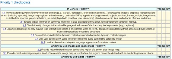
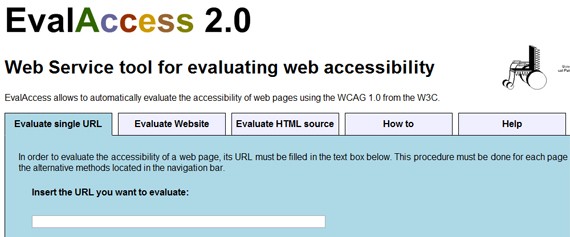
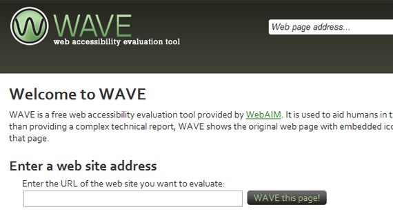
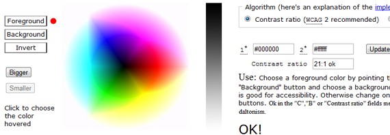
7. Give More ControlFor users who are having a hard time with seeing font size under 14 there are tools that they can use to magnify your website, but will it be too much if you provide it yourself through stylesheets? Try giving them the power over your font size, and they’ll love you for that. 8. W3C’s Guidelines and Checklist for AccessibilityThe W3C published its Web Content Accessibility Guidelines for specific points to consider for better access. A Checklist for Accessibility is also available. It deals with colors, languages, tables, images, and almost everything that a web developer/designer would want to know. Some Tools to UseA web-browser accessibility evaluator. You have the option to evaluate a single page or the entire website, or the source code itself. Another web accessibility evaluation tool which provide an easy-to-understand report about how accessible your site is. Not adept at color pairing? Use this tool to see if your colors are OK! for the three kinds of color blindness. Hear if your website is properly read by accessibility tools. No screenshot for this one because you have to try it to know how it works, behold the power of hearing! There are many tools available to make user experience better, W3C has a List of Accessibility Tools that you may want to check to provide your visitors an accessible content, or to provide your client satisfaction. By sharing the tools and techniques that you know of, many people are given the chance to access information with ease. So share below!
|
| You are subscribed to email updates from 1stwebdesigner - Graphic and Web Design Blog To stop receiving these emails, you may unsubscribe now. | Email delivery powered by Google |
| Google Inc., 20 West Kinzie, Chicago IL USA 60610 | |





Comments (0)
Post a Comment