1stwebdesigner |
| The Ultimate Roundup of Amazing Free Social Media Icon Packs Posted: 12 Mar 2010 12:55 PM PST
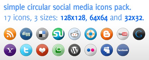
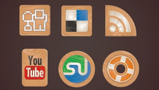
To promote your blog or articles in social media world you need a creative and unique icons and i am sure you will find your most favorite and suitable icons here to include them in your blog or website. 1. WHITE MAGIK – A Free Social Icon PackA clean set of icons from chethstudios.Re-distribution not allowed! White Magik is perfect for white minimalistic sites and can be used with image hover for excellent looks!. It includes 45 icons in .PNG format. 2. Elegant social media Icon PackJust another contribution from chethstudios. An elegant design icons. Well you’re free to use in your blog. But Please DON’T re-distribute. 3.3D Social media iconsThis 3D Social Media Icon Pack comes with 20 icons which include your favorite social media websites such as Digg, StumbleUpon, Twitter and lot more from dawghouse design studio.Get the license details of usage from source. 4.Vintage post stamp iconsThe set comes with 23 icons of your favorite social media sites, all in 200 x 200px and in transparent PNG formats. These icons would surely be a perfect fit for your vintage or grunge themed web designs! 5.Glowing social niche iconsNeat icon set.License usage :Creative Common license BY-ND 6.Social icons sticker setPretty nice icons. It’s a sticker type social icons.Available in .PNG, EPS and Ai format. Free for any use. 7.Social icons vector setConsists of 16 popular social media icons, available in both vector and PNG (64×64 pixels) format. Free for any use. 8.Social icons pack by Sylwia BeszClear design icons.This work is licensed under a Creative Commons Attribution 3.0 License. 9.Social media icons pack from BlogperfumeDesigned as a circular style. Available in 3 sizes (128*128, 64*64, 32*32).Please feel free to use Social Media Icons Pack on both personal and commercial projects. These icons are designed by Eli a south Australia web designer. They provided these icons in two parts. 10.Woven fabric social media icon setThis set contains 26 icons of your most favorite social media sites such as Digg, Delicious, StumbleUpon, Twitter, Facebook and lot more! These icons would be perfect for websites or blogs that uses textures or a grungy theme. 11.Social icons made of woodWood theme icons from webtoolkit4.me .The set consists of 11 icons in PNG format (64 x 64). It's free for both personal and commercial projects. 12.Icon texto web 2.0 inside icon packDownload this free Windows Vista icon pack for your Website or Application. 32 icons in .PNG format.It’s free! These icons are released under CC License Attribution-Noncommercial 3.0 13.Amazing 3d social iconsA brand new set that consists of 20 3D icons in PNG format (64×64 & 128×128pixels). It’s really an awesome icons. 14.Hand drawn social iconsVery cool and creative set of drawn, sketched social icons! Have fun with this one! Hope you enjoy them. 15.Worn out soda cans-social-icon-packThe Worn-Out Soda Cans Social Media Icon Pack is free to use for both your personal and commercial projects.The icon pack once again features icons of our favorite social media sites in 200×200, transparent PNG formats. 16.Social media icons by plechiFree vector social media icons.This work is licensed under a 17.Jeans-social-media-icon-packGreat work and unique idea the designer.Free for personal and commercial use.the credit goes to nishad. 18.vector-social-media-iconsThis free set includes 50 icons of the most popular social media networks on the internet. The icons are designed in 32px and 16px vector format. With the vector format. Now this icon pack is updated recently.This icon set is released under is licensed under Creative Commons Attribution-Share Alike 3.0 Unported License. 19.Minimum-icon-setThis minimum social media icon set.includes deviantart, delicious, flickr, Gmail, twitter.This work is licensed under a Creative Commons Attribution-Share Alike 3.0 License. 20.Grunge peeling stickers social media iconsThis Icon Pack is chuck full of 20 Grunge Peeling Social Media Stickers, This Free Icon Pack is for use in your personal and commercial projects, and can be used without attribution. It may not be redistributed. 21.Iconshock’s free social icon packSmooth edge icons and a classy look.It’s a freebie from Iconshock. 22.Wooden badges icon packThe icon pack contains web and social media icons such as StumbleUpon, Digg, Twitter and several others!.This icon pack is free to use for both your personal and commercial projects but may not be sold or redistributed in any way. 22.Icon pack with PSDA full set of icons ready for use with mac and pc. Attached with PSD. 23.Social grunge iconsGrunge effect in social icons made in a elegant way.available in PNG format.Designed By: tydlinka 24.Networking and Bookmarking icon setThere are a total of 36 icons with 9 different Social Media – Networking & Bookmarking sites.Of course this pack is going to be regularly updated and reorganized .License/Usage : Free for personal and Commercial work 25.Icons made with the type tool and helveticaHelvetica social Icons that are 99% made with the type tool in Photoshop. 26.Social web button setsThere are 20 social web buttons in two sizes and two colors. Download is free. 27.Old bottle crowns icon setThe icon set consists of 20 very unique and never before created bottle crown icons such as Digg, Stumble Upon, Twitter, Delicious, Technorati and a whole lot more.These icons are free to use for both your personal and commercial projects but may not be redistributed or sold in any way. 28.Gummy-social-icon-set29.Social trucks icon setSocial Truck Icon set consists of 10 social network icons; These cute icons are designed by Andrea Austoni . Andrea is an Italian freelance designer currently living in Krakow, Poland. He specializes in icon design and illustration.these icons are absolutely free and you are allowed to use them in personal or commercial project. Just don't redistribute 30.32 Pixel Social Media IconsFree for personal and commercial use.Cute design. 31.Web 2.0 Gift Icons by IconsPediaThis icon pack contains 14 icons, including popular social bookmarking services and our favourite browser Firefox etc… The icons are available in PNG, ICO and ICNS format. They are free to use for both personal and commercial projects, including websites, templates & software. You are not allowed to sell or redistribute the icons anywhere else. A Big treat from webtreatIn this below lists you are going to view a massive contribution of webtreats.mysitemyway.com in social media icons.They have done a great work in social media icons! and these are high quality designs. 32.Glowing Neon Social Networking Icons108 free high-resolution Glowing Neon Social Networking Icons. 2,000 more icons of this style will soon be released on ETC format. 33.Crystal clear bubble iconsIt’s an updated set of icons including Drupal,Deviant art icons etc… They are free to download and use. 154 icons available. 34.Blue Chrome Rain icons2000 more icons are available in this style in webtreats. 35.Orange grunge stickersWonderful orange social media icons in grunge style with some pop out effect. 36.Black paint splatter iconsNo attribution necessary for these icon packs.Splatter effect in social media icons it’s a creative and unique concept from the designers. 37.Red and white pearl icons38.Glossy black glass icons20 web icons in .png format made with these styles, and a layered psd of the image below, which has editable text should you want to use this as a text effect. 39.Blue Jelly Social Media Icons40.In-focus simple white iconsThis matching set is designed to be put in the sidebar of your theme so you can link to your social media profiles.There are 10 more color variations for icon set is available. 41.Glossy waxed wood icons42.Retro Grunge Stripes Social Media IconsA classy look and these icons meet international standars.Retro Grunge Stripes Social Media Icons. 43.Crumpled paper social iconsA creative look for social media icons by this way.It’s suitable anything like grunge or crumpled themes. 44.Glassy space social iconsJust another beautiful glassy style icons. 45.Grunge-warning-stripes46.Vibrant pattern iconsThis vibrant pattern icons social media logos set includes the most popular social bookmarking and networking icons (Digg, Delicious, StumbleUpon and Yahoo logos etc… 47.Twitter icons |
| Redesign Process: Taking Small Steps for a Better Website Posted: 12 Mar 2010 02:00 AM PST This is experimental article, where you will see whole redesigning process behind the scenes and read different way of thinking. In this review you will be leaded through necessary steps needed to get successful redesign. If responses and feedback will be positive, we will make this monthly or even weekly event analyzing also well known blog redesigns – showing pros and cons. I think real examples are the best way to show the point and teach something! Let’s start – we will be happy to hear your feedback! It will be exciting! ReadyPhotoSite is a flash photo CMS created especially for photographers, painters, artists and people of art. The CMS is presented in 3 different packages that vary in functionality and a number of skins, so you can choose the design you like and then choose the website features. We started working on this ReadyPhotoSite project on May 2009 together with Karen Myers who is presently the CEO of readyphotosite. But Karen is not only a partner, but also a good friend of mine so we were both into it. By the time we started working on website design, the product (the CMS and the skins) was ready and our task was to launch a simple website as soon as possible, apply the changes and make the updates as we go. And so we did. Starting with a simple website and the problems we faced
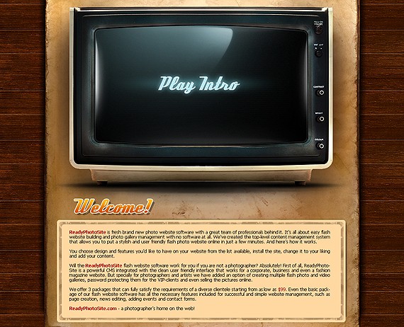
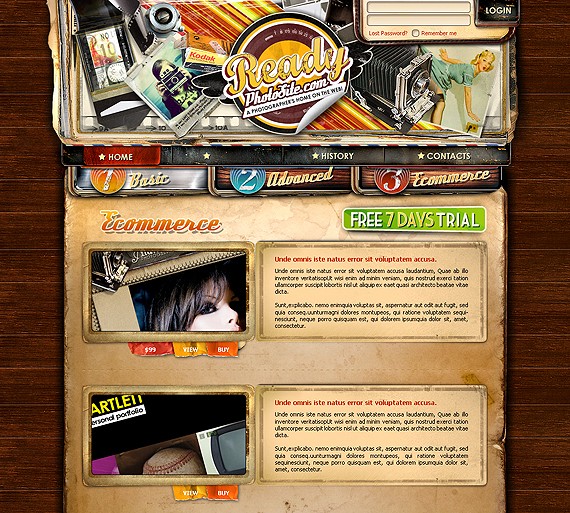
The home page had around 10 lines of text and a cool stylish intro in retro style in the middle – home page didn’t share almost no information about the product and thus was pretty useless. Besides it took around 30 seconds for the intro to load and we were loosing most of the people already in beginning process when they were visiting our home page. Still the owners of the project insisted we should keep the intro as they spent a good amount of money on it and wanted to see it online no matter what.
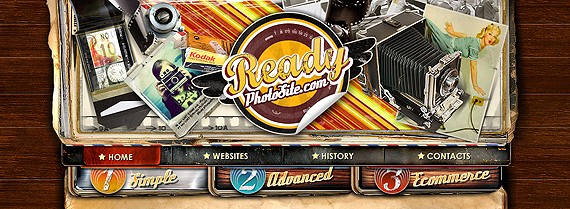
Look above, there is the screenshot showing how this concept was presented on the website. While the products page itself had the basic text info, the buttons in the header lead to almost identical pages of basic, advanced and ecommerce packages that had:
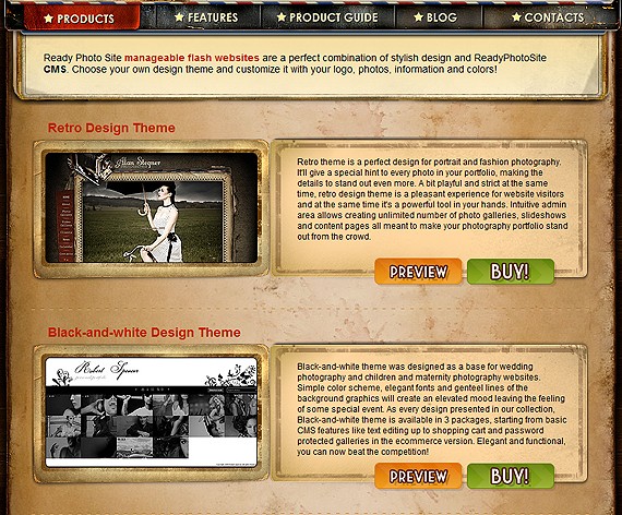
All the pages had the list of the same theme’s screenshots which was obviously somewhat confusing for the website visitors as without visiting the features page they had no idea of the difference and they just saw that same designs.
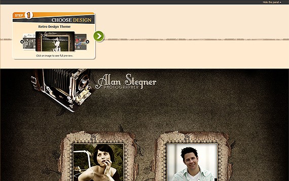
The other thing that we initially paid no special attention to was the skin preview page, that was simply opening the website in the new window and where we were loosing customers as well since there was no calls to action or some kind of info how to move forward.
1) Moving the intro to the inside page.
2) Reworking the product pages.
- reduce the number of steps before the purchase; And here’s what we did:
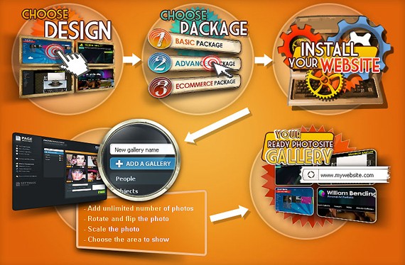
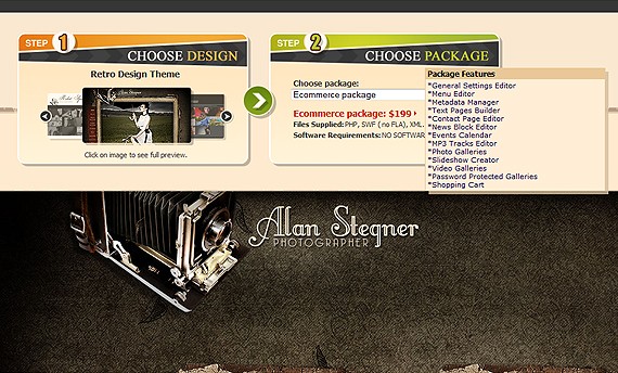
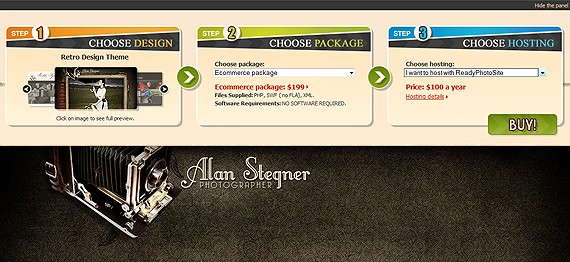
Now the problem was how and where do we actually link the buy and preview buttons (as there are 3 different previews for every skin (for basic, creative and ecommerce packages) and 6 buy links (as every package can be purchased with hosting or without it)). The new buy page have solved all the tasks. Before reading this articles further I suggest to open this page online so that you check in real how it works. Click on any buy or preview button on this page http://www.readyphotosite.com/products.php and you’ll be taken to the buy page.
With the options for the 3 steps loaded you can still change the settings on that same page. You can choose the other theme or the other package or change your mind about hosting. Finally the buy button will take you to the purchase page with all the options you have taken. 3) The need in new pages.
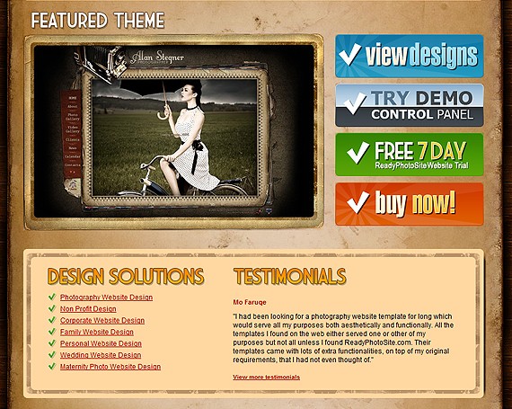
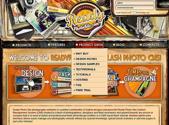
* Photography Website Design While creating the pages we have faced another problem. The main website navigation allowed 5 buttons only and the footer was already crowded with the sub pages and we simply had no place to add the pages. In the next 2 points below I’ll be explaining how we addressed this problem. 4) Creating new home page.Having tested the new home page for several months time we were still not satisfied with the results. We needed to push more people to the products pages and use the place on the home page in more efficient manner. Though the picture was good for people, the home page itself could not be called a good landing page. 1) First of all we decided to decrease the size of the header area, as it was nice but not functional so we reduced it by 40% or so.
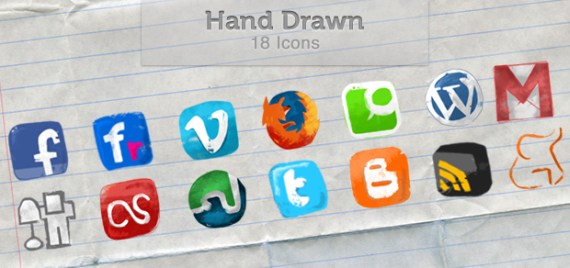
5) Reworking the blog pages
1) Added the banner to the left column offering to exchange old photography website to the new one with 20% discount. 6) Reworking the menu structure and adding new pagesViewing the entrance and the exit points of the website pages we were noticing that our visitors were not finding answers to the questions they were looking for. It was then when we decided to create the product guide section of the website that would contain all the info needed to make a decision.
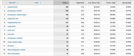
In conclusionWe’ve made a long way studying visitors behavior before the website started looking like this http://www.readyphotosite.com. I have learned that there is always place for improvement and that we are just on the start, not on the finish. We have tried different font sizes, buttons, graphical presentations, motos and texts. We still want to try Google Website Optimizer, add Google Translate, feedback form and some other cool features to make the website even more user-friendly and intuitive. You have to act to be on board. Below are some figures from the stats showing how successful the changes we performed has been so far: |
| You are subscribed to email updates from Graphic and Web Design Blog -Resources And Tutorials To stop receiving these emails, you may unsubscribe now. | Email delivery powered by Google |
| Google Inc., 20 West Kinzie, Chicago IL USA 60610 | |










Comments (0)
Post a Comment