1stwebdesigner |
- 35 Tutorials To Get Your Awesome Design Print-Ready
- 27 Blog Designs With Amazing Design And Functionality
- Breaking Down And Reviewing Important Blog Design Elements
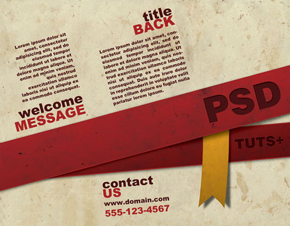
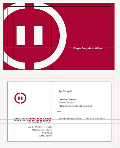
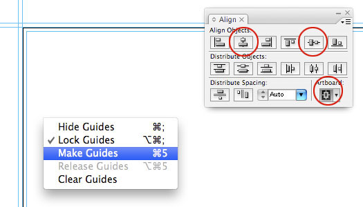
| 35 Tutorials To Get Your Awesome Design Print-Ready Posted: 19 Apr 2010 02:00 PM PDT Print design is everywhere around us. You can see it everyday on newspapers, advertisements, brochures, business cards, T-shirt designs, posters. But you need some skills to create good looking, catchy print design and usually it’s not an easy task. In this article you're going to find some useful tutorials working with print products on Photoshop, Illustrator, InDesign, Acrobat Reader – print designing will not cause any more pain for you! 1. Design a Ready to Print Brochure in PhotoshopIn this tutorial you're going to learn how to create a ready to print three-fold brochure from scratch using only Photoshop. This tutorial is ideal for beginners and for people who want to know more about print design. 2. Making a Print-Ready Business Card Using Only PhotoshopIn this tutorial, we are going to design up a simple business card in Photoshop and get it ready for print with crop marks and bleed. 3. How to Design a Print-Ready Flier with Photoshop and IllustratorIn this tutorial we are going to create 3D text and integrate it in a natural environment. We will not use any 3D programs, so all you need is Adobe Illustrator and Photoshop to create this effect. 4. Create a Fun Print-Ready Doodled Business Card Design
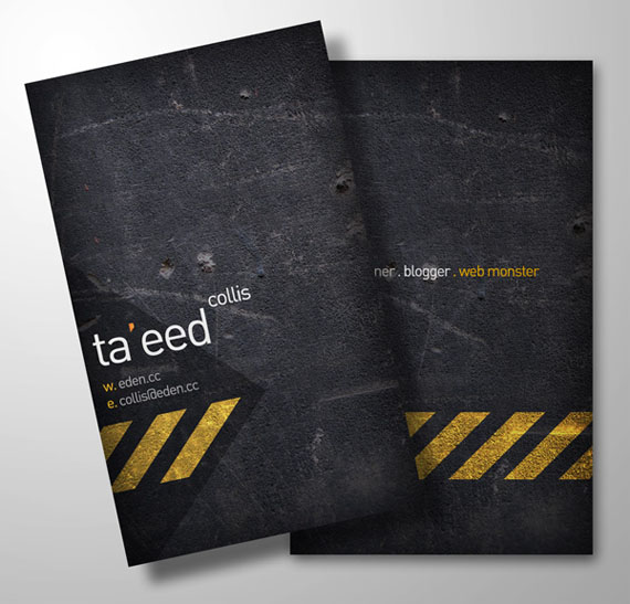
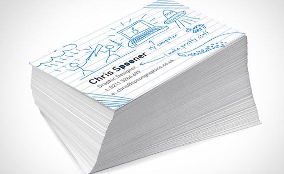
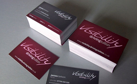
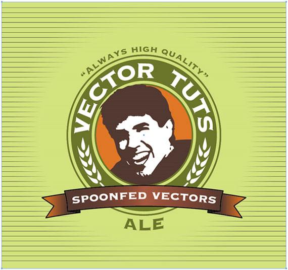
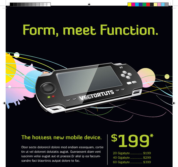
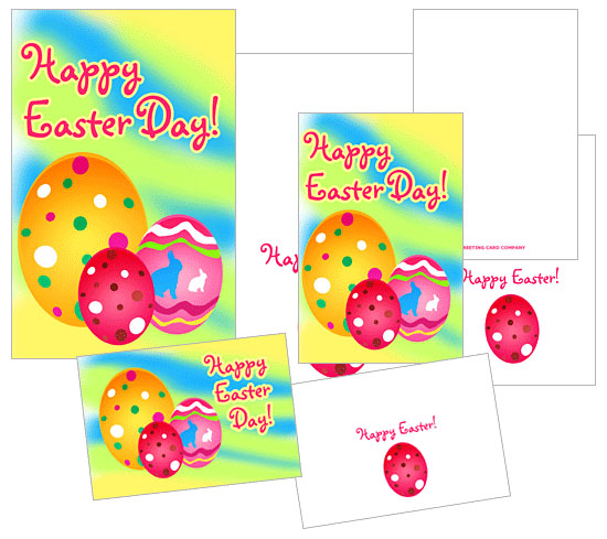
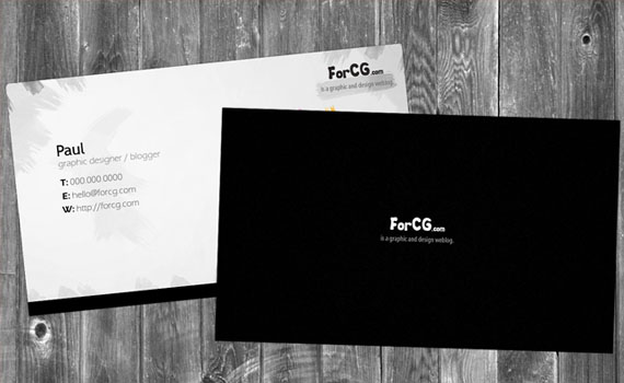
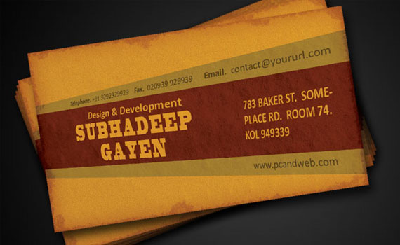
In this tutorial you're going to create unique doodle and sketch business card design. You'll be drawing our doodles directly in Illustrator, and using the application's print abilities to set up your business card document with the correct margins and bleed to build a complete print-ready PDF document. 5. Business Card Design Project WalkthroughYou're going to look look back at Chris process for creating the final concept of James Clarksons business card, resulting in the finished printed product. 6. Design a Print-Ready Beer Label in Adobe IllustratorThis tutorial takes you from setup to production of a really cool beer label, although this could be useful for any bottled concoction of your choosing. 7. Design a Print-ready Ad in Adobe InDesignWant to learn how to make an ad that could go into a magazine? This tutorial is perfect for you if you're familiar with Adobe Illustrator and want to get started with a layout program suited toward publication design. 8. Create and Print a Brochure with Photoshop, Indesign and UPrinting.comThis is a 2 part complete walktrough teaching you complete process of designing a simple brochure, getting it ready for print and then actually uploading it to a commercial online printer, checking the proof and seeing the finished product. 9. Make a Print Ready Easter Greeting Card from ScratchThis ir really simple tutorial, which will help you create nice, simple greeting card for friends or family. 10. Design Slick Print Ready Business Card Using PhotoshopIn this tutorial you're going to see how to design your own double sided business card in Photoshop and get it ready for print. 11. Create a Grunge Print-Ready Business CardIn this tutorial you're going to be guided through the process of creating a grunge print-ready business card using Photoshop. You're also going to find some information on how should a good business card look like. 12. How To Create Old Grunge Style Print Ready Business CardThis tutorial will guide you and help you to create a cool old grunged business card in photoshop which is fully print ready with full bleed. 13. How to Make a Great Print Ready Business Card in Photoshop
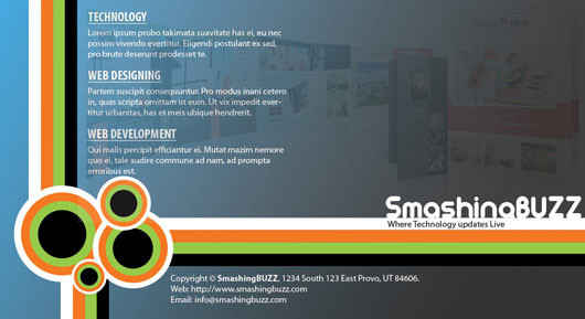
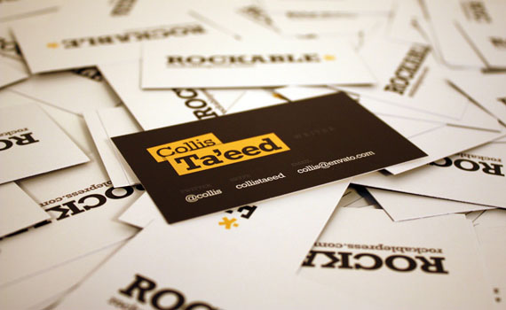
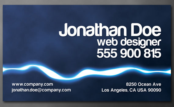
In this tutorial you will learn how to get your business card print ready with crop marks and bleed. 14. Creative Brochure Design Tutorial in Adobe PhotoshopLearn how to create simple 2 page brochure for technology and design company. 15. Create a Business Card in Illustrator and Print it with UPrintingIn this tutorial we'll take the Rockable Press brand tutorials and apply it to create and print business cards with UPrinting. 16. Design a Print Ready Business Card for Designers
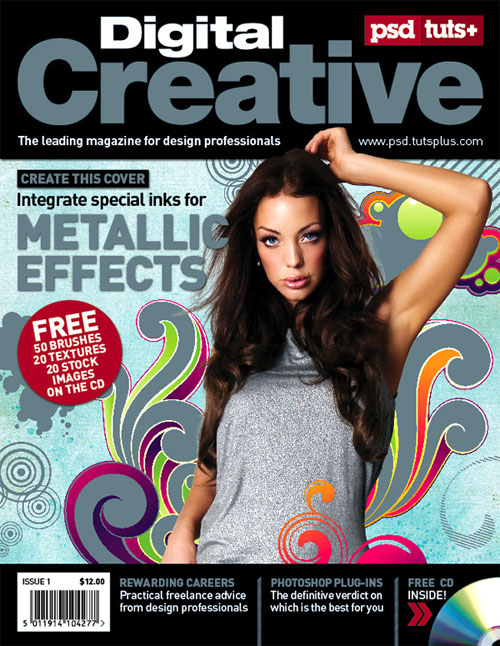
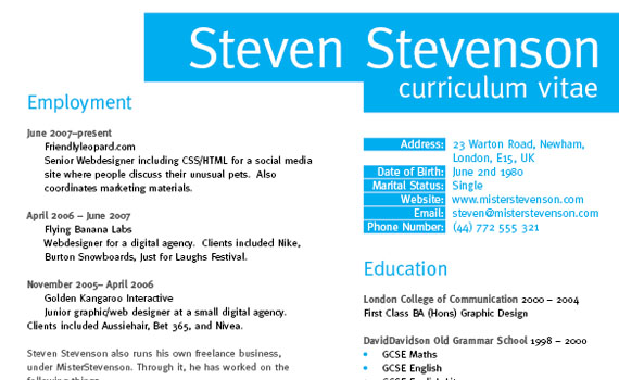
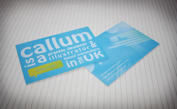
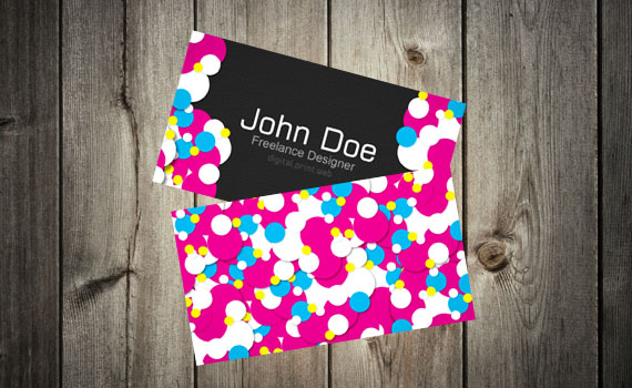
Follow this walkthrough in Adobe Photoshop, Adobe Illustrator and Adobe InDesign to create your own double sided business card design, resulting in a print-ready file to send to your favoured print firm. 17. Create a Five-color Magazine Cover using a Spot MetallicThis as an advanced tutorial where first you'll be exporting InDesgn template in Photoshop and then creating the print with CMYK and spot metalic color layer. 18. Create a Grid Based Resume/CV Layout in InDesignUse the power of grid based designs to create a structured and professional page layout in InDesign, which can then be populated with a range of information to produce a polished CV or Resume. 19. How to Design an Abstract Business Card in PhotoshopIn this tutorial you will see how to design an abstract business card using a combination of Adobe Illustrator and Photoshop. You will be using Photoshop as a base for our business card, all whilst using Illustrator to create some clean, abstract shapes to use in our abstract business cards. 20. Creating a Colorful Vibrant Business Card
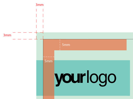
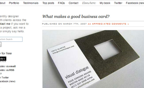
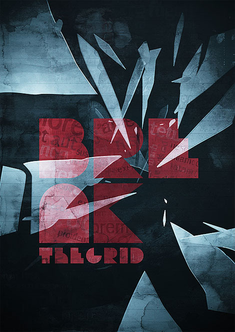
Design a vibrant business card for designer. You have already been given a template with bleed lines. 21. How To Create Print Ready Standard Size Business CardsIn this tutorial you're going to be creating a simple and easy, not hard to follow business card design. You're also goig to find out what are bleeds and what to take in account designing a business card. 22. Designing for Print – Setting Up Crops and BleedLearn how to set up crops and bleeds for any kind of print works. 23. What Makes a Good Business Card?This isn't a tutorial, but if you're creating a business card with intension to really use it, you should consider reading this article by David Airey. 24. Create and Then Shatter a Grid, while Making a Typographic PosterBreak the grid to create a dynamic and exciting layout. So grab the usual tools of the trade, Photoshop and Illustrator, and follow tutorials steps into creating your own solution. 25. Design a 6 Panel CD Package TutorialIn this tutorial the artist will talk you through his workflow and decision-making process rather than focus too much on specific graphical techniques and he'll also explain how to use printers' templates to make sure your design comes up to their specs. 26. How To Design A Movie Poster – With An Example
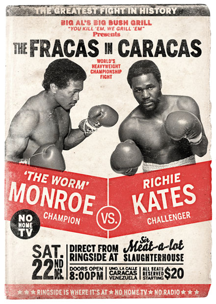
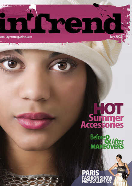
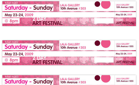
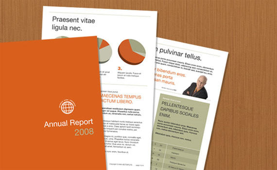
This is very detailed tutorial teaching you how to research materials for your project, creating various outcomes and the message your poster should send. 27. How to Create a Retro Boxing Poster in PhotoshopYou'll be drawing inspiration from Poster Design from the 1960s, particularly Boxing Posters from that era. You'll learn some things to keep an eye out for when mimicking graphic design from any decades past. 28. Magazine Cover Design in InDesignIn this tutorial, we'll not only take you through the process of creating a cover, but also reveal techniques that designers use to make their covers stand out. 29. Create Numbered Tickets the Easy Way in InDesignIn this tutorial, we'll explain how to do an easy setup in InDesign for automatically numbered tickets. We will look at the handy "Data Merge Tool," which is a great time-saver. 30. How to Create a Music Magazine Cover in InDesignIn this tutorial, we'll look at how to create a magazine cover in InDesign. You'll learn how to set up a page layout and add text. This is an introduction to InDesign and no previous knowledge is required. 31. Publishing a Multiple Paged PDF Document Using IllustratorOne of Illustrator's lesser-known functions is it's ability to produce and publish multiple paged documents in PDF format. This tutorial will explain how it's done, while discussing some grid layout theory to produce an Annual Report. 32. Getting Illustrator files Print ReadyQuick check list to do before getting file ready for printing. 33. How to Create a Coupon in InDesign
In this tutorial, we’ll explain how to create a coupon, double-sided in InDesign. This is a beginner level tutorial and by no means meant for print. It gives you a small intro into tabs, style sheets and glyphs. 34. Create an Adobe Illustrator Template for a Tri-Fold BrochureThis tutorial will help you understand how to set crops and bleed for tri-fold brochure. You can also download template. 35. Design Artworks for Screen-PrintingIn this tutorial you'll learn how to colour up a four-colour design for screen-printing using Photoshop and Illustrator. |
| 27 Blog Designs With Amazing Design And Functionality Posted: 19 Apr 2010 07:00 AM PDT
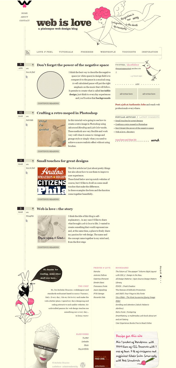
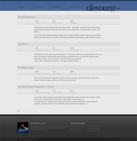
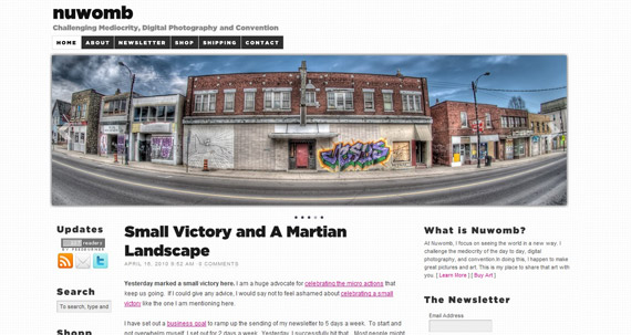
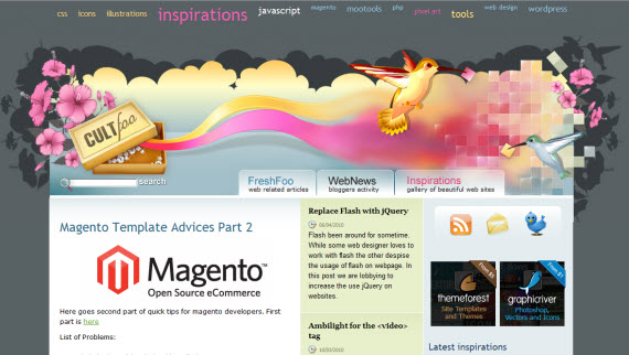
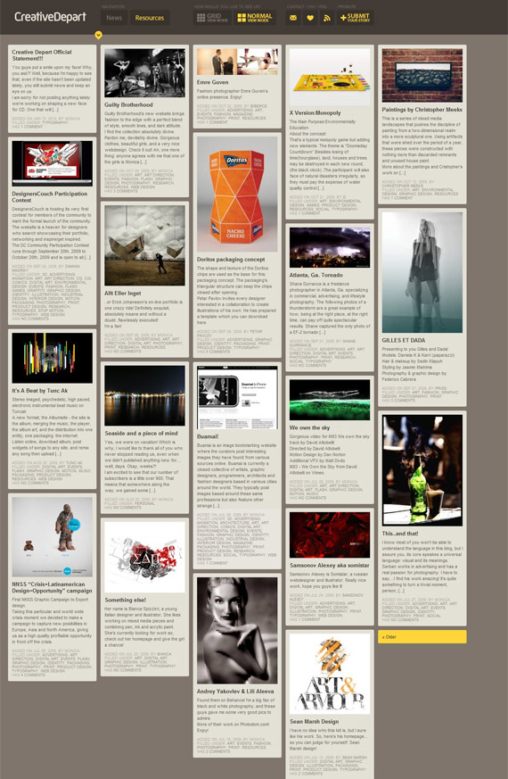
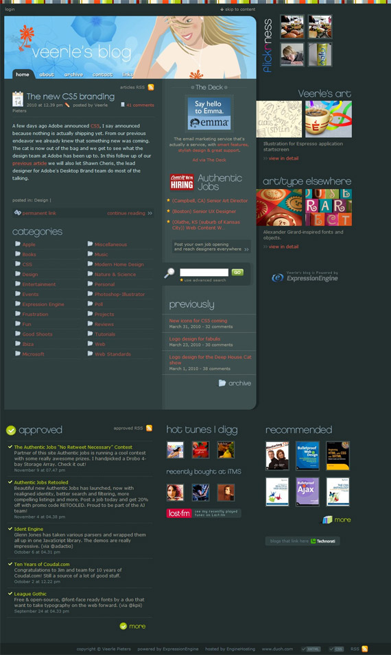
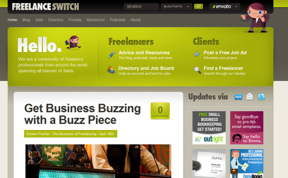
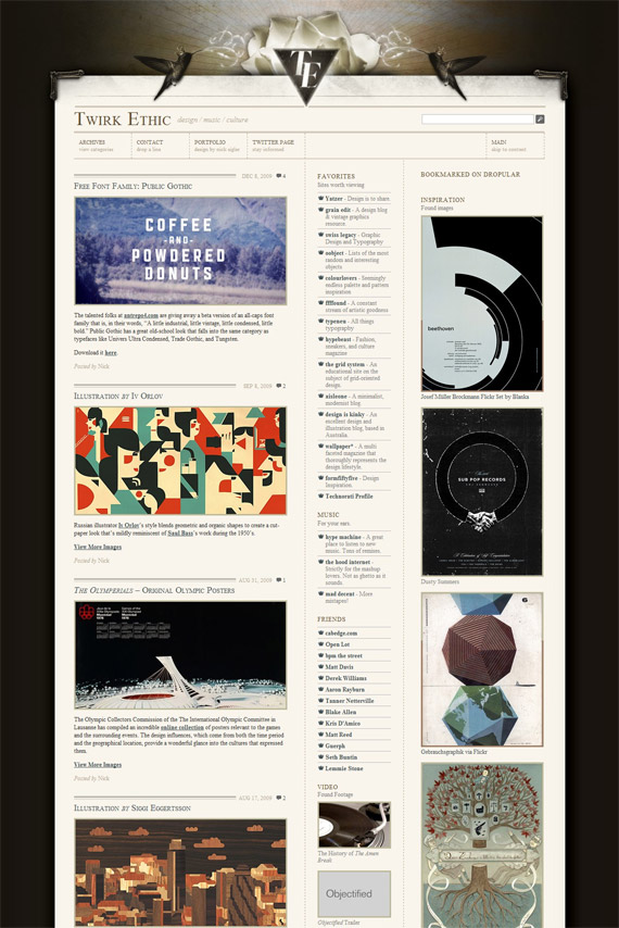
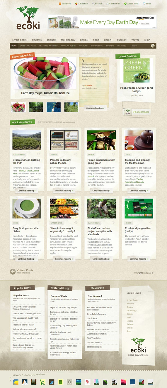
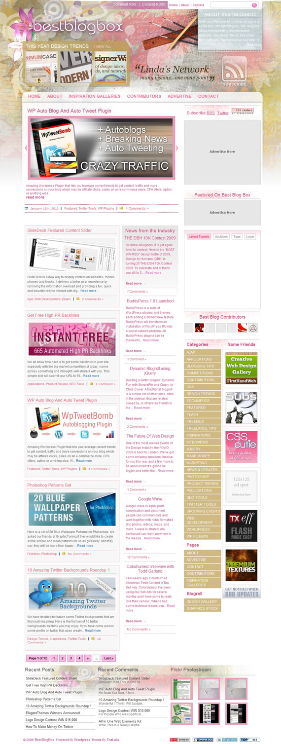
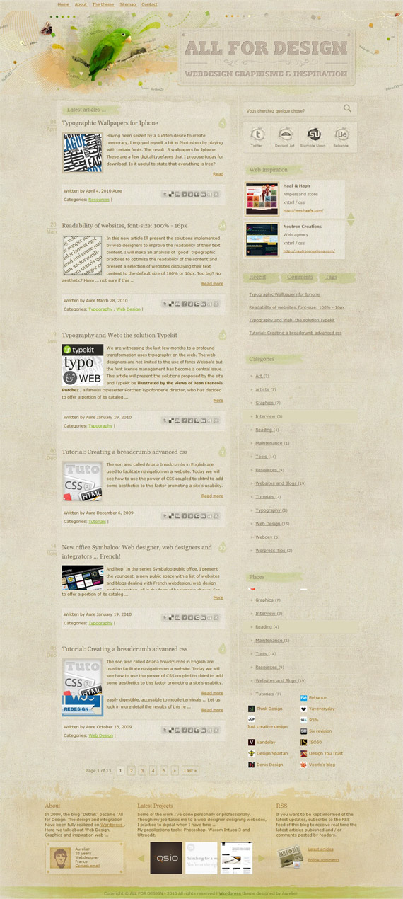
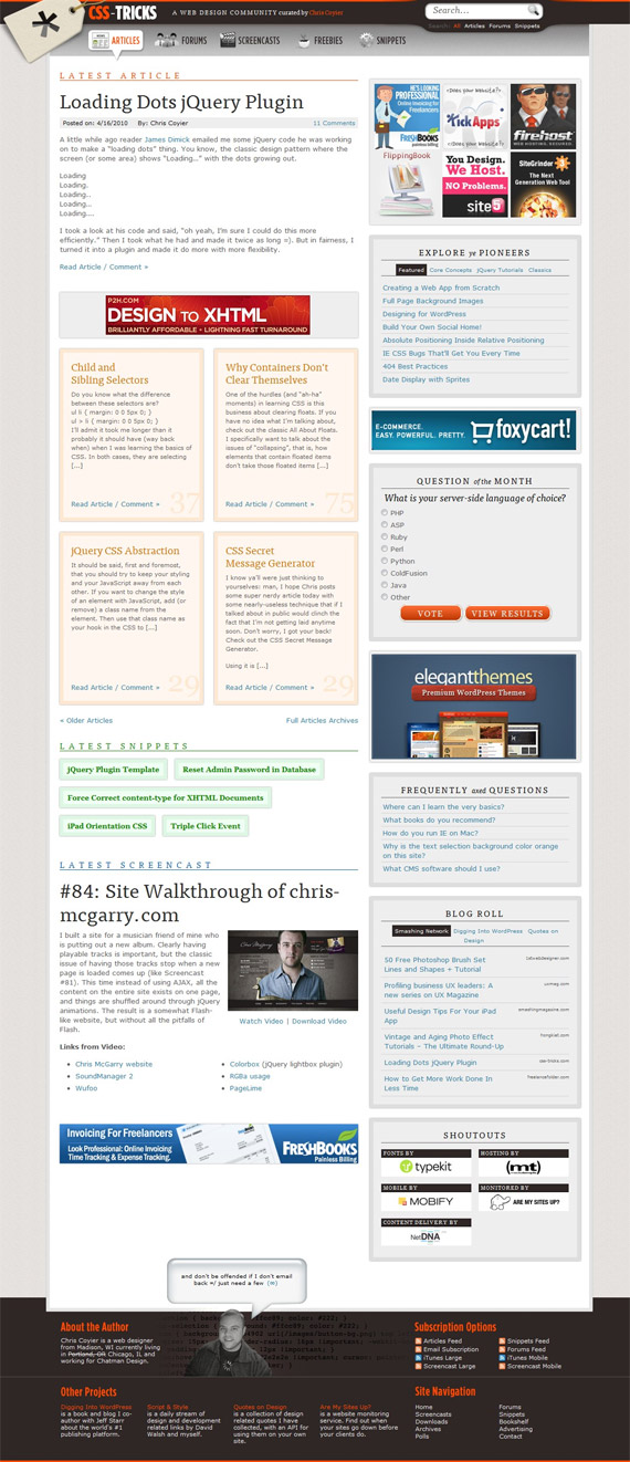
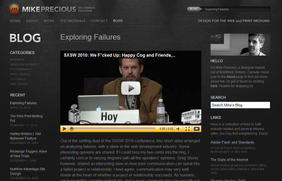
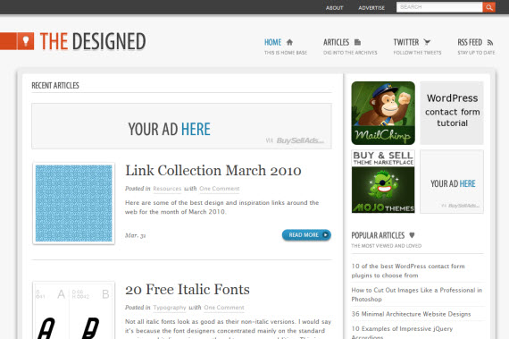
1. Web Is LoveYou will find just a few colors used in this layout, effectively used whitespace, cool hand-drawn illustrations and little icons. Unique concept. 2. 15 JuneVery clean landing page without any images, but visit his individual posts as well, you'll see unique styling and change of navigation color! 3. NuWombWhat I enjoyed the most was a little touch with textured background and featured slideshow putting all main content above the fold. Only I think since middle section is so long, designer should have 2 column layout not 3 to give more space to actual article. It's good to have the most important information on "above the fold" section though (RSS subscribe, newsletter, shop). 4. Cult-FThis blog has excellent header to show immediate creativity, not sure though if it's not too big. Navigation is very interesting – when you scroll down, navigation cloud moves with you – idea is great, I felt a little bit disturbed since I am sitting on my laptop with little resolution, but this is a great way how to increase pageviews I think. 5. SkyLab BlogHere I enjoy the most little, silent Twitter,Facebook, Delicious and RSS buttons – every designer will notice and evaluate this approach! 6. Creative DepartInteresting approach – you can switch between grid/normal modes and choose which layout works better for you. At least for me – I feel appreciated, like I have some kind of modification possibilities and personal touch. 7. Veerle's BlogGreat example showing how it's possible to consume a lot of different information in good way. All those little icons, header and light typography just creates right accents and makes layout interesting. 8. Freelance SwitchEvery site in Envato network is designed in smart and very effective way. Watch out how they put the most important information in above the fold section, but in the meantime they emphasize effect with big typo, self describing icons and cool mascot! 9. Twirk EthicBeautiful simplicity – can retro style be any cooler? Excellent 3 column layout consuming a lot of information in visually appealing way. 10. EcokiIs it possible to be any more cleaner and grid based? Such eye-candy and so effective design! 11. Best Blog BoxVisually and content rich magazine type website – on index page you will find a lot of different articles to grab your attention in 3 column layout, but when you are in article, you'll get even more space for article and just 2 column layout! Handy! 12. All For DesignVery clean and textured French blog design – I enjoy social networking mouseover buttons and style throughout whole design keeping it clean, grungy – yet trendy. Visual beauty is emphasized with colourful "above the fold" header. 13. CSS TricksClose to perfection, Chris has many projects already and he advertised almost all of them in single landing page! Very functional website, only I think it needs more detailed sections, so people could find information more easier besides search and sidebar featured articles. 14. Mike PreciousOne more great dark design! 15. The DesignedVery often it's good idea to just keep layout clean to be effective. 16. SquareSpace BlogLittle rulers and transparent header creates an effective impression, I am not sure about sidebar but other than that – unique approach! 17. Elliot Jay StocksBesides colors, I enjoyed original footer and even more notice Search, which is only there! Good way of thinking – people scroll through site, don't find what they want, but then notice footer and fat search button inviting to search for desired topic!
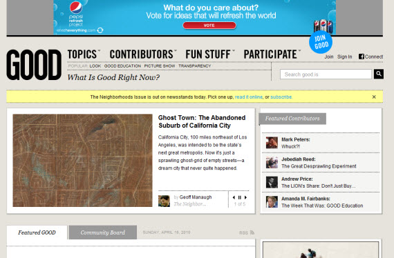
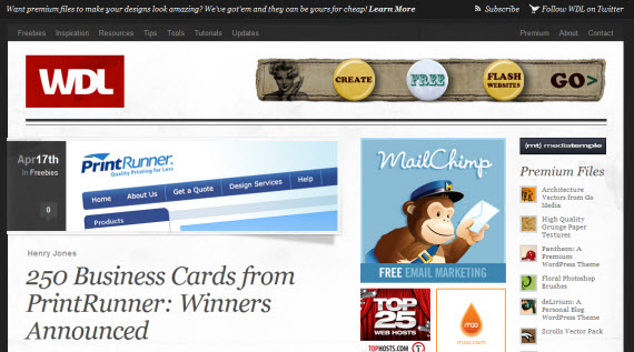
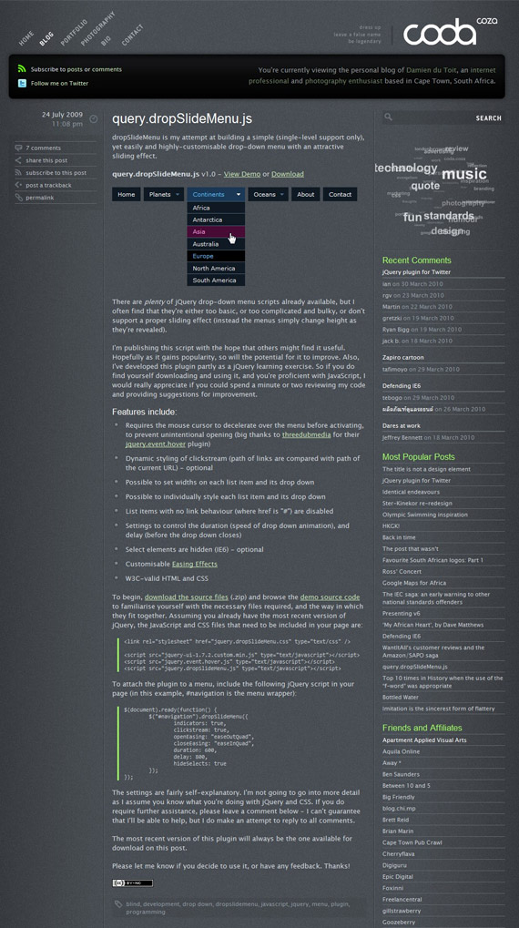
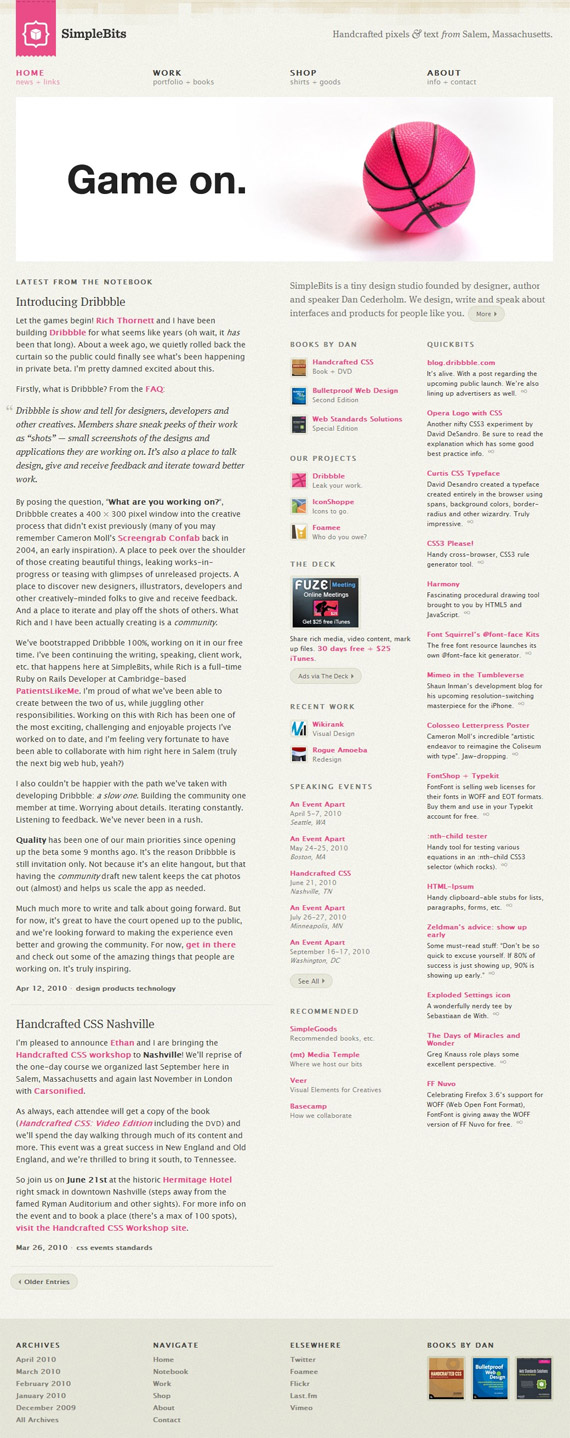
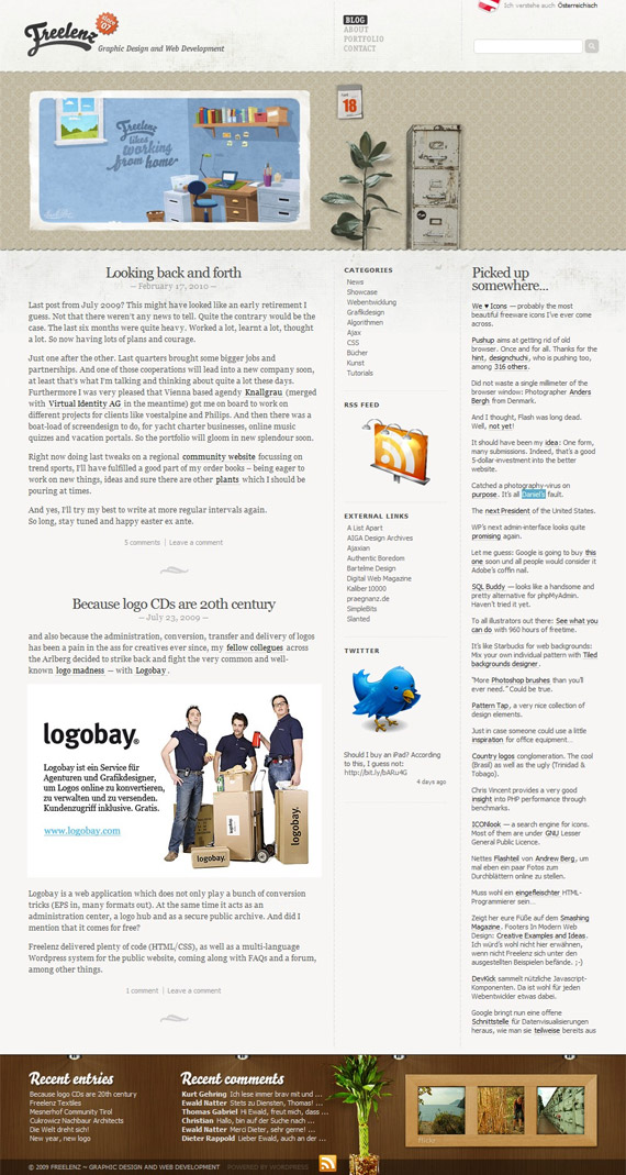
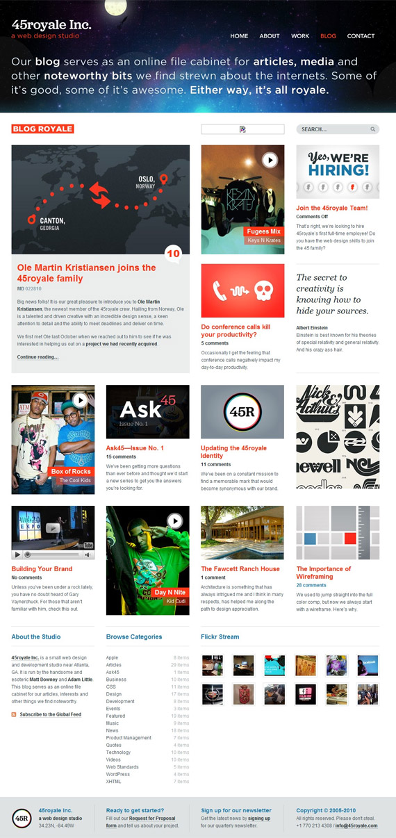
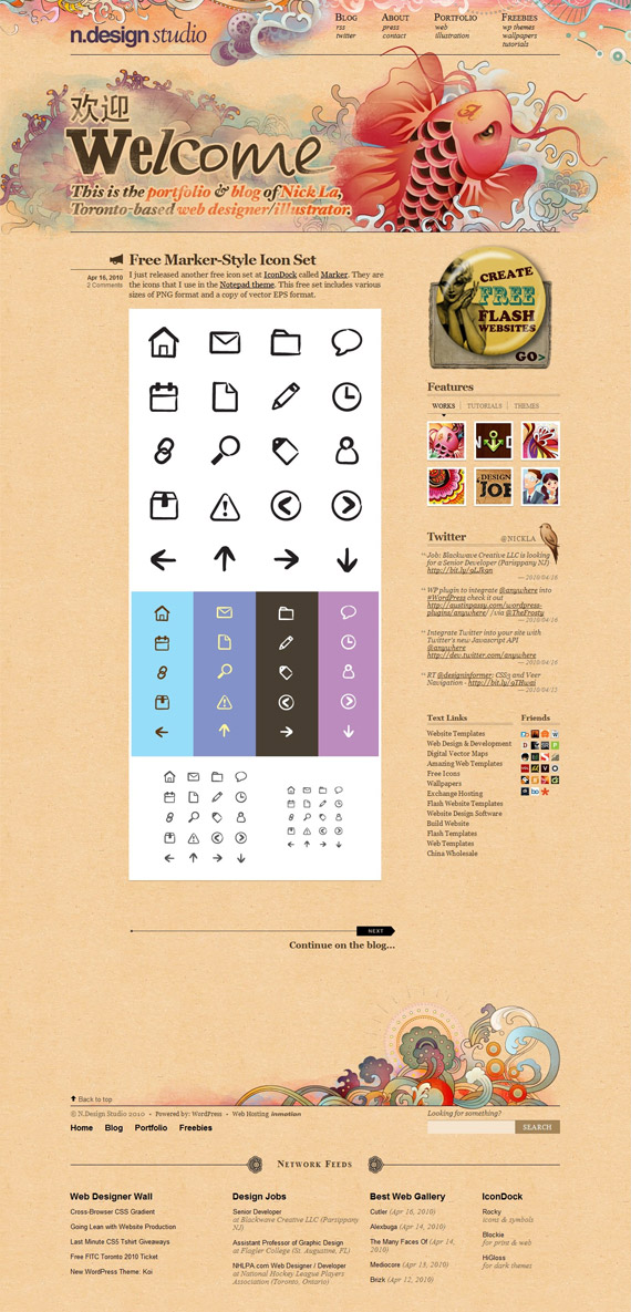
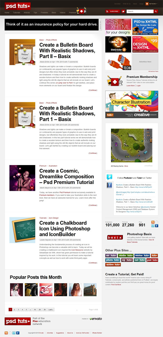
18. Good.IsYou can learn from this website, how to consume huge amounts of information and sections in good way. 19. MashableMashable's great design is huge case of study more from functional point of view (I would give a little bit more artistic look to it, but it's social news site, not design blog). I include whole index screenshot, because I wanted to show how many ads and information is consumed here, how mashable promotes their all social networks and really dominate there! 20. Web Design LedgerHenry Jones has given this 3 column site some great functional and visual features – beautiful featured images and a lot of small thumbnails in sidebar to grab reader (designer) attention and it works! 21. CodaOne of rare exceptions where I really like dark design! Design could be more functional, but it always depends from specific project – for them, I think, suits perfectly! 22. Think VitaminBeautiful light and functional design which works using just monochrome, orange and green colors in the right sections! 23. Simple BitsHandcrafted pixels done effectively! 24. FreelenzLittle things matters and a lot of little things used in good way, create amazing website like this! 25. 45 RoyaleAt first design seemed to be chaotic, but just after a moment I got a very good impression about its appearance and functions! 26. N-Design StudioAmazing designer blog – extremely creative and surprisingly functional in the same time!! 27. PSD.TutplusNot a long time ago Envato changed their network site designs – big case study, interesting choice of navigation, sidebar organization and great icons to make good accents! |
| Breaking Down And Reviewing Important Blog Design Elements Posted: 19 Apr 2010 12:10 AM PDT
In this post, we will go through each main section of a blog and talk about the design elements, what you should be thinking about, and relevant resources related to that section. Header
Your header, the first chance you have to make a lasting and unique impression on your readers. Typically the area where your logo will live and for new visitors, the place where users will interact with your brand for the first time. Having a well-designed logo that is easy to read and is catered to your target market, will help give your blog a more authentic and professional feel. Be careful though, some designers can go a little overboard with making the header so large that it takes up a big part of the main real estate on your blog. If you blog is taking up half of the users screen, it can lead to people bouncing because they are having to scroll down each time they want to find content. Header Resources
Main NavigationYour main navigation will typically be the categories that organize the content on your blog. It will be extremely important to understand who your audience is, and design a navigation around what those users are looking for. If you have 20-30 categories, it will confuse your readers and they will have too many options to choose from. Try to keep the categories broad and simple. This will help the readers drill down into your content because they will not be bombarded with lots of category options.
Sub NavigationHaving a top or secondary navigation will be key for static pages for your blog. This is a perfect area to have those “About”, “Advertise” “Write For Us” “Contact” etc…pages. Remember, your content should be the most important aspect of your blog, not a sales pitch, “Advertise With Us”. If users are engaged in your content, they will find how to contact you to advertise or to write for your blog. So do not make this extremely prominent, but make sure it is there and accessible.
Navigation Resources
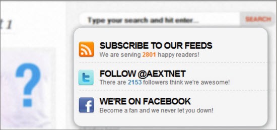
Sidebar1. RSS Subscribe What is probably the most important aspect of any blog? To gain loyal readers. Make sure you have your RSS subscribe option at the top of your sidebar and anywhere else you can put it across your blog.
2. Newsletter Your blog newsletter can be an outstanding way to keep driving your loyal customers back to your site. Place your newsletter sign-up in prominent location on your sidebar so users can easily see it. Don’t just say “Sign-up for our Newsletter”, give them a reason to sign-up. Tell them they will receive insider tips, discounts, premium content, etc… this will make users think they are getting VALUE.
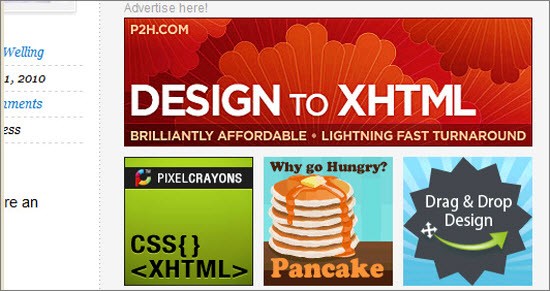
3. Advertisements Ads on your blog can be an excellent debate as to whether you should have ads? how many ads? at what point should you put ads on your blog? These are all great questions. Initially when you are trying to build up your audience, I recommend not putting any ads in your sidebar or blog for that matter…it can devalue your brand. Once you start earning a loyal readership, then you can start to incorporate ads. I would start with 4-6 125×125 ads. I would suggest putting it about half way down your sidebar, this way you can still add more important aspects like your RSS feed, Twitter Button, and Newsletter Sign-up about it.
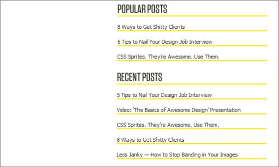
4. Popular/Archive Posts Users like easy ways to get to existing content on your blog. There is no easier way that by putting quick links in your side bar to your “Popular Posts”, “Monthly Archives”, “Category Links” and “Most Discussed Posts”. This will make it easy for users to search for previous content from a multiple array of search options.
Popular/Archive Resources
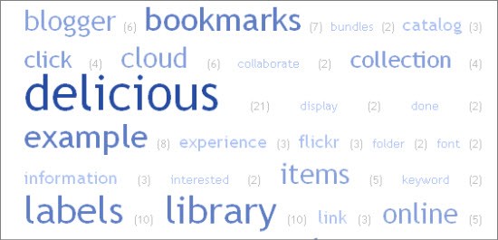
5. Tag Clouds Users may also want to read content on a certain keyword or topic. Having a small tag cloud in your sidebar can allow users to easily find keywords that interests them.
Tag Cloud Resources Sidebar Resources
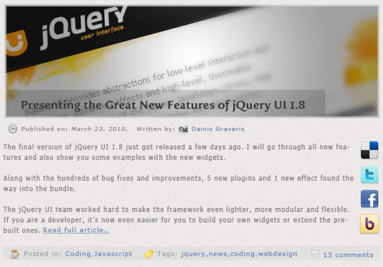
Post Preview SectionThis will be your chance to try and capture your reader to get them to give into a blog post. The intro snippet should be enticing, give the user an understanding of what the post is about, while leaving them thirsty for more. Using a relevant image along with the intro text will make the post more appealing and likely that someone clicks through to read the entire post. Make it easy to share even from the post preview section. Many people by just reading the post title will be energized enough to share your content on their favorite social networks. It is also helpful for blogs that gain a lot of traffic, to show Tweetmeme, Facebook Share, and Digg buttons to show how popular each post is.
Main Post SectionThis should be where the beef of your content. This is where people are going to come to read your blog posts, so don’t clutter the section up with ads, irrelevant images, useless white-space, and bad layout/formatting. Make sure the font you use is easy to read and highlights key titles, subjects, points, etc… Using things like bullet points, bold titles, italics, links, and relevant images will help make this section more engaging and keep the user reading your content. It is helpful to have information about the author, post date, comment/reaction recap, and social media sharing icons to give the reader a recap of the post and make it easy to distribute on the web.
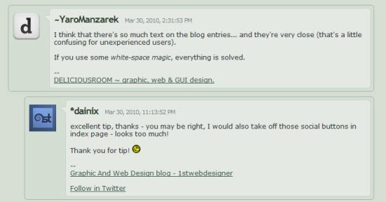
1. Comments Comments are going to be a huge part of keeping your blog interactive and engaging. It will also help to build your readership, by showing that you have an active and fun environment for people to share their opinions and comments. Tweaking the design to allow for commenter images, basic HTML, threaded comments, and date/time of comments will make this section entertaining and encourage commenting.
Comment Resources 2. Social Sharing Make it extremely easy to share your content. Use social media icons at the top and bottom of the post, add the ShareThis plugin, add the TweetMeMe, Facebook Share buttons,allow people to email to a friend.
Social Sharing Resources
FooterHaving a well designed footer can be useful on a number of different levels. For an end-user, this can act as a sitemap-like navigation so a user can quickly dive back into your content. It should be a way to easily find main categories and key pages on your blog.
Things to think about adding to your footer:
Resources for Well-Designed Footers
Functionality1. Search Having search functionality in the sidebar or header, will make it easy for reader to search for content or topics they are interested in. Having a “Search” button that is easy to see and stands out will entice more people to search your blog content. It may be worthwhile to add a few areas on the blog where they can search.
2. Trending Topics/Posts Mashable was the first to start the feature of trending or hot topics. It puts content that is going viral at the forefront of your blogs homepage. Having similar functionality will allow users to not have to hunt for content that is popular among your audience.
To make it easier for readers to leave comments, sign-up for an account, or download content, give them the option of using the “Connect” feature for their favorite social network. This will allow them to login using their existing facebook, twitter, or openID account.
Overall, in order to design an effective blog you need to think about what your audience wants. What type of functionality do they want? What content do they want? What important aspects of your blog should be highlighted on the homepage? How can you gain more leads, sign-ups, subscribers, shares? These are all things that you will need to think about and gain feedback from other industry blogs, your readers, and friends. |
| You are subscribed to email updates from Graphic and Web Design Blog To stop receiving these emails, you may unsubscribe now. | Email delivery powered by Google |
| Google Inc., 20 West Kinzie, Chicago IL USA 60610 | |























Comments (0)
Post a Comment