1stwebdesigner |
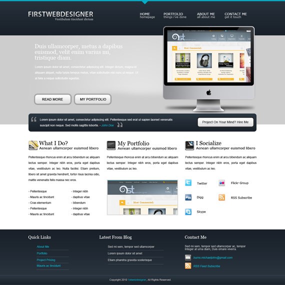
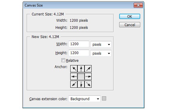
| 1stDelicious: Create A Simple Clean Portfolio Layout In Photoshop Posted: 19 Jan 2011 02:00 AM PST Hello there everybody and welcome to another PSD web design tutorial here at 1stwebdesigner! In this tutorial you will learn how to create a Simple Clean Portfolio layout in Photoshop. A few techniques discussed in this tutorial will include the use of proper spacing, typography and colors. We’ll be using really light color scheme and design is meant to be really minimal for portfolio type of website. Let's get started – I hope you will make out together with me until successful finish together ! By the way in few days you’ll see also PSD TO HTML tutorial to this design – so keep up, design this template so you can immediately code it into live design!! Resources you will need to complete this tutorial: Here is what we will making, click on image for full preview: Step1: Working with Site StructureBefore we get started download first 960grid system for easy Guideline creation. Open 960_download\templates\photoshop\960_grid_12_col.psd We also need to make sure that our Rulers and Guides are viewed, do that by pressing
CTRL + SHIFT + C to change the canvas size.
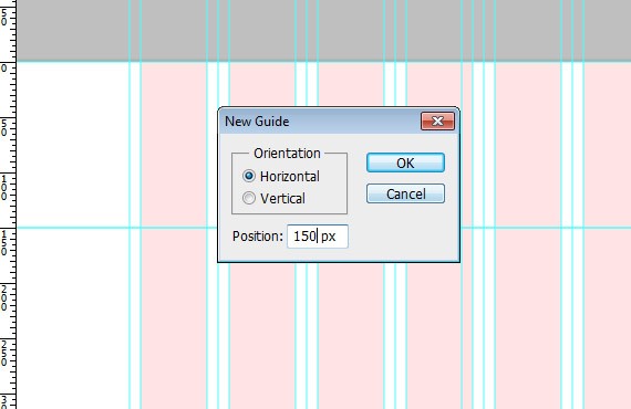
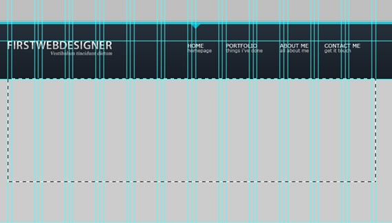
Step2: Working with HeaderRename the layer1 folder to Header and rename layer 1 to header_bg (put everything in separate folder like Header, Navigation, Footer to help to be organized better). Create new guideline go to View > New Guide and set the position to 150 px, orientation to horizontal.
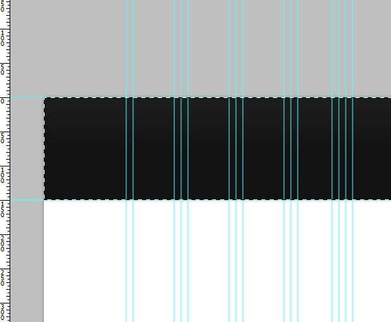
Select Rectangular Marquee Tool(M), make a selection as shown in the screenshot below and fill it with any color.
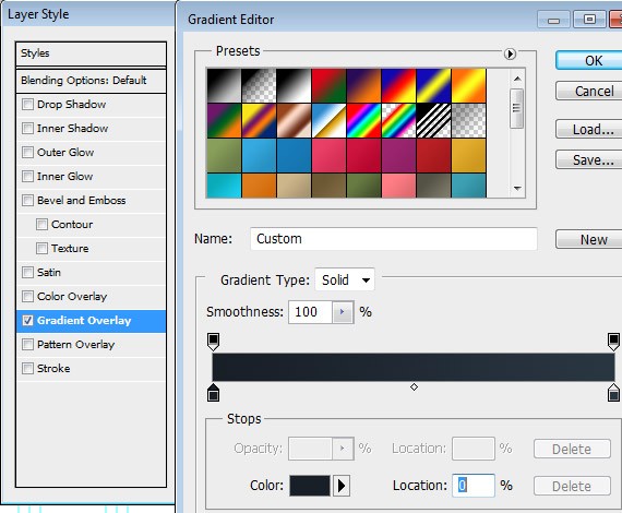
Add this Blending Option: Gradient Overlay
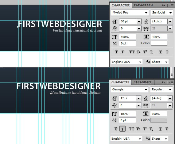
Step 3: Working with LogoCreate a folder inside header folder and name it to Logo, put all your logo related layers there. Create another guideline 50px from the top. Now Select Text Tool(T) and put up your Site Name and Slogan.
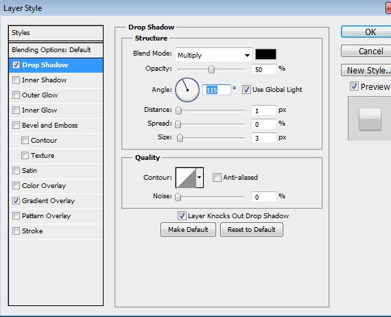
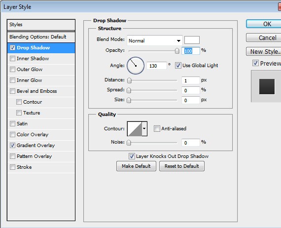
Add this Blending Option: Drop Shadow
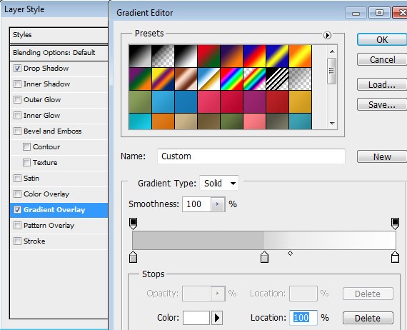
Gradient Overlay
You must have something like this in the result:
Step 4: Working with NavigationCreate a folder and name it to Navigation, put all your navigation related layers there. Create another guideline 5px from the top.
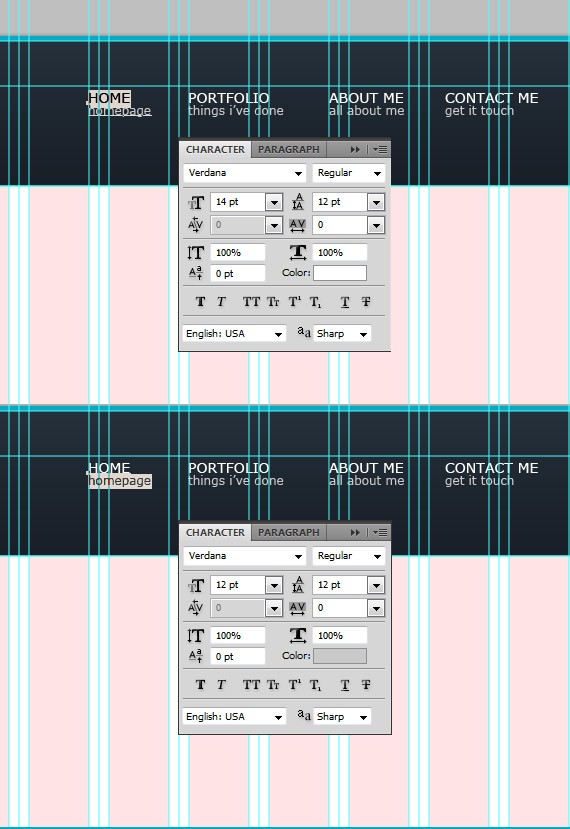
Select Text Tool(T):
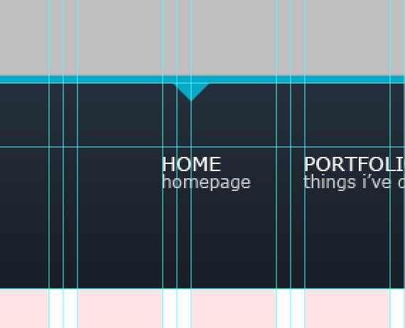
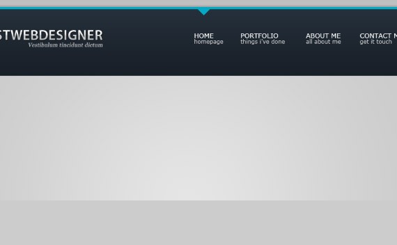
Let’s create a hover/active state to our navigation. Select Pen Tool(P). Create an arrow-head shape and place it as shown in the screenshot below.
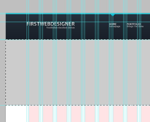
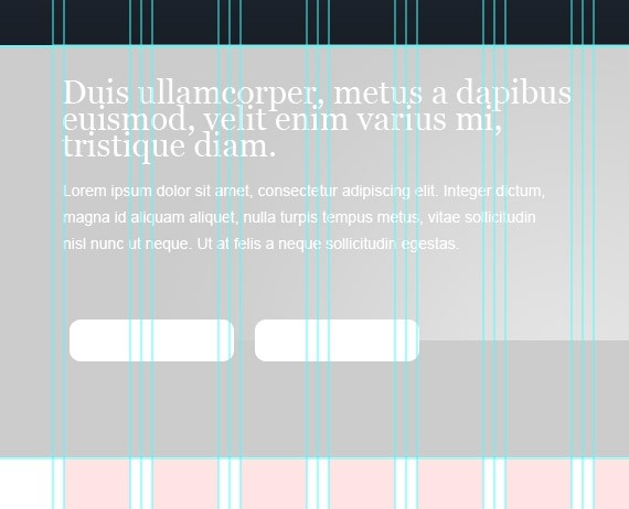
We’re finished with our header section, so now let’s proceed with featured section. Step 5: Working with Featured SectionCreate a folder and name it to Featured_Section, put all your Featured related layers there. Select Rectangular Marquee Tool(M), make a selection as shown in the screenshot below and fill it with #cccdcd.
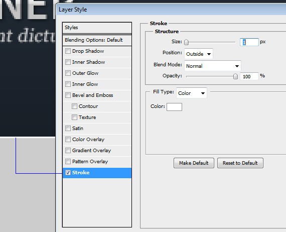
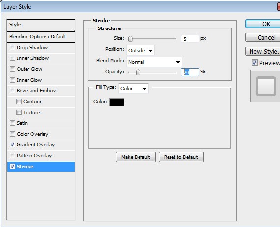
Add this Blending Option: Stroke
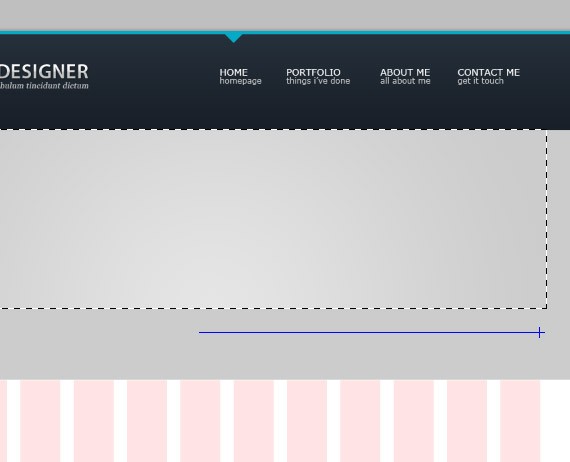
Create another layer and name it to middle_light. Set the opacity to 50%. Select Rectangular Marquee Tool(U). Make a selection as shown in the screenshot below:
Drag the gradient starting from the middle all the way to the right.
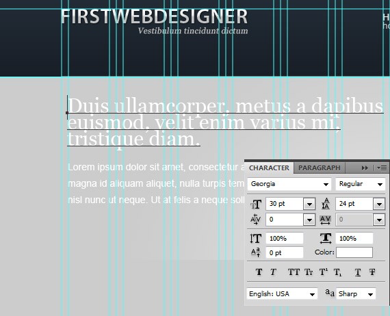
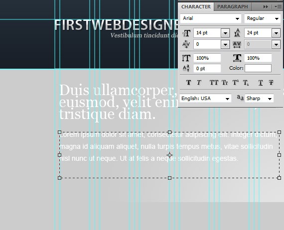
Select Text Tool(T), put up your site message.
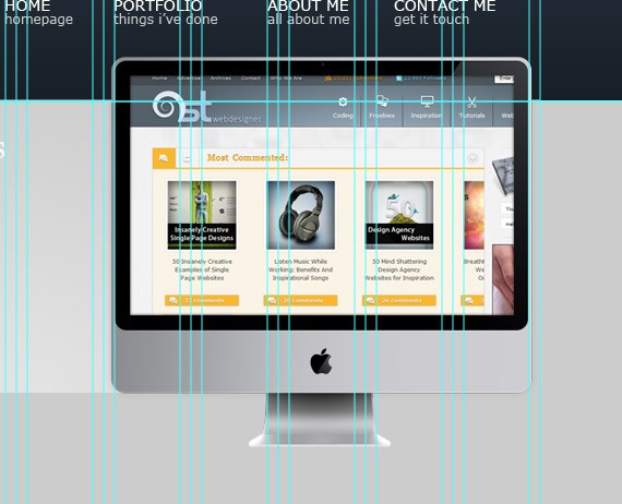
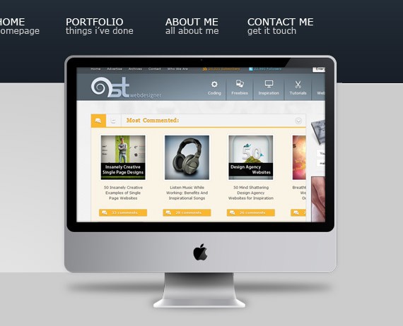
Now Open up the Imac.psd file. Place it as shown in the screenshot below.
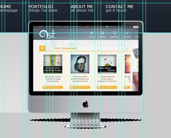
Below the Imac layer Create a new layer and name it Shadow. Select Elliptical Marquee Tool(U). Make a selection as shown in the screen shot below and fill it with a color #000000. Remember that while holding shift key you can create multiple selections.
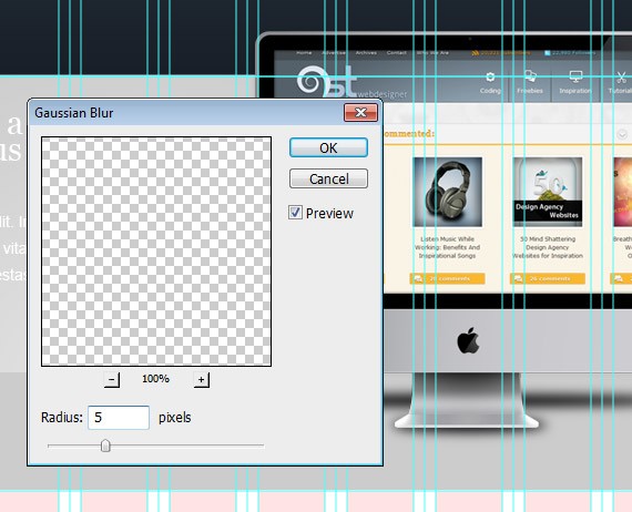
Go to Filter > Blur > Gaussian Blur.
Set the layer opacity to 50%.
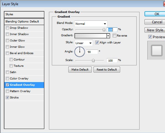
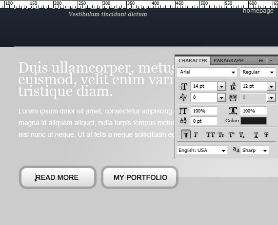
Step 6: Working with Read more ButtonsCreate a folder and name it to buttons, put all your read more buttons related layers there. Select Rounded Rectangle Tool(M), place it as shown in the screenshot below.
Add this Blending Option: Gradient Overlay
Stroke
Select Text Tool(T) and add text to buttons.
Add this Blending Option: Drop Shadow
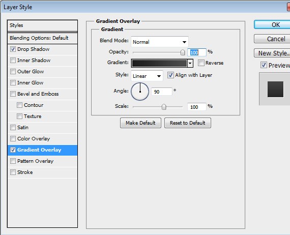
Gradient Overlay
With the help of drop shadow and gradient overlay this effect will make our text look embedded. Step 7: Working with Testimonials
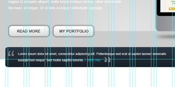
Create a folder and name it to testimonials, put all your testimonials buttons related layers there.
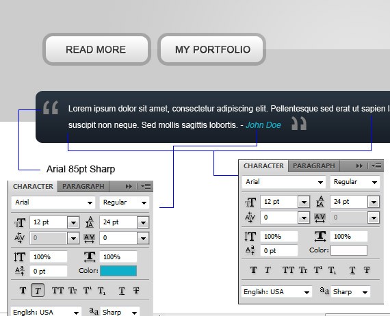
Apply the same layer style as we did into our header and place Place it as shown in the screenshot. Select Text Tool(T), add up your testimonials.
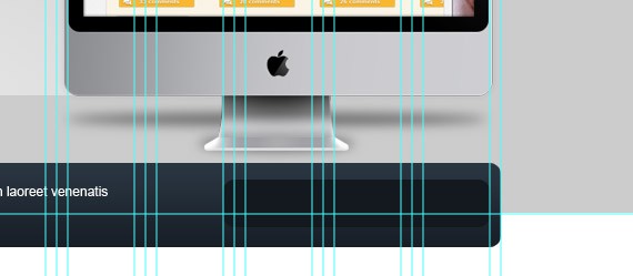
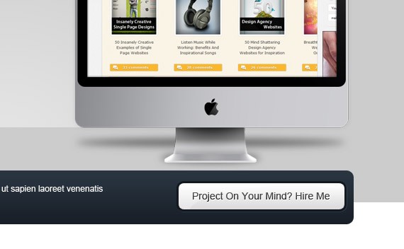
Step 8: Working with Hire Me ButtonCreate a folder inside testimonials folder and name it to hire_btn, put all your hire button related layers there. Select Rounded Rectangle Tool(U), set the radius to 10px and color to #141a20. Place it as shown in the screenshot.
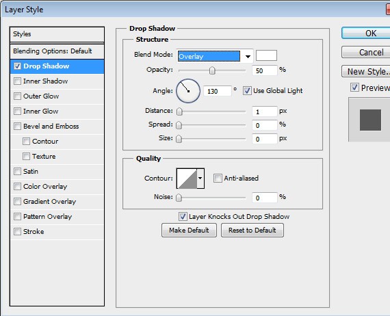
Add this Blending Option: Drop Shadow
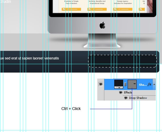
Ctrl + click to the layer to make a selection.
Go to Select > Modify > Contract. Set it to 3px. Create another layer and name it to button , and fill it with any color. Apply the same layer and text style as we did to our button in featured area.
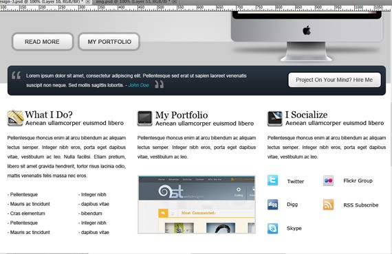
Step 9: Working with Main Area(What I Do, My Portfolio, I Socialize)
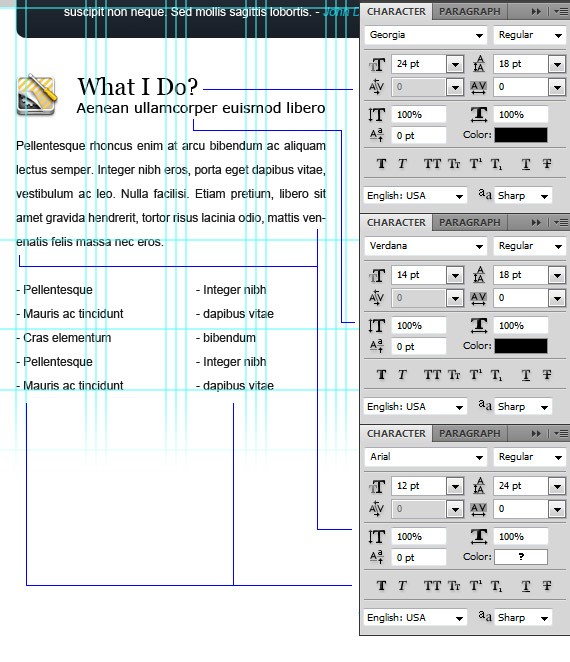
Create a folder and name it to main_area, put all your main area related layers there. What I Do Create another folder inside main_area and name it to What I Do. Now Open icons that you have downloaded and grab 3 icons that will fit to (What I Do, My Portfolio, I Socialize). Select Text Tool(T):
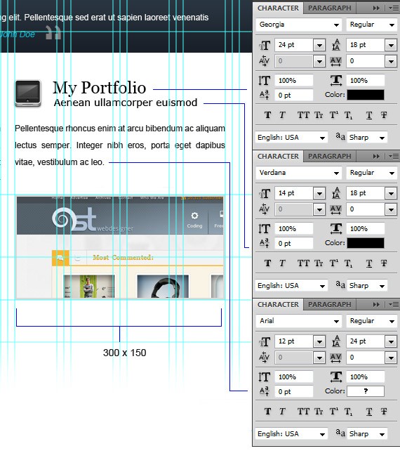
My Portfolio Create a folder and name it to my_portfolio, put all your portfolio related layers there. Select Text Tool(T):
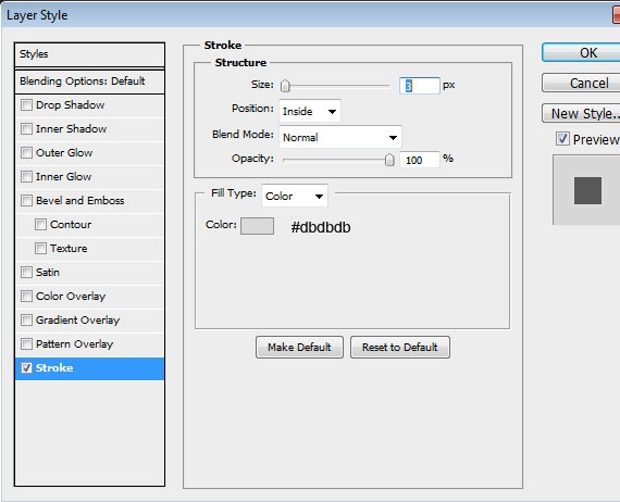
Apply this Blending Option to the image. Stroke
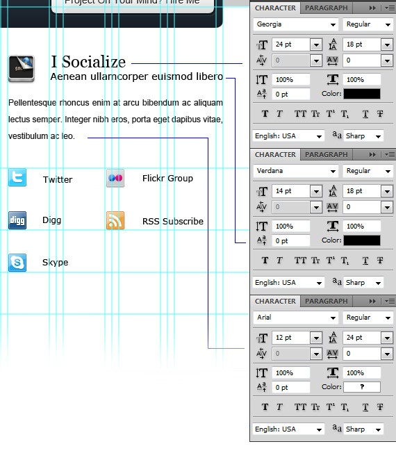
I Socialize Create a folder and name it to i_socialize, put all your I Socialize related layers there. Open up social icons and place it as shown in the screen shot. Select Text Tool(T):
Now were done in our main area lets proceed to footer. Step 10: Working with Footer(Quick Links, Latest From The Blog, Contact Me)
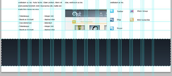
Create a folder and name it to footer, put all your footer related layers there. Go to View > New Guide. Set it to 965px Horizontal. Repeat the step. Set it to 1158px Horizontal Select Rectangular Marquee Tool(M), make a selection as shown in the screen shot and fill it with any color.
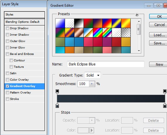
Add this Blending Option: Gradient Overlay
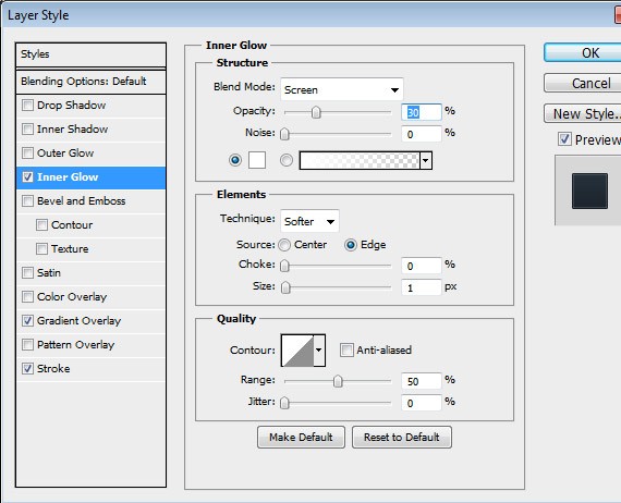
Make a selection in to the remaining white space. Add this Blending Option: Inner Glow
Gradient Overlay
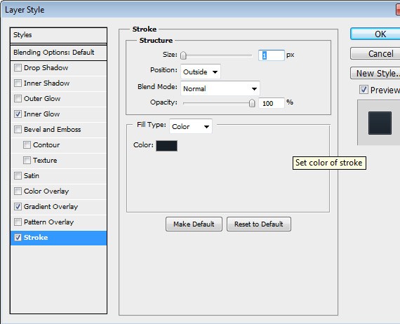
Stroke
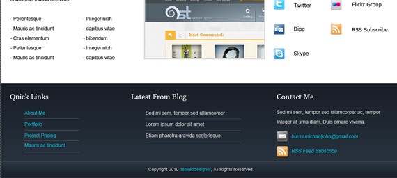
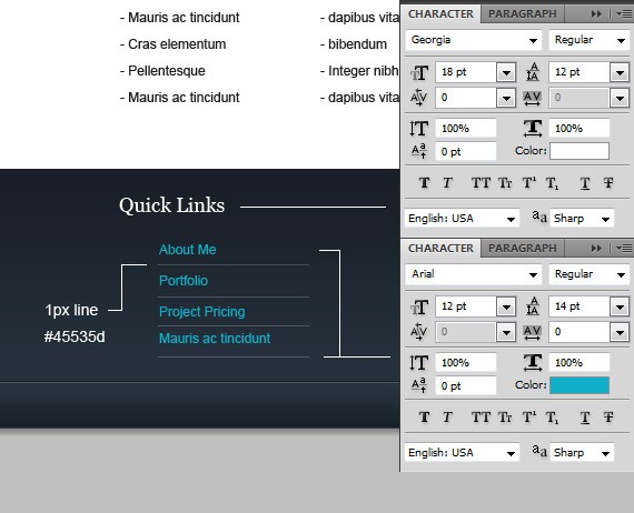
Quick Links Create another folder inside footer and name it to Quick Links. Select Text Tool(T)
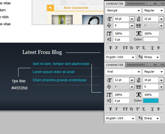
Latest From The Blog Create another folder inside footer and name it to Latest_blog Select Text Tool(T):
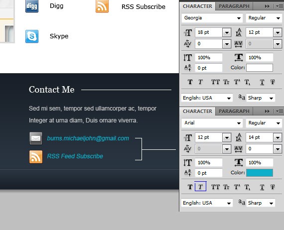
Contact Me Create another folder inside footer and name it to Contact_me Open up social media icons and grab an icon for email and rss. Select Text Tool(T):
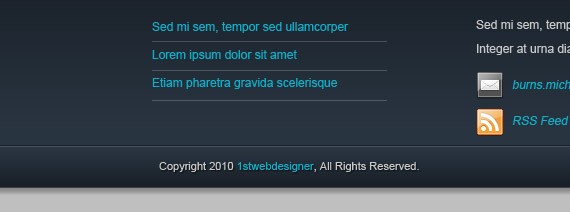
The last thing to do is add up your Copyright. Select Text Tool(T). Arial 11pt
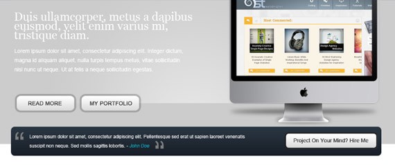
Finally were done! Hope you learn something on this tutorial and hope you like it. If you have Final PreviewBy the way in few days you’ll see also PSD TO HTML tutorial to this design – so keep up, design this template so you can immediately code it into live design!! |
| You are subscribed to email updates from 1stwebdesigner - Graphic and Web Design Blog To stop receiving these emails, you may unsubscribe now. | Email delivery powered by Google |
| Google Inc., 20 West Kinzie, Chicago IL USA 60610 | |




Comments (0)
Post a Comment