Fashion is a cultural phenomena and a means of personal expression. It has been around for ages and is undeniably a big phenomena. It is important to those that follow fashion trends, and for many people fashion is an integral part of their life and identity. Getting into the hostile world of high fashion is a great achievement for those that are passionate about it as the industry is undying and it gets bigger by the minute. That’s why it has decided to take over the world wide web as well.
When it comes to fashion, everyone’s a critic. “High-fashion” means taking things over-the-edge. Seeing designs in an unusual or unique way that would actually gain signature. Sometimes, high-fashion could also mean ” going totally whacko” – Just like the ever notorious fashion icon, Lady Gaga. But of course, a high-fashion website can be played well with great Photography and cutting-edge web designs. In this article, I will be gladly sharing what websites are highly fashionable and edgy enough to get fashionistas’ attention.
A very minimal design, this website focuses its marketing strategy by using a large photo background. Showcasing the product with a beautiful model.

This design is calm and features vivid buttons to navigate. If you hit the play button in the middle a video showcases the eccentric concepts like a fashion show.
Another simple design, using a white background with nice photography. The photos don’t distract from the concept of the design. Easy navigation lets shoppers navigate their way around the site without a problem.
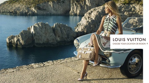
One of the most expensive brands in the whole world has lived up to fashionistas’ expectations. The website offers a clear page with a huge photo background. Hover on the Logo banner, and you can choose from a selection of countries. When you get to the country specific page, the navigation is easy and vivid. There’s even a little bit of history about how this huge brand started.
Many high-fashion websites show the most edgy and beautiful shots of their newest designs on models. These sites could easily catch fashionistas’ attention.

This website uses simple typography combined with bold & edgy images. This website gives the shoppers fast & easy navigation.
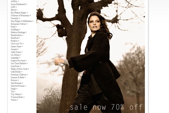
Net-A-Porter gives a good jump-start showcasing the newest trends and designs. Minimalist design with no eye strain.
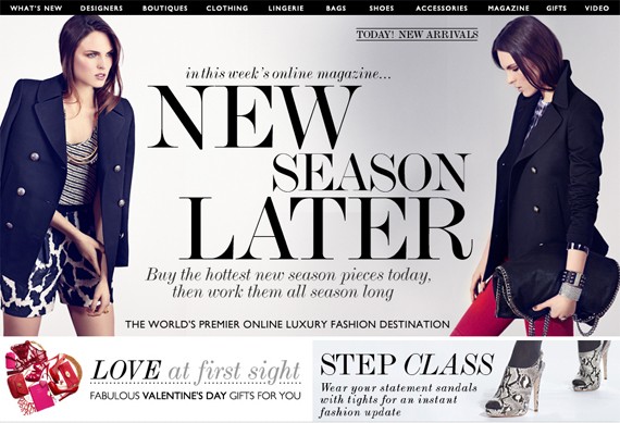
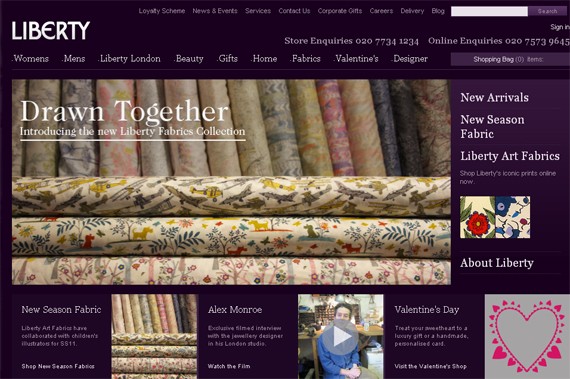
Other fashion websites use all-white or all-black on the wallpapers, Liberty.co.uk uses a very bold shade of purple, with medium-sized screenshots in the middle. The thumbnails on the bottom are just enough to lure shoppers.
An amazing example of functionality and minimal design. This website gives you a fashion show slide show for a background, and on the bottom are thumbnails categorized according to design.
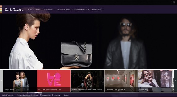
A nice clean layout with a unique video concept. This website is both edgy and high-fashion.
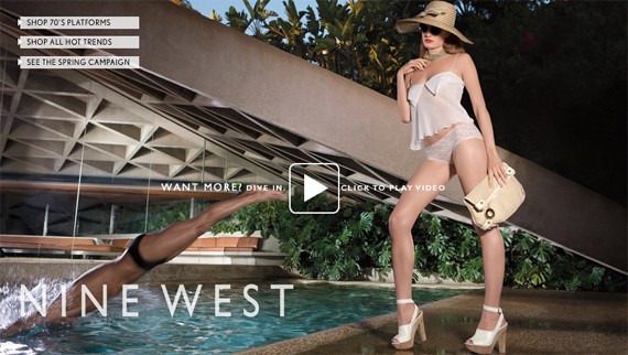
Using a catchy phrase is how this website design makes its mark on fashion. Using a bold red color, with shades of black and white.
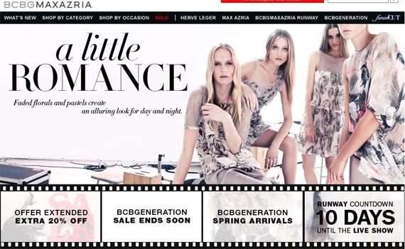
Keeping it plain and simple with an all black background and an artistic photo in the middle, this website just says high-fashion.
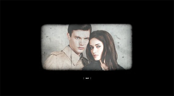
A color combination of softer color tones adds a feminine touch. Minimal typography,vivid layout and simple navigation make it welcoming.
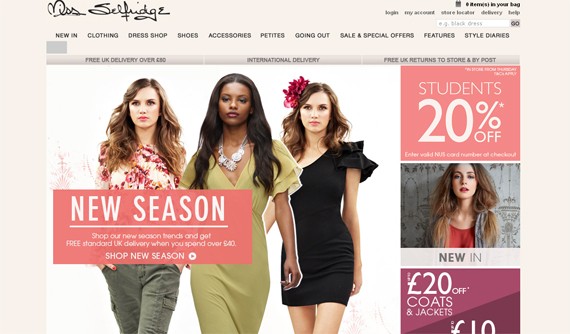
A very feminine background, minimal typography and a simple layout. It makes it easy for shoppers to navigate with vivid buttons in black and white fonts.
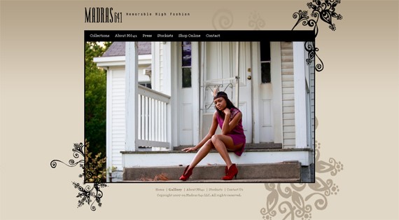
Making a statement that simplicity is indeed beautiful. This website design goes clean with an all-white background and dark-blue fonts.

The website lives up to the edgy and beautiful designer clothes it sells. With amazing flash effects, if you click on a design you’re treated to an awesome group of pop-out photos.
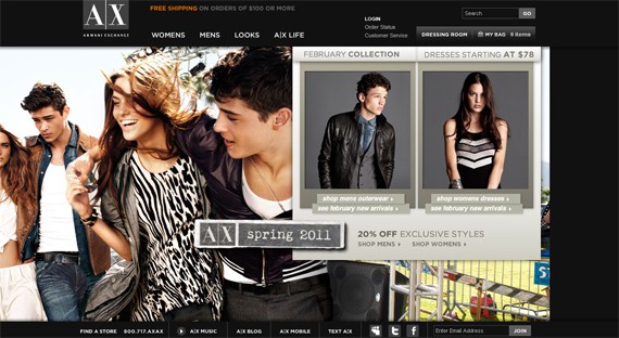
Displaying a wide array of artistic and beautiful pictures combined with minimal typography and buttons. This website takes a different, but edgy, approach.
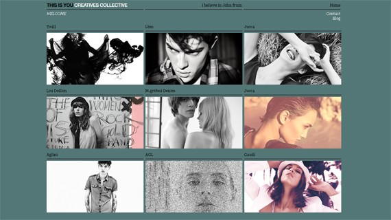
Simple, yet it has a major impact! This design makes it look like a page from a magazine.
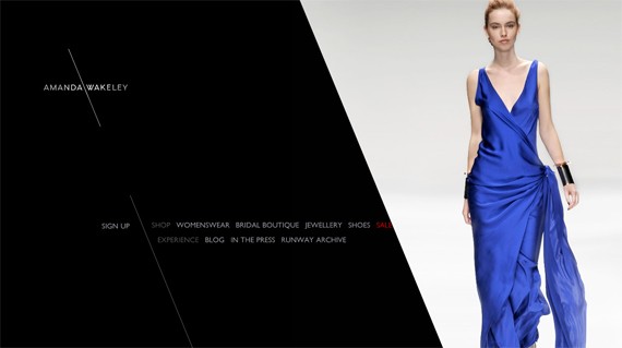
Composed of hand-drawn images and big fonts, this Norwegian clothes line showcases their dark fashion and love of graphic design. Amazing concept all around. Shoppers can zoom in on the fashions they like.
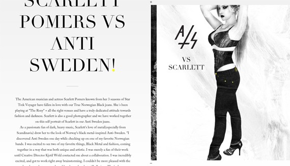
Very impressive layout and the background is very conceptual. It’s a teaser that encourages the viewer to explore the site further.
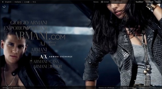
Going for bolder and stronger color tones with side buttons for better and easier navigation. This website is a major high-fashion page.
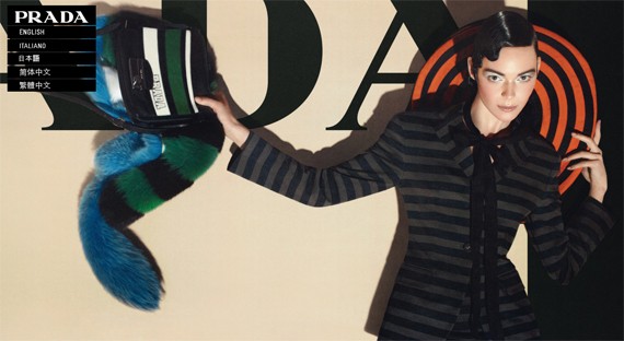
Although eccentric in design, there is still a minimalistic feel with just enough context to awe the viewers.
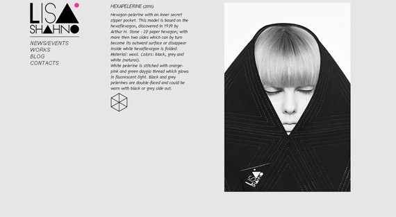
Great marketing strategy and amazing color combination, this site is aiming for real shoppers willing to buy their high-end bags, shoes and other amazing products.
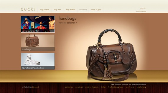
Warm color tones, great photographs and very bold fonts. This web design is very simple, yet edgy.
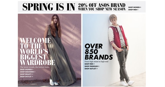
A good combination of black, red, gold & white. This website is also minimal in approach, while giving the shoppers a clear view on the buttons to navigate with ease.
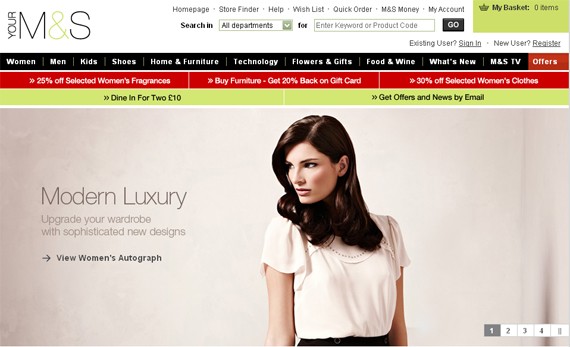
Because black is a very safe shade to match with any color, this color scheme works perfectly fine. The site has a soft touch because of the use of powder blue and carnation pink, not to mention a lovely huge photograph.
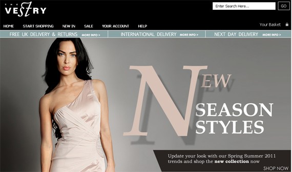
This layout makes it very easy to determine where the shoppers should click.

For this very minimal layout, the photos complete the look.

A great photo concept and easy navigation are used to lure and invite viewers to explore the site.
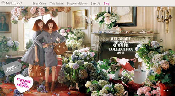
This website’s target is mainly e-commerce. However their teasers are amazingly high-fashion & trendy.
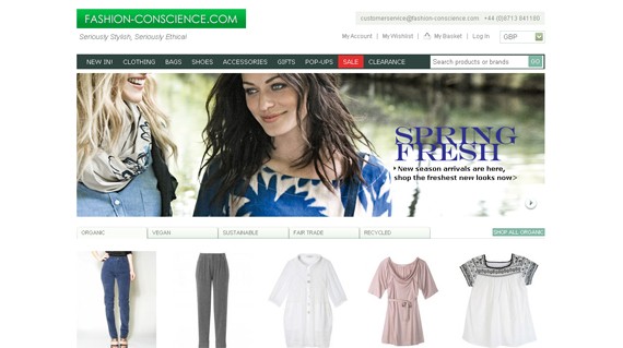
Another good example of minimal design with great categorization to make online shopping easier for fashionistas.
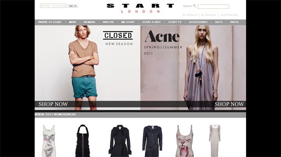
Using hand-written fonts and a large photograph for the background, this website is just catchy.
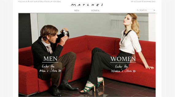
Selling high-end labels is made easy by using really good photographs and great arrangement.
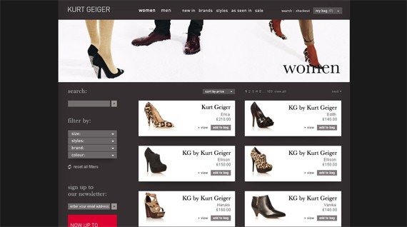
A very cool shade of blue used on the layout makes it nice to look at. The photographs add to the overall design, rather than distracting from it.
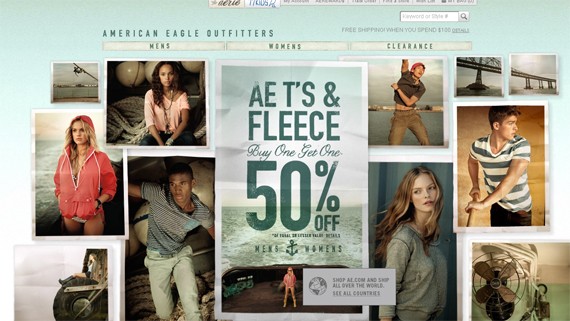
Using simple color schemes and minimal typography, this website is mostly articles on or about fashion and has some great photos.
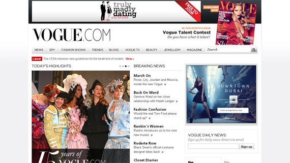
Very attractive color scheme and background makes this website very pleasant and inviting.
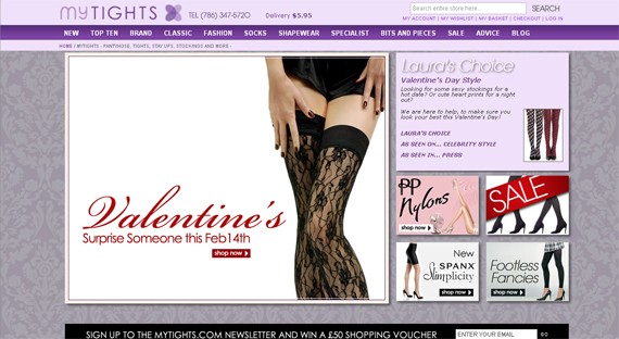
As elegant as their products are, this web design pulls it off with exquisite taste in color combination, fonts & layout. Not to mention, great photos of their high-end pieces.
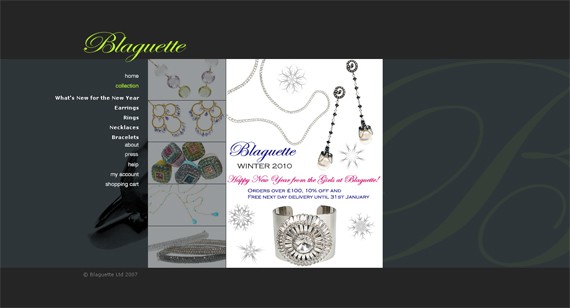
This site shows a mini fashion show on the website. It’s a very nice strategy to lure shoppers.
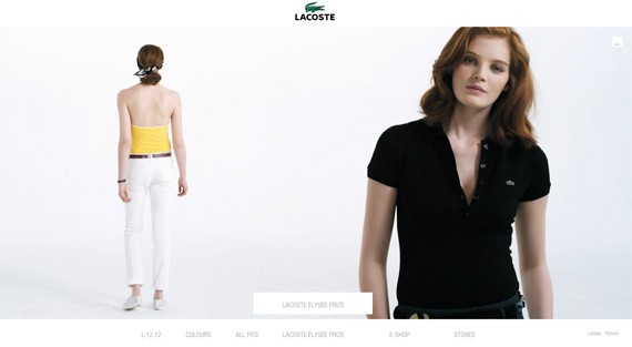
A very feminine color scheme and minimal in design makes it pleasing to the eye and easy to navigate.
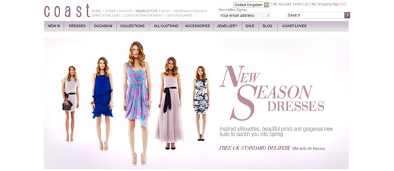
Another great combination of minimal design and great photography to improve e-commerce.
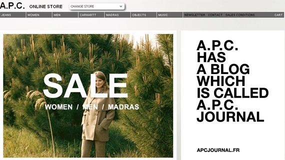
This site gets away with their detailed photos and eccentric banner by placing it all on a minimal background.
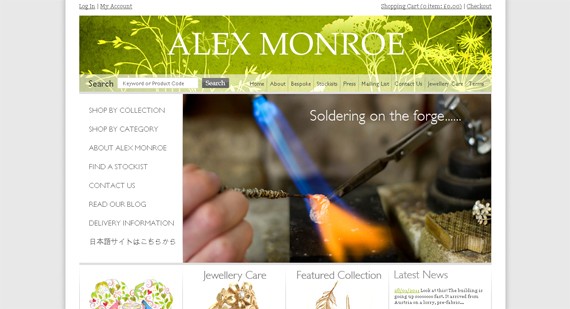
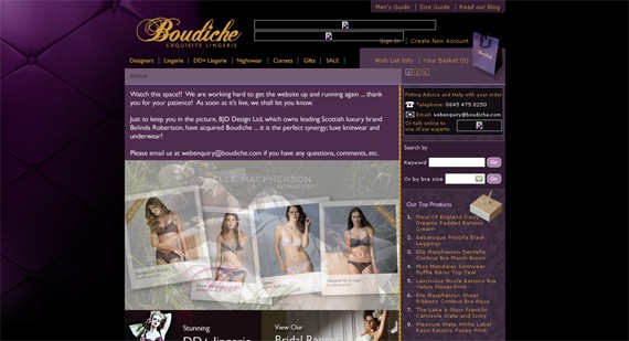
This lingerie line makes it sexy with a purple & black color combination. The images of sexy models adds a kick to the sexy layout.
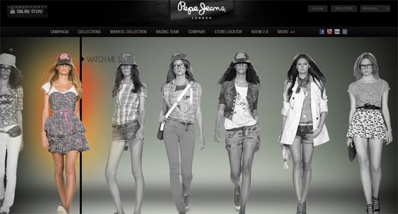
Very nice layout with an exceptional concept. Click on the model’s image and you can view a short video of them strutting their stuff on the runway.
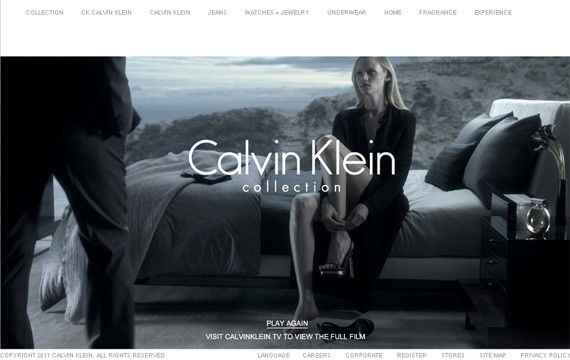
Another thing about high fashion websites, is that they use amazing photographs to tell a story. That way it makes it more realistic. Just like this web layout.
Modeled by the entrepreneur himself. Using music icons as models work great!
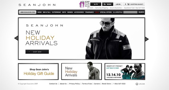
Great display of the products always gets the shop-a-holics.
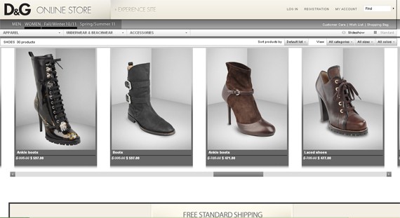
A simple layout with red, white & pink. Very feminine and classic.
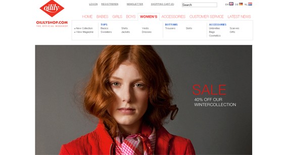
Victoria’s Secret is that they have really hot models. This website showcases their products with a boom.
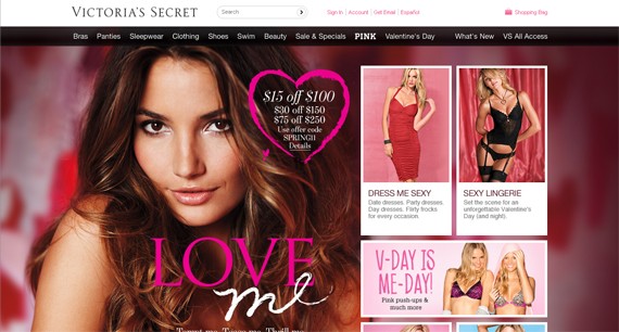
A simple layout with great photography. Very high-fashion.
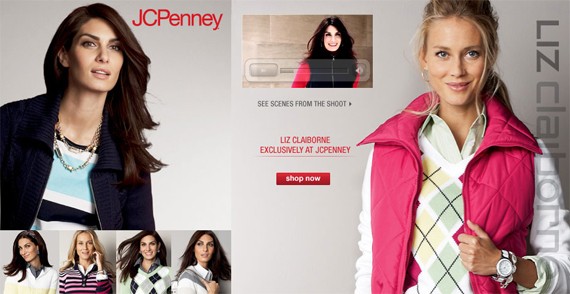
A great use of hand-written fonts and bold colors of red with shades of black & white.
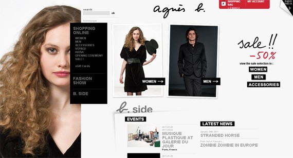
-Arranged in no particular order. These high-fashion websites make their products look pricier than they actually are. High fashion is about making a statement.




Comments (0)
Post a Comment