1stwebdesigner |
| Look Under The Hood: Photoshop Color Settings Posted: 14 Feb 2011 03:00 AM PST Color settings are often skipped by self taught Photoshop users and usually people can get away without any knowledge of them. So should you bother getting familiar with them? The real question is – how serious are you about your work? If the answer is anything else then "not at all", then any additional knowledge benefits you. Basic knowledge of the options here can make your life much easier at some points. Your designs will probably be displayed in multiple places in various shapes and forms, therefore you might want to make sure, that they look they way you intended them to look. The following article will give you a helping hand in achieving that goal.
Let me start off by telling you, that the purpose of this article is not to give you a long and probably boring explanation of all the options and their respective descriptions, but to give you enough knowledge so that you know what you’re doing. Let's begin with localizing the Color Profiles option. The following window should come up: The default settings most often look something like that. So let's go through with what is what in here. Working SpacesRGB You probably will have the sRGB IEC option set here by default. It's fine for consumer purposes, but does not give you a very rich color palette. It would be a good idea, especially for web designers and photographers to go with Adobe RGB (1998) which offers a wider color range as more colors is what we all want. Don't go panicking if you’ve been designing in sRGB, the difference is not that big, but this profile is created for the less expensive displays. Also – don't confuse the sRGB IEC with Monitor sRGB IEC , if you chose the second you might get varying results on different displays. A big number of desktop printers use RGB values when printing, not CMYK. So have that in mind as well. CMYK You will want to leave this option here at it's default place at U.S. Web Coated (SWOP) v2 . If you have the possibility of asking for the CMYK Color Settings file of the printer you will use, do so by all means. With that in mind just choose the "Load CMYK" option from the menu and you’re good to go. Gray / Spot
Color Management Policies
All the values here are the same for all three options, so let's see what they do. Off Preserve Embedded Profiles With this option on, you can have multiple files with different color profiles opened at the same time. Photoshop will treat every one of them separately. Convert *In color management, an ICC profile is a set of data that characterizes a color input or output device, or a color space, according to standards promulgated by the International Color Consortium (ICC)
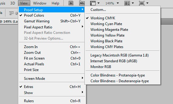
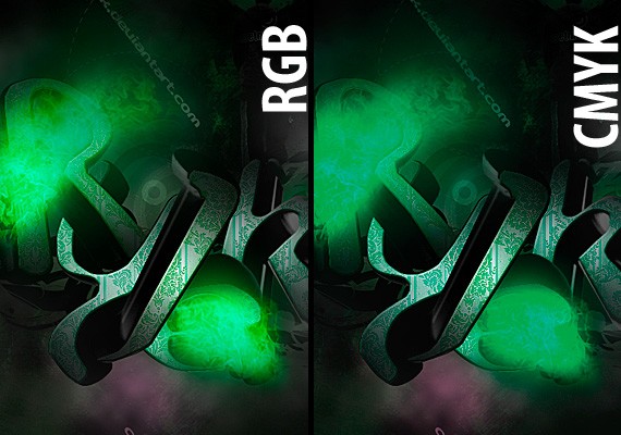
Conversion OptionsClick the "More Options" button. New fields will appear. Engine Intent Relative Colorimetric – takes only the colors which are out of gamut and converts them. All the remaining colors are left intact, which may result in some color changes on your design. Use Black Point Compensation Proof SetupProof setup goes hand in hand with Color Settings. You will find this option under View -> Proof Setup. It's purpose is to make your display simulate print or other Color Profiles. The hot key to turning it on and off is CTRL+Y. If your colors are strange, you might want to check if you accidentally didn't turn this feature on. If on the end of your file name there is a backslash with a Color Profile, then you have your culprit. In the Proof Setup menu you have different preview options. Working CMYK will simulate the CMYK values you chose in the Color Settings, so you have a quick preview of how your file will look like after print. Why just not convert the image to CMYK all together? Doing that will lock you out of some options and filters Photoshop has. So you sometimes might want to wait and convert from RGB to CMYK until later. The neighboring options do pretty much the same, but with one plate at a time. Mac / Win RGB here you can simulate a Mac or Windows display. Can come quite helpful when you’re designing for cross platform purposes. Custom - if you choose the custom option the following window appears. Here you can create an additional profile for the proof simulation. The first two options we went through before. Simulate Paper Color will do as it says – simulate the white shades of white of paper on the screen. Managing Color ProfilesCheck the files ICC Profile Assigning / Converting Color Profiles That’s basically it. Now you should have the basic understanding of how Color Settings work and how to manage them in your work. |
| You are subscribed to email updates from 1stwebdesigner - Graphic and Web Design Blog To stop receiving these emails, you may unsubscribe now. | Email delivery powered by Google |
| Google Inc., 20 West Kinzie, Chicago IL USA 60610 | |


Comments (0)
Post a Comment