1stwebdesigner |
| Graphic Design Examples Worldwide: How Nationality Reflects In Artworks Posted: 21 Feb 2011 02:00 AM PST Graphic design is a lot like languages. It’s an identity; beautiful and enigmatic. Graphic design varies from culture to culture, influenced by a country’s culture, history and way of life. Just like art and music, graphic design aesthetics differ from culture to culture. There may be common elements found in a culture’s graphic design, not found in other cultures and vice versa. We’re all very familiar with graphic design from the west, particularly in the US and UK. I will discuss and showcase graphic design from around the world, from the most interesting cultures: Latin America, China, Japan, Middle East, India and the Netherlands. Graphic design from these areas is a bit different, but still very aesthetically appealing.
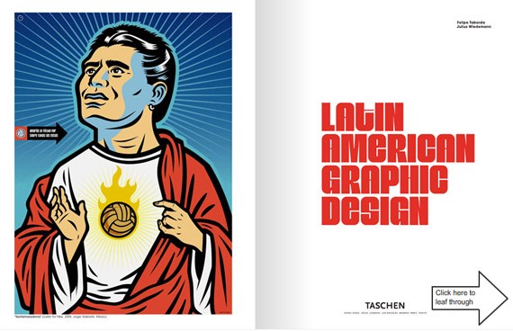
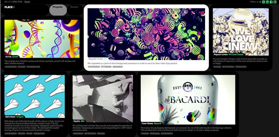
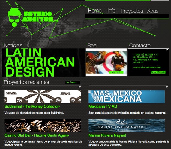
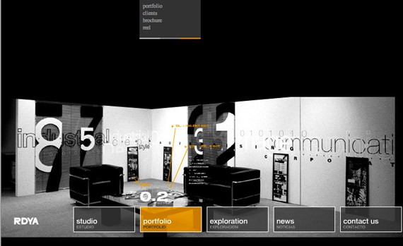
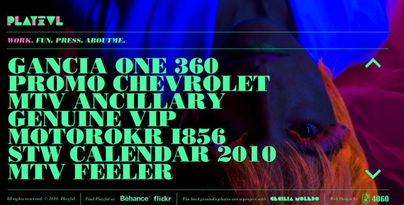
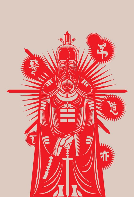
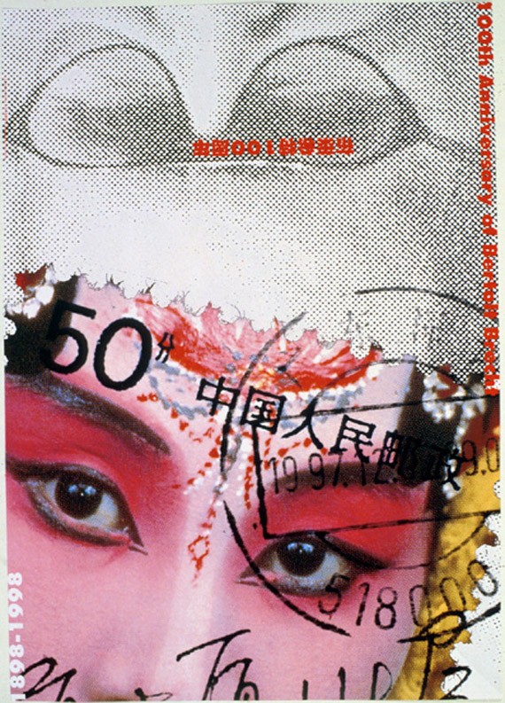
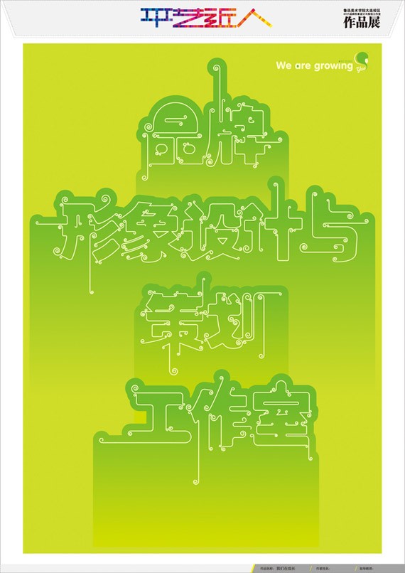
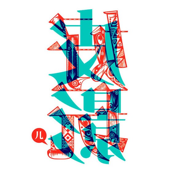
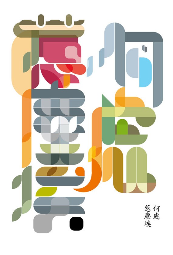
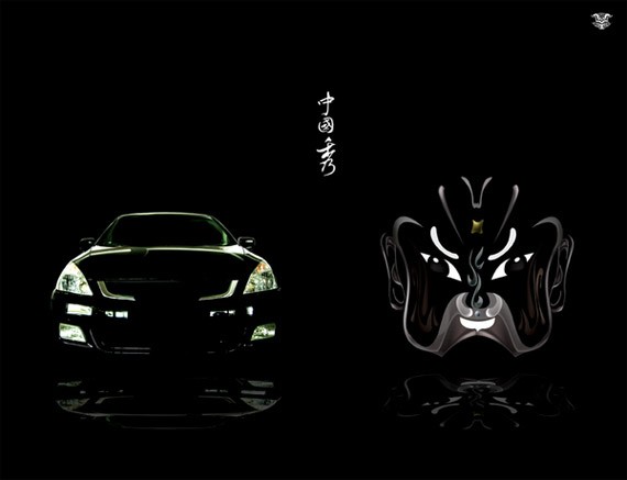
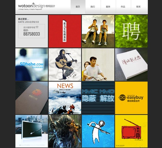
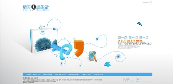
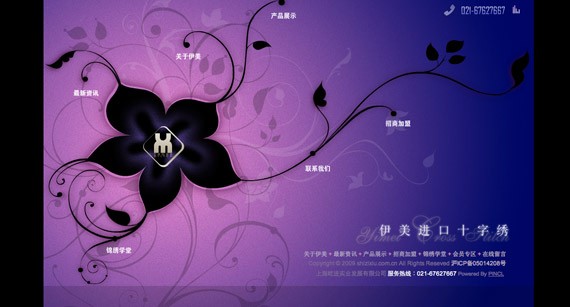
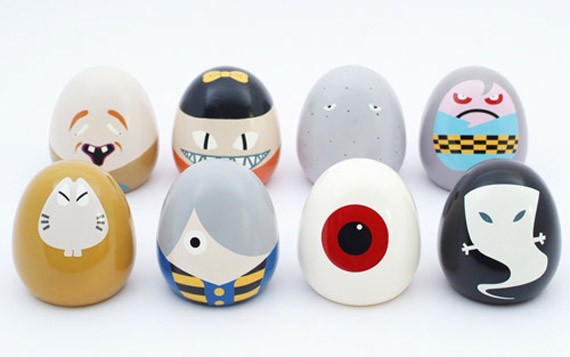
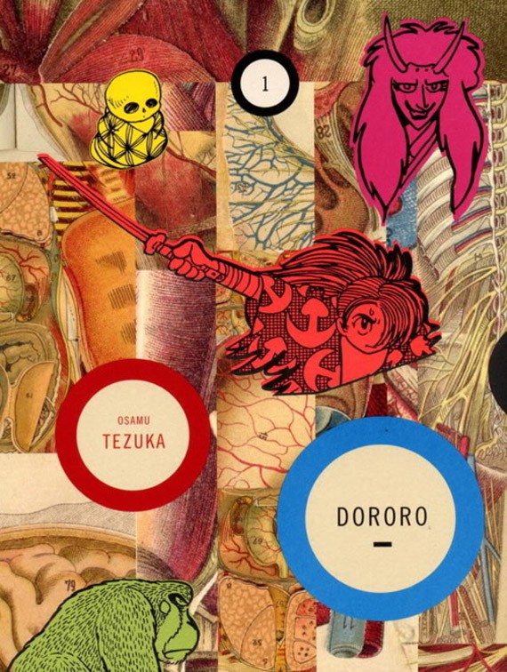
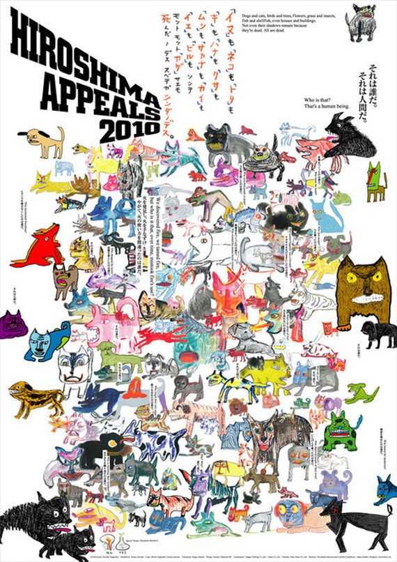
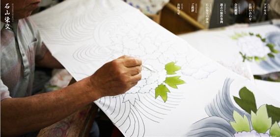
Latin AmericaLatin America is occupied with 500 million people, consisting of 20 Spanish-speaking countries save for Portuguese Brazil. Latin America has produced the most unusual and energetic form of graphic expression history has seen. Art is alive and well in the streets of Argentina, Ecuador and Brazil. Building exteriors filled with graffiti & stencil art. Latin American design is a reflection of the rampant street art scene: colorful, tantalizing, soulful, and a bit naive. Her art revolved around her surroundings and culture. It is diverse, given its hundreds of years of exploitative colonization from other countries. Latin America is one whole continent and stretches more than 21 million kilometers, but we see a common theme for all Latin American design: the latino’s love for life, dance and celebration. Most Latin American posters have evident pop art and art deco influences. It makes use of contrasting colors, wacky typography and energetic shapes. The latino’s piousness is evident with the use of religious themes and Roman Catholic symbols. Propaganda, nationalism and revolution are also common themes in Latin American graphic design (especially in the Caribbean islands). Impressive Latin American Web DesignLatin American graphic design shows the latino’s love for partying and celebration. Latino graphic designers are liberal when it comes to using bold colors and contrasting elements. Minimalism is also used, but mostly for web design–and it’s not as ‘minimal’ as it is in other places. The world can learn a lot from the Latin Americans; such as to take life less seriously and enjoy. They teach us to look at design not just visually, but with your six senses. ChinaChina is one of the oldest civilization, spanning at least 4,000 years. During its heyday, China was one of the most advanced societies in the world, but through imperialism and civil wars it began to decline. Still, China has a flourishing history of art, literature and culture. Chinese graphic design is fairly new as compared to the west. It wasn’t until recently, in 1979, that China reopened their doors to the world again, welcoming new ideas and the latest technologies. The country is making a slow but sure move to democratic ways, becoming more liberal with new ideas, especially in art and design. China is surging with creative energy with a strong sense of nationalism (if not a bit xenophobic), so it’s no surprise that modern graphic design still employs the same design elements found in traditional Chinese art. Graphic design in China was used as an effective means of illegal political expression. It was a vehicle for self-identity and self-expression. Wonderful Chinese Web DesignChinese web design is addicted to using Flash. Web sites from China are highly interactive and playful. Some elements in graphic design are copied from other cultures. In the recent decade, Chinese graphic design is heavily influenced by the west, but still retains its own Chinese drive and soul. For example, design makes use of feng shui symbols, calligraphy, cultural festivities, etc. JapanJapanese contemporary art takes many forms: architecture, advertising, video games, anime and graphic design. Japan’s influence in art is immense, contributing many ideas in graphic design and modern art in general. Japanese graphic design is urban and offbeat. They show an affinity for neon colors, simulating the lights we see in downtown Tokyo at night. Japanese graphic design has heavy influences from Japanese traditional art and manga.
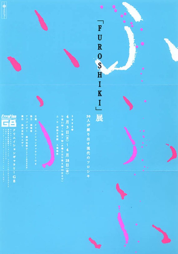
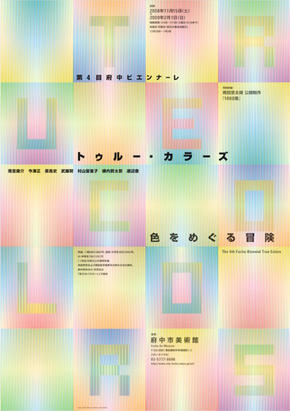
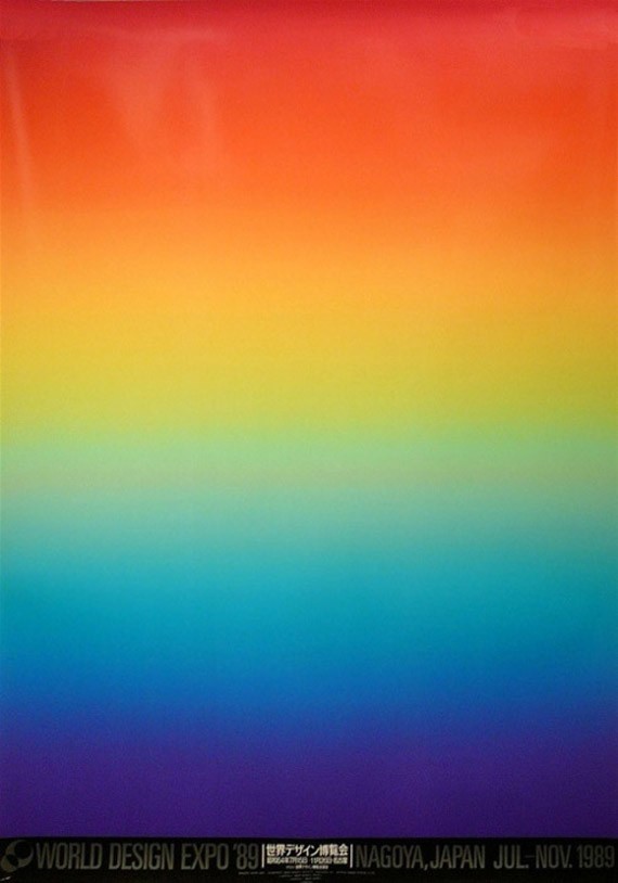
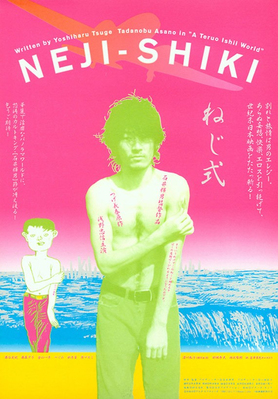
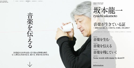
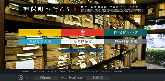
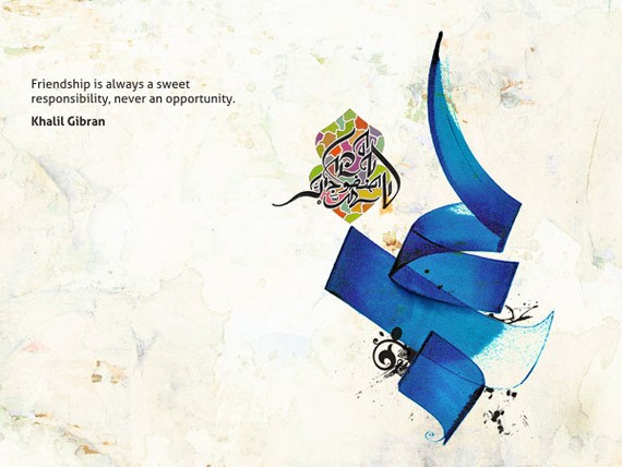
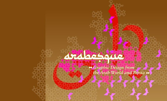
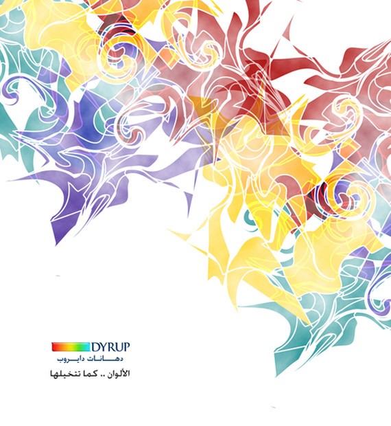
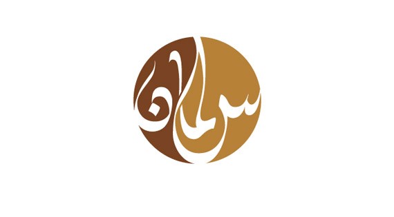
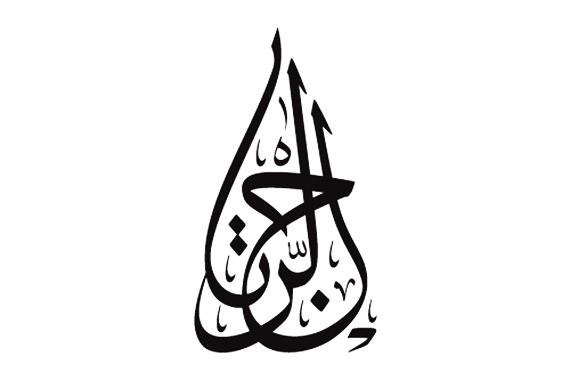
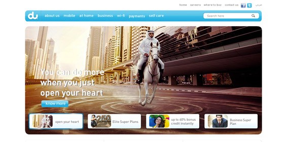
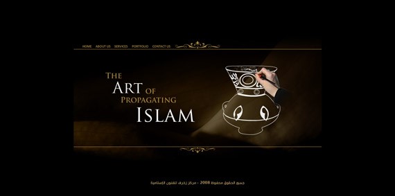
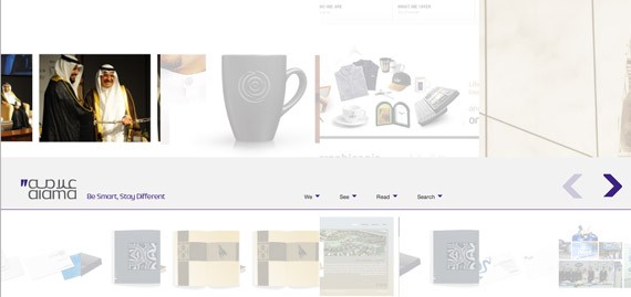
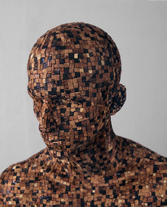
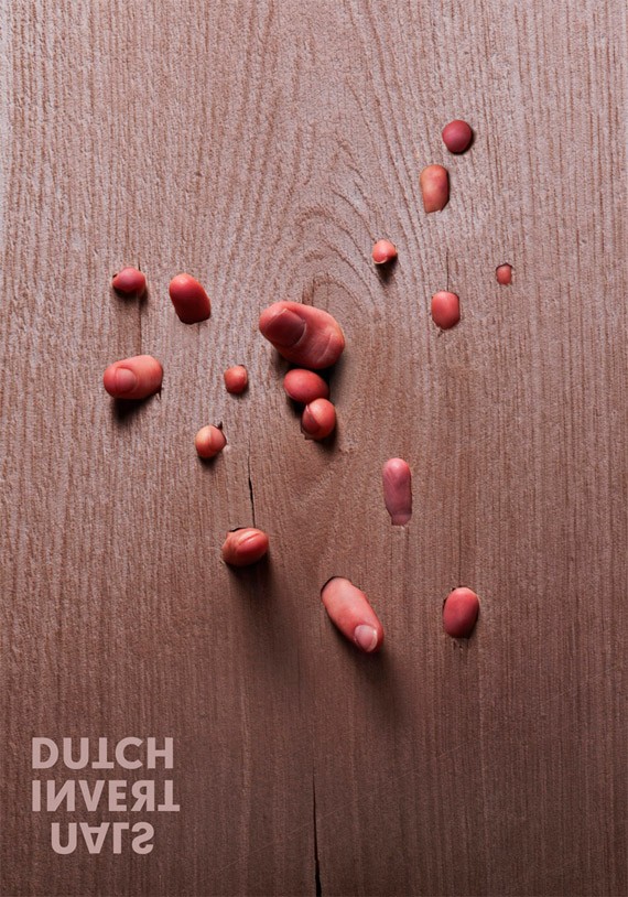
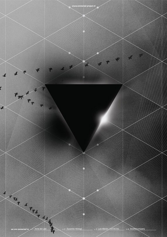
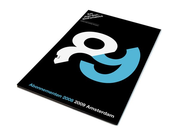
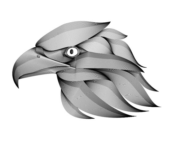
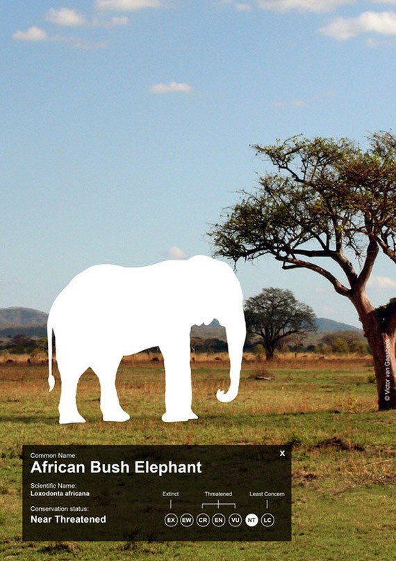
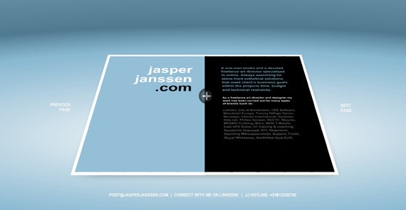
Brilliant Japanese Web DesignJapanese graphic design is interesting because it’s radically different from what we are used to in the west. It’s extremely varied, and an infusion between the old and the new. On one side of the spectrum, it’s sleek, futuristic and very minimal. But on another, it is super cute, childish and wacky. Middle EastThe Middle East is seen by the west as mysterious, alluring and mystifying: it’s the land of sands, flying carpets and magic lamps, the kind most of us will only visit in our dreams. The Middle East is a paradox–this culture is wealthy with some of the oldest and most extensive art in history, boasting thousands of years of art. However, graphic design in the Middle East is still pretty recent. It’s still a struggle for the Arab world: freelancing is not a good way to earn a living here, the government is not very cooperative and there are only a few graphic design schools around. Middle East graphic design is just as alluring and mystifying. It is strongly influenced by old calligraphy and arabesque, or the repetition of forms and patterns. The Middle East has slowly opened themselves to the western culture of consumerism. The Arabs love their gold–and this affinity can be evident in design.  Just like the whole world, the Middle East world has also caught on the minimalist bug, but still maintains the Middle Eastern vibe we’re all familiar with. Superb Middle Eastern Web DesignMiddle Eastern design is rich in color and culture. Like other Asian countries, the Middle East prides herself in beautiful symbols and calligraphy.In some aspects, the region is still conservative in many matters. For example, they need to open themselves to the idea of freelancing, female graphic designers, etc. Nevertheless, the region is a hot-pot of new and intermixing ideas. They have adopted many Western ideas on design, but retain the identity that makes them distinct. NetherlandsThe Netherlands is a Dutch speaking country located in the Northwest of Europe, bordering Belgium to the south and Germany to the east. The Netherlands is a tiny country, but is home to the greatest artists in history: Rembrandt, van Gogh, van Eyck, Mondrian and van Doesburg. Dutch graphic design tend to be individualistic, if not anarchic. They prefer clean, minimalist designs–this is where the De Stijl movement, precursor of the Minimalist movement, started after all. The Dutch are inclined towards conceptual art and contemporary themes. Simplicity is appreciated, and ‘undesign’ is a common design strategy here. Dutch designers often design conceptually. One of my favorites is the young Dutch graphic designer Victor van Gaasbeek, whose designs are typically Dutch, modern but make use of nature and natural elements. Great Dutch Web DesignThe Netherlands and her neighboring countries create the trend when it comes to graphic and web design. Their art is clean, conceptual and smart. It doesn’t mean that it’s all serious and minimalist though–Dutch design can also be playful. Maybe because of the government’s huge financial support for the arts, or the country’s prosperous economy, or probably the local’s passion for the arts, Dutch graphic design is among the most advanced in the world. ConclusionBecause different cultures have a different history and story, we have different experiences, beliefs and customs. We see the world from a slightly different angle. Graphic Designers from around the world have their own approaches to art. Despite that, one thing is certain: good design will always be good design. Even if we don’t understand the meaning, symbol and calligraphy being used, we can distinguish good from bad design. Appreciating art goes beyond cultural and geographical lines; and its more than a summation of our culture and beliefs. Appreciating design is an international and universal feeling, felt by all despite our color, skin or race. |
| You are subscribed to email updates from 1stwebdesigner - Graphic and Web Design Blog To stop receiving these emails, you may unsubscribe now. | Email delivery powered by Google |
| Google Inc., 20 West Kinzie, Chicago IL USA 60610 | |


















Comments (0)
Post a Comment