1stwebdesigner

Posted by | Posted on 18:51

1stwebdesigner


Dezign Folio: Create A Detailed Portfolio Homepage Design In Photoshop

Posted: 02 Feb 2011 02:00 AM PST

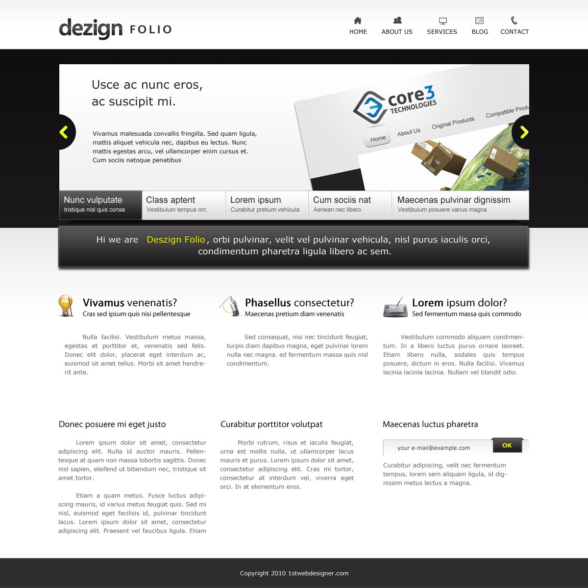
In this tutorial you will learn how to create a Portfolio homepage design with a unique slide show and welcome message design. Also choosing great resources around the web to make our design more cooler. I Hope that you can go through in this tutorial and learn a few techniques.

Resources you will need to complete this tutorial:

Here is what we will making, click on image for full preview:

Step1: Working with Site Structure

Before we get started download first 960grid system for easy Guideline creation.

Open 960_download\templates\photoshop\960_grid_12_col.psd

We also need to make sure that our Rulers and Guides are viewed. By pressing

  • CTRL + R (View Rulers)
  • CTRL + ; (View Guides)

CTRL + SHIFT + C to change the canvas size.

Using the Paint Bucket Tool(G) fill the background layer to #242b30

Now you need to create a folders. Here is the folders that we will use in order to be organized.

Step2: Working with Header

Make sure that you have downloaded all the resources. Create a new layer inside the header folder and nae it toe header_bg (Make sure that you have finished creating the folders as said earlier). Now create a new Guideline to do this go to View > New Guide, set the value to 100px and set the Orientation to Horizontal.

Select Rectangular Marquee Tool(M), make a selection as shown in the screen shot below. Now set the foreground #f4f4f4, background #ffffff. Select Linear Gradient drag it by starting at the top down to the middle of the section .

Logo

Still we were working on the Header folder, create a new folder and name it to Logo. Make sure you installed the Vegur font that you have downloaded. Follow the text formatting as shown in the screen shot below.

Add this Blending Option

Drop Shadow

Gradient Overlay

Color Used

  • #191919
  • #505050
  • #202020

Apply this styles to both texts

Navigation

Create a new folder and name it to Navigation. We will be putting our navigation links and place each icons “108 Mono Icons by Tutorial9″ for its desired link , so grab text tool and place it as shown in the screen shot below.

Add this Blending Option to the Icons

Let see what we have on this step. First we created our header background adding up our Logo using the Veguar font we style it by the power of Blending Options, here we can style it uniquely. Next we added our Navigation menu using simple text and Icons from Tutorial9. Thats it for our Header section.

Step3: Working with Slideshow

Preview of what we will making

Let’s work on first with the dark background. Create a new layer inside the Slideshow folder and name it slide_bg. Next create a new guide Value to 465px, Orientation to Horizontal. Make a selection starting below our header down to the guideline. Now select Linear Gradient, set the Foreground to #0f0e0f and Background to #1a181a start dragging from the top down to the bottom of the selection.

Create a new layer and name it slideshow_holder. Next create a new guideline as shown in the screen shot below. Select Rectangle Marquee Tool(M) make a rectangle at the center of the guideline and fill it with white.

Add this Blending Option

Inner Glow

Gradient Overlay

Color Used

  • #ffffff
  • #f0f0f0

Stroke

Now we will delete some area in our slieshow_holder to place our Next and Previous buttons. Select Elliptical Marquee Tool(M) and make a selection as shown in the screen shot below. Do this in both sides.

Next and Previous Buttons

Create a new folder and name it to Arrow. Select Rounded Rectangle Tool, radius to 10px and follow the screen shot as shown below.

Place this icons both sides.

Add this Blending Option

Gradient Overlay

  • #d7ff00
  • #d7ff00
  • #fff600


Now add up some text with the font choice of yours and also grab some image for the slide show.

Tabs

Create a new folder and name it Tabs. For the background of the tabs select Rectangular Marquee Tool(M), place it as shown in screen shot below and fill it with white.

Add this Blending Option

Gradient Overlay

  • #ffffff
  • #dcdcdc

Stroke

  • #b8b8b8

Inside the Tabs folder create another folder and name it to hover. Select Rectangular Marquee Tool(M), place it as shown in the screen shot below and fill it with black.

Add this Blending Option

Inner Glow

Gradient Overlay

  • #191919
  • #5d5d5d

Stroke

  • #2d2d2d

Select Text Tool(T) and add this text formatting.

Create another folder and name it to Normal, Select Text Tool(T) and add up texts with the same formatting. Also I added a Divider. Follow the screen shot as shown below.

Let see what we have on this step. We started our slide show by doing first its background follow by the holder of the entire slide show. Next thing we have done is putting up some text and image to contain the slide, then we added Tabs a design for active/hover and the other is styled in a normal state.

Welcome Message

Still were in the slide show folder. Create another folder and name it message. Now select Rectangle Tool(U), place the shape as shown in the screen shot below.

Add this Blending Option

Drop Shadow

Inner Glow

Gradient Overlay

  • #191919
  • #585757

Stroke

  • #2c2c2c

Notice in the Preview of the Welcome Message it looks like it is hanging, so to do that select Pen Tool(P) and create a shape both sides as shown in the screen shot below.

Make a selection of it. Set the Foreground to 0a090a, Background to #1b1b1b. Select Linear Gradient and start dragging from the top down to the bottom of the selection.

Add this Blending Option

Stroke

  • #100f10

You may have something that looks like this

Now were going to add the message, so select the Text Tool(T) and put up you message with the same formatting as shown in the screen shot below.


In this step we styled the welcome message to make it looks like its hanging on the design. With the help of the dark background and Drop Shadow we achieve this hanging effect. Also we styled our text to make it looks like beveled effect by duplicating the text place it at the back of original, make the text darker and move it up once by the use of the arrow key.

Step4: Working with Services

Preview of what we will making

In the Services folder create another folder and name it to Service1. Open up “This Is Art2″ and select some icons that is appropriate to each services. Now select Text Tool(T), follow the placement and the formatting as shown in the screen shot bellow.

When you’re done duplicate it 2 times then change it texts and icons. Now were going to add a background to our services section to make it more nicer. Select Rectangular Marquee Tool(M), make a selection as shown in the screen shot below. Select Linear Gradient, set the Foreground to #f4f4f4 and Background to #ffffff, start dragging from top down to bottom of the selection.

In this step we simply grab some nice Icons, style our text with a proper font, font size, colors and by the use of proper alignment of texts.

Step5: Working with Information

Preview of what we will making

In the Information folder create a layer and name it to background. Select Rectangular Marquee Tool(M), make a shape and fill it with #eaeaea

Add this Blending Option

Inner Glow

Stroke

  • #e0dfdf

Now were going to add the site Information. Select Text Tool(T), follow the formatting and place it as shown in the screen shot below.


Create another folder and name it RSS Subscribe. Select Rectangle Tool(U), create a shape color to #b7b7b7 as shown in the screen shot.

Duplicate the shape. By the use of arrow key move it 1px to the right and 1px to the bottom.

Add this Blending Option

Gradient Overlay

  • #eeeeee
  • #ffffff

You may have something that looks like this

Select Rectangle Tool(U), create a shape and place it as shown in the screen shot.

Add this Blending Option

Drop Shadow

Inner Glow

Gradient Overlay

  • #191919
  • #585757

Stroke

  • #2d2d2d


In this step we just copy the text formatting of what we have done on our services area. Also we create an RSS Subscribe area where we style the subscribe button looks like it is hanging the same as we did to our Welcome Message

Step5: Working with Footer

Select Footer folder and create a layer name it foot_bg. Using Rectangular Marquee Too(M) cover all the remaining white space below the information area and fill it with #1d1d1d.

Add this Blending Option

Inner Glow

Stroke

  • #2d2d2d

To finish the design add up your copyright text using Text Tool(T).

Conclusion:

I really hope that you follow and learn something from this tutorial for your future projects. If there are some steps that you didn’t understand feel free to ask some question below. Also if you like this tutorial please share it to your friends and don’t forget to subscribe to our news letter. Have a great day!.


WebResourcesDepot

Posted by | Posted on 13:34

WebResourcesDepot


Amazing Multi-User File Manager – FileVista (Giveaway Of 5 Licenses)

Posted: 01 Feb 2011 10:57 PM PST

FileVista, an impressive file manager application that can be installed on your websites, is giving away 5 x "5 Users License" ($199/each) to WRD readers.

Details on joining the giveaway is mentioned at the bottom of the post. But before that:

What is FileVista?

It is a feature-rich file manager application that works on your browser and offers a desktop-like working experience (even more) for your web files.

The application is built with ASP.NET (works on Windows servers), has a free "single user" version and more users require a license.

FileVista supports every action that can be expected from a file manager like create, delete, rename, copy, move, zip and unzip files + folders

FileVista

Actions can be accomplished very quickly as the interface is completely Ajaxed and a context menu (right-click) has shortcuts to everything.

It has a very powerful, permission-based access control system which gives the administrator full control over the contents with features like:

  • creating groups and users
  • locking users/groups into folders with desired rights (user's actions, disk usage and allowed file types)
  • groups can have sub-administrators which can manage the users of that group

FileVista Uploader

Using the application, you can also create custom links to files, set them to be temporary and even password-protected (every file can have its own password).

The file uploader is so nice. It handles multiple file uploads, displays a real-time progress bar and can resume interrupted downloads (handy for large files).

FileVista is multilingual (supports 9 languages) and it is definitely a very useful resource for collaboratively managing + sharing files (a very good fit for interactive agencies).

How to join the giveaway?

It is pretty easy, simply comment to this post and/or tweet this article with hashtag #wrdfilevista (click to tweet easily). You can do both to increase the chances.

Winners will be selected randomly on 9 February 2011 (1 week later).

Good luck to everyone.

Special Downloads:
Ajaxed Add-To-Basket Scenarios With jQuery And PHP
Free Admin Template For Web Applications
jQuery Dynamic Drag’n Drop
ScheduledTweets

Advertisements:
Professional XHTML Admin Template ($15 Discount With The Code: WRD.)
Psd to Xhtml
SSLmatic – Cheap SSL Certificates (from $19.99/year)


1stwebdesigner

Posted by | Posted on 18:24

1stwebdesigner


What Everyone Ought to Know about Initial Client Meeting

Posted: 01 Feb 2011 02:00 AM PST

In the glorious field of web design there are far too many prices, skillsets, levels of professionalism, and difference in deliverables for any client to really understand them all or even comprehend where to start. We live and work in a field that is ever-changing and as hard as it is for us to keep up with technology, clients can’t possibly be expected to. This post is going to be the start of a series on the entire process of building a website for a client. It will entail many phases from initial meeting to design mockups to development, testing, and launch. Within each of the articles there will be pertinent information for anyone in the freelance field whether you’re a full-timer or not. My simple goal is to provide information for each of you that will aid you in streamlining the process and help cut out some pitfalls along the way. I’d also like to ask for your feedback on each of the phases I’ll be outlining here. There is no “right way” to do things so give your thoughts and opinions, no holding back. Let’s get started.

You Get the Contact

We’re going to assume you have contact for a potential client and that’s where this article will start to help you out. And now that you have that contact, you’ll inevitably have to setup a meeting with them to discuss what they are looking for and what you can provide. There are some things to note here and keep in mind when meeting with the client that I believe are contrary to much of the “traditional” information out there.

  1. You’ve heard it said, “Say yes and figure out how to do it later.” That’s probably not the best idea in our industry as doing something like this will most likely either make the project not worth-while monetarily or cause you loss of money you most likely don’t have. There are instances where this will work, maybe something in HTML or CSS you don’t know how to do but have seen it done, but don’t jump into languages you don’t know an assume you can “get it done” or “figure it out.”
  2. Take the job no matter the budget. If you’re starting as a freelancer, you’ll most likely have to do some of these…but don’t get in the habit. Clients with no budget are usually one of two things. (a) They don’t want to pay a professional but expect professional work or (b) they “just want it done” no matter how it looks or functions. Either of these is just plain bad news. You will either have a client from (you know where) or it won’t even be portfolio worthy making it worthless to you in all senses.
  3. Your initial feeling of the client goes a long ways. It doesn’t take much time to get a vibe from someone and clients are no different. Don’t get swooned into doing work if you think at all the project is going to go poorly. Easier said than done, I know, especially when you need the money. But trust in your gut and pass on it if you have an uneasy feeling.
  4. You’re interviewing the client as well. Many people think that meeting with a client is so you can impress them and they’ll pick you as a choice over other freelancers or agencies. Remember that you’re interviewing to work with them as well. Take special note of the item above and don’t work with them if you don’t like their style.

So now that we have those tips in mind, lets talk about the process a bit. The initial meeting, as I said above, is an interview from the client to you…and from you to the client. Don’t let them have the upper-hand here as it will only set you up for failure down the road. They’ll think they can walk on you and you’ll end up being their photoshop puppet to get the job done.

Client Meeting Sharpie

Photo by Pigpogm

What To Take With You

If you’re meeting with the client on the phone or skype, just make sure you’ve looked at their site thoroughly and done some research on their industry. But if you’re meeting in person, there’s a very simple list of things you’ll need for the meeting.

  • Yourself in presentable form. Unless you just like suits, all you really have to do is wear something decent. But not a ragged t-shirt and jeans, unless maybe you know the client.
  • Sketchbook. I’ll go into more detail on this in a later article but this will get you some attention.
  • Marker. For sketching should you have an idea. Use a marker so you don’t get into details.
  • Pen. For taking notes…do not use it for sketching an idea
  • Business Cards

And that really should be it. I never take a computer unless the client tells me to specifically. This helps to establish that you are a creative and not just someone that knows how to work a computer design program. The sketchbook and marker are your best friends at this point of the process.

Client Meeting In Cafe Coffee

Photo by Stepheye

Get Acquainted

This is important, probably more so than even finding the needs for the project. You’ve got to have some sort of connection with the client and if you don’t, the project will feel stiff and you’ll have little passion for it. Now I realize there are people out there that will disagree with me when I say that we need to connect with our work and get involved and passionate about it. But I’d venture a guess that many people in the creative field, professionals that is, will agree with me here. If you don’t have fire about what you’re working on, you’re creative is stifled. You’ll have no desire, no passion, no connection. The creative field breaks all the traditional ties that many other fields have. We don’t wear suits, dress in Armani shoes, or carry a briefcase everywhere we go. I’ve found that I get more attention from clients when I walk in wearing street clothes (but be presentable) and have my sketchbook and marker in hand. They’re hiring you to be creative and I don’t wear a suit at my desk so I don’t wear one to meetings either.

I won’t say this will work for all clients, but small to medium sized businesses typically don’t care how you look as much as they care about how you work and how your work looks. And to be honest, if they’re going to judge me on my looks and not my character or skillet, I don’t want to work with them anyway. So with that said, keep it presentable, but be yourself and you’ll get more attention and they’re much more likely to remember you.

However you look and dress is becoming less important these days. Clients want someone they can trust. Someone that will be honest with them and will deliver when and what is promised. Ultimately, you have to convey that you are, in fact, the most capable and trustworthy person they’ve met with for the job. This is what getting acquainted is all about. It’s about connecting and seeing if you’re right for the client and if they’re right for you.

Brainstorm client needs

Photo by Andymangold

Figuring Out The Client Needs

I urge you to take notice of the above title…notice it says needs, not wants. We’re professionals here or at least striving to be so it is our job to tell the client what they need. Not all sites need a blog. Not all sites will require a link every social media site available. Not all sites will require social media at all. This is where you’re professionalism is to shine through. If you’re straightforward with the client, tell them your position on what you think would be best for them and what would work best for their users, you’ll get picked almost every time. And if you don’t, they are probably one of the clients we described above and you don’t want to work with them anyway.

The initial meeting is imperative to be able to establish the needs (and some wants) of the client. I’m not saying you can’t give them anything they want, but be reasonable…no dancing frogs on the homepage…unless they breed frogs or something strange like that. Talk with them about what they are trying to accomplish with their site. Below are some questions to keep in mind as you talk with them about their project.

  • Who do you think would be using this site the most and what information would they be after on it? The reason we ask who is simply because many clients use their sites more for internal use than giving to clients.
  • Do you know if your users are tech-savvy or more traditional? You can most likely tell this from the type of business they have, but it’s good to ask.
  • What is the main information you’d like to get across to the users on your site?
  • What are some sites you like within your industry and why?
  • What are some sites you like outside of your industry and why?
  • What’s your budget for the site? I’ll go into more detail on this below.

There’s plenty more questions that can be asked and can come up in discussion…these are just a few. You’ll learn over time that every client is different and you’ll have different questions for each one. I used to have a small packet of about 20 questions I asked all my clients. It helped to find out information from them that I would need. But as time went on, I realized that many of the questions wouldn’t apply to all clients and that the ones that applied to one client had no application to another. So needless to say, I scrapped it.

So take this time to really dig into the project with the client. Figure out their needs, write them down, and make notes of everything they say. They’ll remember what they like and want and you’ll be expected to as well.

Talk About the Dreaded “B” Word

Yes we all know that no one wants to talk about how much a site will cost. You’ll ask them for a budget and they’ll tell you they don’t have one or want you to give them a quote first. You can explain to them that in order for you to be able to tell them right now if you can do the job or not, you’ll need to know what they are expecting to spend. They have an idea somewhere in their head. If they still won’t tell you, drop it and do your quote as if they had an unlimited budget. At this point you’ve done all you can and if they come back on you saying it’s too much, then they already started out your relationship with a lie because they had an idea of the cost. Keep in mind that most companies work off budgets and if they don’t spend the entire budget allocated for something, they lose it at the end of the year.

I used to believe that you never gave a price up front for how much something will cost because it will lock you into that rate. But I’ve found that not to be true over time. For one, people will often pick you because you were the only one they talked to that had an idea of the cost. That shows you’ve got enough experience to tell them a ballpark figure. It also shows you’ve researched their industry a little bit (which you should do before the meeting) and understand a bit more than even what you’ve talked about in the meeting. With that said, it takes time to get your pricing down. So if you’re starting off as a freelancer, you may keep the price to yourself until the you’ve worked it out on paper and done the proposal.

Leaving Client Meeting - Tiremarks

Photo by Shaun Bascara

And You’re Off!

Now that you’ve had the initial meeting, gotten the vibe you want to work with the person, and (hopefully) established a budget, it’s time to move onto the next phase. It’s best to give them a timeframe of a few days for the proposal and then make sure you get it to them within that time. If you’re late, they may take it as a key factor for what will happen during the project.

So that’s all for now. We’ll touch on the topic of the proposal in the next article and incorporate some proposal software pros and cons as well. I sincerely encourage you to give your feedback and rip my article apart, but please be gentle. I’m not saying this is the only way to do things…but it works for me and my research has shown several points in here work for other people as well. Let’s get conversing!


WebResourcesDepot

Posted by | Posted on 13:32

WebResourcesDepot


Streamie – Open Source & Real-Time Twitter Client

Posted: 01 Feb 2011 10:03 AM PST

Streamie is a web-based, totally real-time and open source Twitter client which makes use of the latest web standards such as HTML5 and CSS3.

It has different menus for displaying mentions, direct messages, favorites or retweets. And, as expected, you can send tweets easily.

Streamie

A number of options help customizing the application like message filtering, display settings and enabling geolocation.

The application is fully Ajaxed + uses nodeJS, less.js, require.js and Socket.IO which can be a good way of getting experienced in these "getting popular" resources.

Special Downloads:
Ajaxed Add-To-Basket Scenarios With jQuery And PHP
Free Admin Template For Web Applications
jQuery Dynamic Drag’n Drop
ScheduledTweets

Advertisements:
Professional XHTML Admin Template ($15 Discount With The Code: WRD.)
Psd to Xhtml
SSLmatic – Cheap SSL Certificates (from $19.99/year)

An Original Icon Every Day – (ico)trip

Posted: 01 Feb 2011 02:30 AM PST

(ico)trip is a website which creates/shares a new icon and makes it downloadable as a .PNG file each day.

Rather than widely used icons, the project focuses on items that we may not find elsewhere.

Icotrip

Icons are mono-colored, in 126*94px size and they are all very detailed.

The website also has a RSS feed which you can subscribe to get the new icon every day.

Special Downloads:
Ajaxed Add-To-Basket Scenarios With jQuery And PHP
Free Admin Template For Web Applications
jQuery Dynamic Drag’n Drop
ScheduledTweets

Advertisements:
Professional XHTML Admin Template ($15 Discount With The Code: WRD.)
Psd to Xhtml
SSLmatic – Cheap SSL Certificates (from $19.99/year)


1stwebdesigner

Posted by | Posted on 18:37

1stwebdesigner


Art Direction Trend Coming To 1WD: Foundations And History

Posted: 30 Jan 2011 11:00 PM PST

Art Direction is here. The art of creating kick-ass blog posts with great content and super awesome unique designs.

ART Direction

1stwebdesigner

blogazine

A Brief History of Art Directed Blog Posts: A True Story

One day a master designer, whose name even time forgot what, was browsing through many blogs and news websites. He was doing only that for hours while suspecting that something is amiss. There were blogs with black backgrounds matched with orange font, colourful animated GIFs, marquees, and many things that shouldn't be there. He thought of magazines, of how effective medium they are on delivering information…but how can he possibly give a blog post a magazine feel? Bam! More advanced CSS came to existence.

Pros

Let me state the obvious:

  • existing articles can be reborn into an art directed post and it will look waaaaaay cooler.
  • It is a process of creation; you are free to express things you can't with traditional blog posts.
  • An art directed post, when done right, will bring tremen dous traffic to your website.
  • People will remember your website as something worth seeing again.
  • Art direction is simply genius!

Cons

If you did great on your first post then chances are people will expect more. I know that this shouldn't even be under negative effects but in the long run it might. People tend to easily notice the difference in quality, like a movie sequel, often you will read reviews going like "the first one was better, didn't like this sequel."

But before even publishing the material another drawback is the time it takes to produce one. Writing is just the third of it before the designing phase, which is very crucial to the success of the whole material, afterwards the coding ensues. No wonder people don't see many art directed posts, many haven't heard of it too.

Another negative quality is that you will be alienating your readers because of the modified layout on your website. First time or second time visitors might think they're at the wrong website.

Imagine there are two dishes laid before you, one very plain and the other is well decorated. Chances are people will not choose the plain dish because something better is presented. People are biased towards things that look good; it gives a sense of wonder and excitement. Designers today find something very lacking in every blog posts, the initial thought that enters the mind is "it can be better if…".
Let's admit it, pure text and some images here and there is STILL boring. The website's design has little, or none, to do with the attractiveness of every blog posts. Blocks of texts can give readers the feeling of boring. There's a world inside of every designer that wants to get out there and create things with freedom. Problem solved.

The Script and The Actor

A good script defines a good story but the portrayal of the actor is important to convey the message. As previously mentioned, the design in an art directed post helps give meaning to the whole thing, making it more enjoyable and more understandable. In this case the actor is the design and the script is the text. They should work together well or the whole thing will be in ruins.

Tofu vs. Ramen

The fight between an art-directed post and a traditional blog post is like the fight between Tofu and Ramen. We all know that both are delicious and very nutritious, but when appearance is among your criteria then ramen wins. Tofu is plain white while ramen is all-so-colorful. Naturally for most people they will choose ramen.

Both are nutritious, you can live for a week or months eating only them.

Many designers irk traditional blog posts because of its monotonous way of delivering information. Most went to the lengths of typography and beautiful headers and footers to attract their audience and it surely helps to attract people. But you know what's cooler? A page full-blown with "relevant" design!

What About the Formatting Rules?

Consistency, no all caps, font size, column width, and font type. Should you really abide by those rules? While it is good to follow the rules for optimum performance, it just doesn't work with art direction. YOU CAN TYPE IN ALL CAPS IF YOU WANT if that will contribute to the "feeling" of the design.

Summary: do what feels good.

What It Should Be

Art direction should feel good. If it doesn't feel right a revision is necessary until you get that feeling. The idea is to make people comfortable enough to go on scrolling down, to make them feel that their time is not wasted, that there is a sight to see and a trove of knowledge to consume.

With so many information today popping in and out of everyone's screen the attention span of people has tremendously shortened. A good design makes people think "wait, this is worth spending my time on."

An art directed post should "guide" the readers on what to read next without telling them. Since information on the page is scattered, not the usual top to bottom, there should be a visible path that everyone can follow.

Finally, an art directed post SHOULD be.

What It Shouldn’t be, It shouldn't be crappy

Article written by Rean John Uehara, designed by Michael Burns and coded by Ahmad Hania