1stwebdesigner |
| Complete Toolbox: 55 CSS Menu And Button Coding Tutorials Posted: 06 Jul 2010 02:00 PM PDT
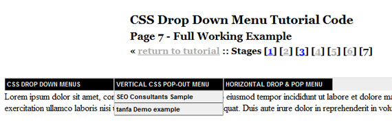
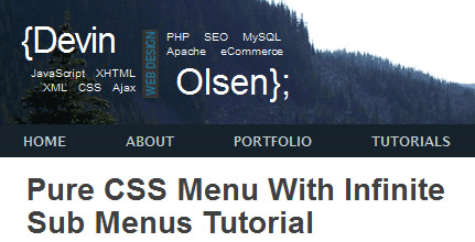
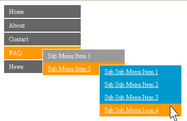
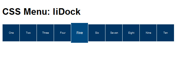
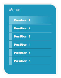
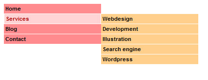
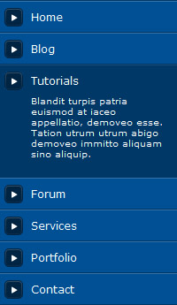
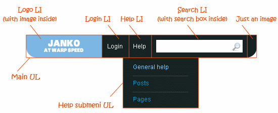
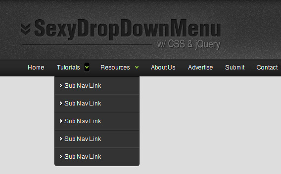
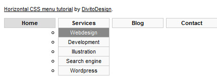
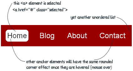
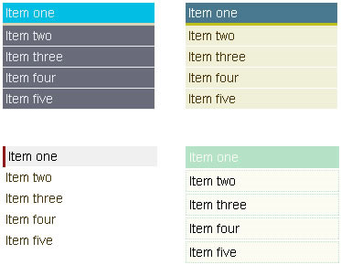
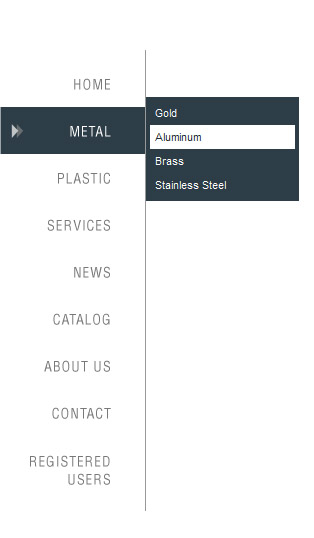
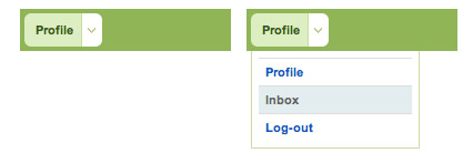
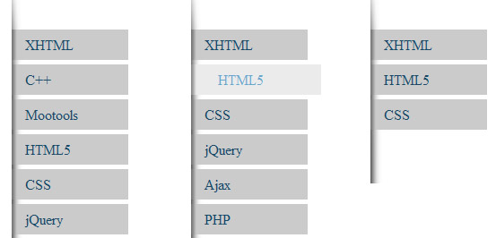
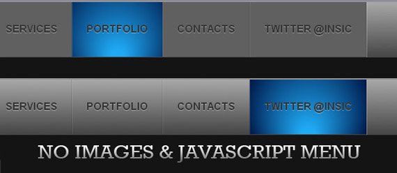
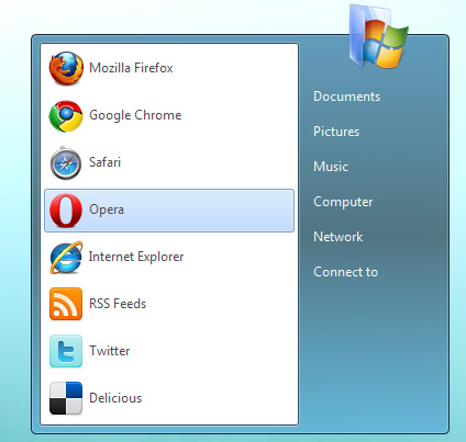
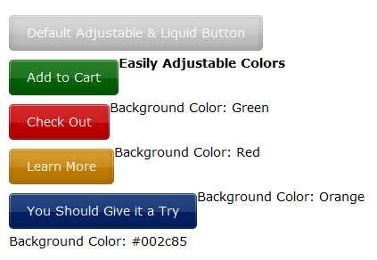
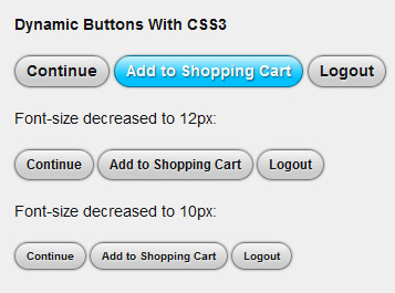
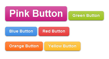
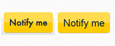
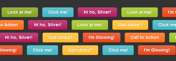
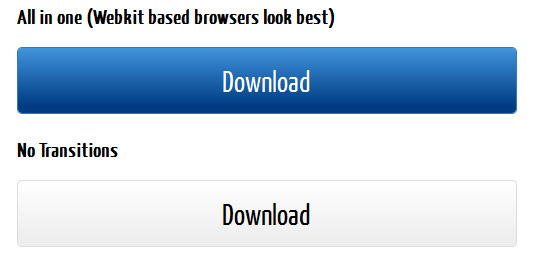
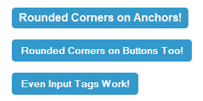
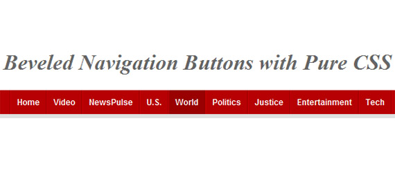
Below you will find a lot of tutorials each teaching you something different and appropriate. You will also find quite lot CSS3 tutorials, because CSS3 offered features are being used more and more and you should practise them too. Menus1. Bulletproof CSS Sliding DoorsIn this tutorial author shows you solution how to preclude common problems with implementations. 2. CSS Sliding Door Using Only One ImageIn this tutorial, author will show you how to code the navigation bar using only 1 image. 3. CSS Dropdown Menu TutorialLearn how to create simple horizontal CSS dropdown and popout menu. 4. Pure CSS Menu With Infinite Sub Menus TutorialToday we are going to cover how to build a pure CSS menu with infinite sub menus; an area of CSS that is seldom talked about, poorly written or misconceived. This pure CSS menu with infinite sub menus technique makes use of CSS2 selectors so it will not work in IE6 and below without help from JavaScript. 5. Pure CSS Vertical MenuFollowing this tutorial you are going to build the second most common menu navigation, the vertical navigation menu. Here you are going to be using only pure CSS and un-ordered lists to create your vertical navigation menu with three levels of pop outs. This version of the vertical navigation menu will work in IE5, IE6, IE7 and IE8 as well as FF and Safari. 6. Horizontal Menus That Grow on YouIn this quick tutorial, author is going to discuss how to create a neat little menu effect. You’re going to create a horizontal row of boxes containing link text. When you move the mouse over one of these boxes, it’s going to get taller and the text larger and bold. 7. Advanced CSS MenuThis tutorial will show you how to slice up the menu design (step by step) and put them together with CSS. Most of you probably know how to code a horizontal or vertical CSS list menu. Now let's take it to the next level — code an advanced (un-typical) list menu utilizing the CSS position property. 8. Horizontal Subnav with CSSLearn how to create simple submenu with CSS and a touch of jQuery for IE6. 9. Advanced CSS Menu TrickThis tutorial will teach you how to create powerful and solid navigation. What you want to do here, is instead of simply altering the state of the navigation item the user is currently rolling over, we want to alter the non navigation items as well. 10. How to Create a CSS Menu Using Image SpritesFollow these steps to build your own modern navigation bar design, starting with the initial steps in Photoshop to flesh out the design, then moving on to constructing the HTML and styling with the CSS image sprite technique. 11. CSS Graphic Menu With Rollovers3 part tutorial showing you how to make clean, nice vertical menu using Adobe Photoshop, then slice your web graphic and finally code website menu using unordered lists, and valid xHTML/CSS. 12. CSS Dock MenuIf you are a big Mac fan, you will love this CSS dock menu. It is using Jquery library and Fisheye component from Interface and some great looking icons. Here author will show you how to implement it to your web page. 13. Vertical CSS Menu With a 'Behavior' FileIn this tutorial you will build a vertical CSS menu with rollover submenu's. This menu will be written in CSS and HTML, and will use a so-called 'behavior' file. 14. CSS Vertical Navigation with TeaserLearn how to code simple vertical menu a simple way to display some teaser information for your vertical navigation. 15. CSS Sprite Navigation TutorialThis tutorial teaches how to build a css navigation using sprite images. With the mobile web becoming more important than ever before, load time and the size of a web site are some of the biggest factors to consider when developing a site for mobile users. 16. CSS3 Dropdown MenuLearn how to create Mac-like multi-level dropdown menu that author's created using border-radius, box-shadow, and text-shadow. It renders perfect on Firefox, Safari and Chrome. 17. Create an Advanced CSS Menu Using the Hover and Position PropertiesStarting with a photoshop file and finishing with semantic HTML and CSS, you’ll be creating an advanced CSS navigation menu using its :hover and position properties. 18. Create Vimeo-like Top NavigationLearn how to re-create Vimeo style dropdown menu. The menu drops down when you hover over the search box and it offers you different search options that you can choose and narrow your search. The base for this tutorial is simple CSS drop down menu based on unordered list 19. Sexy Drop Down Menu w/ jQuery & CSSIn this tutorial author would like to go over how to create a sexy drop down menu that can also degrade gracefully. 20. How to Create Dropdown CSS MenuThis CSS menu will have submenus and will use the web-techniques HTML, CSS and the "whatever:hover" behavior file to make things work in Firefox and IE6+. 21. CSS Overlapping Tabs MenuIn this tutorial you're going to learn to create a simple, yet cool menu with overlapping tabs. 22. Rounded corner CSS navigation bar with jQueryFirst, check out how to Turn your HTML list into a navigation bar with CSS. Then this tutorial will show you how to add some nice round corner effect to your anchor elements with jQuery. And yes, you will be doing this without using any image. 23. Simple CSS Vertical MenusIn this tutorial you will learn the basics of creating simple vertical menus for your website using only HTML and CSS. 24. CSS Navigation Rollovers With Drop-downsFirst read Super Fantastic CSS Navigation Image Rollovers, then come back to this tutorial and learn how to code your images into working CSS menu. 25. Navigation Bar With Tabs Using CSS and Sliding Doors EffectRead short explanation about how to use PHP URL variables to set a tab “active” when the relative page is loaded. 26. Simple CSS Vertical Menu Digg-likeThis tutorial explains how to implement a simple vertical menu digg-like using CSS and javascript to show/hide sub-menu. 27. jQuery Style Menu With CSS3In this tutorial you will learn how to create an animated sliding vertical menu using CSS3 without any JavaScript. 28. Apple's Navigation Bar Using Only CSSFollowing this article you are going to learn how to make the toolbar below, using nothing but HTML and CSS. 29. Create a Slick Menu using CSS3In this article I am trying to mimic the navigation menu in Dragon Interactive website using only CSS (no images, no JavaScript). 30. Create Windows 7 Start Menu Using CSS3 OnlyTest CSS3 offered opportunities and create slick Windows 7 menu using only CSS3. Buttons1. Gradient Buttons with CSS3A quick tutorial on how to use multiple CSS3 effects at the same time to create a cool looking gradient button showing people just how amazing CSS3 is. 2. Liquid & Color Adjustable CSS ButtonsLearn how to save time and adjust button color with CSS. 3. CSS3 Gradients: No Image Aqua ButtonCreate Mac OS X style aqua button with CSS3 using no images. 4. Sexy CSS Hover ButtonLearn how to bring two Photoshop files into functional web buttons. 5. Creating buttons with CSS3The following example demonstrates how to create nice looking, dynamic buttons that are fully scaleable using the new CSS3 properties border-radius, box-shadow and RGBa. 6. Roll Your Own Google ButtonsCreate Google style buttons with CSS3 where no images are required. 7. How to make sexy buttons with CSSThis tutorial will teach you how to create pretty looking textual buttons (with alternate pressed state) using CSS. 8. Better Button and Nav InteractionsCreate iPhone style glowing button using CSS3. 9. Roll Over Button TutorialIn this XHTML CSS tutorial you'll learn how to create a button for a web page using Photoshop, XHTML and CSS. More specifically, you'll learn how to create a button who's hover state image is preloaded. 10. How to Build a Simple Button with CSS Image SpritesTake a look at building a simple button using CSS image sprites, starting right at the beginning in Photoshop and finishing with the complete coded example. This one's a good one for anyone getting started with CSS! 11. Fast Rollovers Without PreloadWhen using CSS image rollovers, two, three, or more images must be loaded (and often be preloaded for best results). We’ve got one image for each state (normal, hover, active, visited etc). Putting all states into one image makes dynamic changes faster and requires no preload. 12. Pretty CSS3 buttonsLearn to create a set of styles that are both cross browser compliant and degrade gracefully for non CSS3 compliant browsers. 13. How To Design A Sexy Button Using CSSLearn how to create simple good-looking button getting it by almost only by CSS. 14. Radioactive ButtonsCreate awesome looking and engaging buttons by using CSS animations to give them all that radioactive feel. 15. Beautiful CSS Buttons With Icon SetThis tutorial illustrates how to design nice clean buttons using some lines of HTML, CSS code and proxal icon set. 16. Building Beautiful Buttons With CSS GradientsWe'll build a nice-looking embossed and beveled button using gradients and existing CSS properties, where you don't have to regenerate images every time you change text, pages will load much faster because you don't have to download separate images and it allows text to be easily localized. 17. CSS3 Gradient ButtonsIn this tutorial author's going to show you how to put the CSS gradient feature in a good practical use. Check out demo with a lot of buttons. 18. Build Kick-Ass Practical CSS3 ButtonsLearn to take advantage of modern CSS3 features and create pretty button just with code. 19. CSS Only ButtonAnother tutorial showing you that you can live with CSS only. 20. How to Make Nice CSS ButtonsLearn how to use pseudo-class and apply the same CSS styling for all your website's buttons. 21. Cross-Browser Rounded Buttons with CSS3 and jQuerySimple a solution for developers to create flexible buttons with easily changeable text. 22. Making CSS Rollover ButtonsIn this tutorial, we’ll show you how to create easy, search-engine-friendly rollovers, using nothing but HTML, CSS and images. No JavaScript or IMG tags in sight! 23. Recreating CNN's Beveled Navigation Buttons with Pure CSSThis brief tutorial shows beginners that creating images for CNN's beveled style navigation isn't necessary. 24. Creating a Glassy Non Div Navigation BarThis tutorial will show you how to style and control lists in CSS, as well as showing you the valid ways of using lists and where to use them. 25. CSS Button Sprites TutorialIn this post author will show you how to implement the image of a two-state button into your design. |
| Create Really Detailed Dark Web Layout Using Photoshop Posted: 06 Jul 2010 04:00 AM PDT
I will do my best to make this tutorial easy for you to follow, just follow screenshots as we move forward step by step and try to understand how to use these techniques in your own designs! Let’s start? Before we get started download first 960grid system for easy Guideline creation.. Open 960_download\templates\photoshop\960_grid_12_col.psd Here is what we will making, click on image for full preview:
1st Step- Creating Document & GuidelinesFollow this guidelines Go to view > new guide make sure that the orientation is Horizontal
Repeat until you complete all the guidelines: (20px,50px,70px,450px,480px,608px,638px,766px,796px,924px,974px)
Maybe you’re wondering why I provide that guidelines? Let me answer then – I measure them in order to make this tutorial easier for you so you don’t have to wonder at the end of tutorial why item placement is different and you couldn’t get the same outcome as I did. Step 2 – Creating The HeaderCreate a new layer and name it Top_header Click on Rectangular Marquee Tool(m) Make a selection from the left to right 70px height. To make this tutorial easier I will not mention height anymore. I will just say 3rd horizontal Guide(3HG). This is based on what we’ve done on first step. OK? Set the foreground to 2d2d2d, backround 121212. Click on Gradient Toll (g) drag it from top to center
Step 3 – Creating SiteName and HighlightsClick on Horizontal Text Tool(t) Assuming that we have two-word Site Name. The 1st word is 1st and the second word is webdesigner. 1st word:
2nd word:
Put the SiteName at the Top left side.
1st Word: Add this blending Option: Drop Shadow:
Gradient Overlay:
2nd Word: Drop Shadow:
Gradient Overlay:
Now for the Highlights create a new layer at the top of top_header and name it Highlights, (Ctrl + Click) the line between the two layer.
Select Highlights layer and set the blend mode to Overlay and Opacity to 0%. Click on Brush Tool(B). Set the Diameter to 250 px and Hardness 0%
Start clicking at the top of our logo. Select 1st and Webdesigner hit (CTRL + G) to group and name it site_logo. Now You should get something like in the screenshot below:
Step 4- Creating Navigation MenuClick on Rounded Rectangle Tool(U), Radius: 20px. Color will not matter because we will applying Blending Options after that anyway. For the alignment of our navigation it should be placed 320 px from the left side, between the 1st horizontal line and 2nd draw your Shape.
Add this Blending Option: Inner Shadow:
Gradient Overlay:
Stroke:
Make sure to check Reverse now and duplicate the shape. Add these Blending Options on duplicated: Inner Shadow:
Gradient Overlay:
Stroke:
You should achieve the same result as in the screenshot below: To make things organize and easy to remember name the first shape nav_frame and the duplicated shape to nav_btn. Click on Text Tool(T) and type: Home. I used Futura Condensed font, 14 px Crisp. Place it in the center of button we made. After doing that, group 3 layers and name group – Home_btn. Now for the other navigation button duplicate the Home_btn, move it 15px from the Home_btn, now select nav_btn Add this blending Option: Inner Shadow:
Gradient OVerlay:
Stroke:
After doing this change HOME to BLOG. For the two remaining buttons just apply the same step. Name it ABOUT & CONTACT. Don’t forget to rename each folder, then group all btn and name it Navigation_btn. Done? For now you should have something looks like this:
Step 5- Creating Search BarSelect Rounded Rectangle Tool (U), 15px from Contact button
Add this Blending Option: Inner Shadow:
Color Overlay:
Stroke:
To make the search button duplicate the Shape go to Layer > Rasterize > Shape and clear all the layer styles. To do this select the layer Right Click > Clear Layer Style.
Select Rectangle Marquee Tool(M) follow the selection done as shown in screenshot below:
Name the 1st shape to search_frame and the duplicated shape to search_btn. Select search_btn and Add this Blending Option: Inner Shadow:
Gradient Overlay:
For the search icon Custom Shape Tool(U) select search icon and place the shape at the center of search_btn, name the shape search_ico and group the 3 layers and name it Search.
Step 6- Creating SlideshowCreate a new layer below the Top_header and name it Slideshow_bg. Select Rectangular Marque Tool(M), make a selection from left to right 3rd Horizontal Guide to 4 th Guide, then fill it with #0a0a0a color.
Add this Blending Option: Stroke:
Select the Top_header Layer Add this Blending Option: Stroke:
Result:
Now we will download some free useful stuff Nexus One icon gadget - Here Create a new layer above Slideshow_bg, name it slide_display. Open it, hide everything so just The Gray Nexus One remain – (CTRL + SHIRT + E) to merge. Select all (CTRL + A) Copy (CTRL + C), go back to the document (CTRL + V) to paste. (CTRL + T) to transform and place it as shown below.
Click on text tool, choose Helvetica font, size 24px, Crisp and type on “Google Nexus One“. Now copy some dummy text from Lipsum.com. Copy the Character Setting as shown below:
Now we will be making 2 buttons for ‘discover more‘ & ‘watch video‘. To do this create a new layer above Slideshow_bg. Select Rounded Rectangle Tool(U), draw a shape as shown below.
We will be applying the same style just like our navigation. Copy the layer style of nav_frame. To copy simply Right click > Copy Layer Style. To paste Right Click Shape 1 > Paste Layer Style. Duplicate Shape 1, Copy and Past the Style of nav_btn. Do the same step to shape 2. Name the shape as shown below.
We will change the Gradient color of Slide_btn Change this Gradient Overlay Gradient to 353399 – 646cd8, grab Text Tool(T), Helvetica Bold, set the size to 12px, Crisp and type some text. Mine is DISCOVER MORE & WATCH VIDEO. Group the layers, name group Slide_btn.
Now we will make Slideshow Thumbnails. 86 x 86 px big. To do that select Rectangle Tool(U), make a shape as show below. Name it thumbnail.
Add this Blending Option: Stroke:
Create a new layer below the shape and name it thumb_frame, CTRL + Click on the shape mask to make a selection, then go to Select > Modify > Expand 5px. Fill it with #000000, black color.
Add this Blending Option Drop Shadow:
For now we can really see that the effect popping up. Just stick with me and later on we will add the highlights for the Slideshow_bg. To make our thumbnail image, duplicate the slide_display and place the duplicated layer at the top of the thumbnail and link it by pressing CTRL + CLICK the line as shown below.
Group the 3 layers and name it thumbnail. Duplicate 2 times 20 px apart. And reduce the opacity of the group to 50 %.
Now we will create Prev and Next Buttons. Select Rounded Rectangle Tool(U). Set the Radius to 20px. Follow the image shown below.
Add this Blending Option Inner Shadow:
Gradient Overlay:
Apply to both arrows and don’t forget to name it next and prev.
Now lets work on our Slideshow_bg. Create a new layer above and name it noise link it to Slideshow_bg. Add another layer above and name it Highlights.
Select the noise layer, set the foreground color to #0a0a0a and fill it using Paint Bucket Tool(G) or by hitting (ALT + Backspace). Go to Filter Noise > Add Noise > Amount 1% and set the opacity to 30%
Select Highlights Layer, set the layer mode to Soft Light, Opacity to 40%. Select Brush Tool(B). Master Diameter to 600 px, Hardness 0% and you are ready to start.
Click in the middle of the slide show and at the top of Nexus One. We’re done with slideshow area. Before moving to the body area don’t forget to Group, what we have made and name it Slideshow_Section.
Step 7: Creating Body BackgroundCreate a new layer above the Background and name it body_bg. Grab the Rectangle Marquee Tool (M), make a selection in the remaining white areas. Grab Gradient Tool(G), set it to be Radial Gradient, change the foreground to #292929 background #121212. Start to drag from the top to the bottom.
Create a layer above body_bg, link it to body_bg and name it noise. Do the same step as we did on our Slideshow_bg. Step 8- Dividing the body into two sectionNow will divide the body into two parts: Left Side bar and the Content. Grab the Line Tool(U) 1px with white black color. Set the layer mode to Soft Light. Make another line besides the black line by hitting ALT + ARROW RIGHT. Set the layer to Soft Light and Opacity to 50%. Group both shape and name it Divider.
Step 9- Creating Left Side Bar Recent PostsTo our Leftside Bar for this tutorial we will be making Recent Post and Flickr images. Grab Text Tool (T), Font Helvetica, 18 pt, Smooth. This is for our Header. For our posting titles change the size to 12 pt, None. Refer to image below for the positioning.
Create a new layer below the text and name it post_bg. Grab Rectangular Marquee Tool (M), make a selection as show in the image. Fill it with #0a0a0a color. Set the layer to Overlay, Opacity to 15%. Do the same in every Post Title. Group all the layers we made and name it Recent_posts.
Step 10- Creating Left Side Bar FlickrThe same font and size to Step 9, let’s make the thumbnail of flickr photos. Duplicate the Thumbnails on what we’ve done on our slide show and resize it about 65 x 65.
Duplicate the divider. Transform it horizontally, place and resize as shown in the screenshot.
Step 11- Creating The ContentFor this step we will be making a common post on a blog that will have its Post title a little info and an image thumbnail. For the image thumbnail just the same on Flickr thumbnails Grab a copy on it and Resize 120 x 120. For the Post title Set the font size to 14pt, Smooth Color(#bebebe). For the info, set the font size to 12pt None. Additional to our post, download a free social icons as you like. Here what I’ve done.
Group all layers and name group as Post. Duplicate 2 times and place it 20 px below.
Step 12- Creating the FooterBelow the last post create a layer and name it footer. Grab Rectangle Marquee Tool(M), Set the foreground color to #0a0a0a. Make a selection from the bottom left to top right of the last horizontal guide and fill it with the foreground color. Add this Blending Options Stroke:
Grab Text Tool(T), set it’s size 12pt, None. Type in your Copyright. Finally were done.
I hope you enjoyed this tutorial and you could understand my explanations, I am not native English-speaking but I tried my best to teach you some great tips. Maybe you have some comments what should be improved? Maybe some steps were not enough good explained? Let us know – we are here to help! |
| You are subscribed to email updates from 1stwebdesigner - Graphic and Web Design Blog To stop receiving these emails, you may unsubscribe now. | Email delivery powered by Google |
| Google Inc., 20 West Kinzie, Chicago IL USA 60610 | |























Comments (0)
Post a Comment