1stwebdesigner |
| 40 Stunning Premium and Free Tumblr themes Posted: 13 Jul 2010 02:00 PM PDT
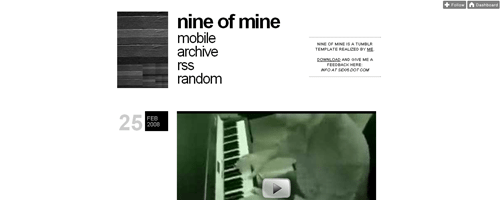
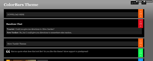
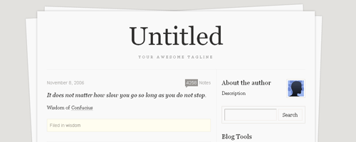
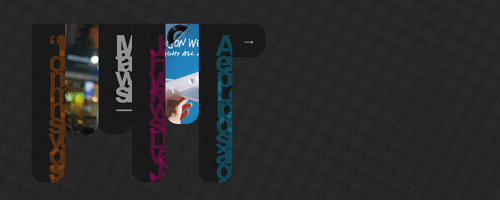
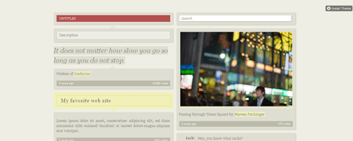
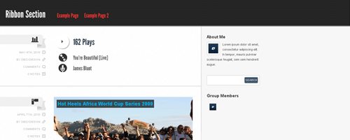
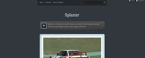
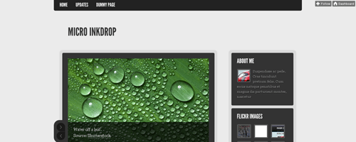
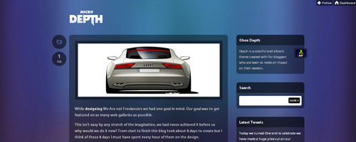
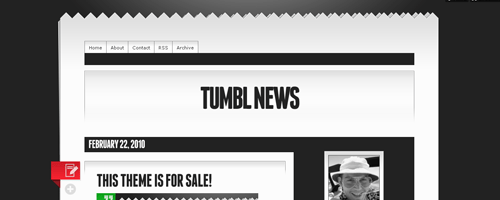
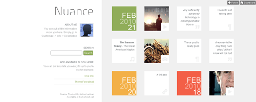
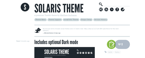
FreeFrom the beginning, Tumblr has had a fantastic library of free themes; it’s site says there are over 400 indexed. Here are 10 that stand out to me as being fantastic quality for free themes. 1. Easy Reader 2A typographic beautiful mix of grey, red and white. 2.101A pastel colored sexy left aligned theme. 3. PostageBeautiful imagery taking the persona of letter postage! 4. Godlike BlissA twitter inspired theme that’s up there in the clouds. 5. bbxtumblrFantastic css3 typography coupled with stunning icons. 6. Doodling in ClassPerfect for scribbling down notes here and there. 7. ScreenshotShow of your latest work with this screenshot gallery theme. 8. TumbleDeskBring the readers to your desk with this theme. 9. PhotoboardContent is displayed on cards, with beautiful enhancements such as flipping for details! 10. Panda Classics RecycledKeep it cool with this panda theme! 11. Nine of MineSheer simplicity. Let your content shine. 12. 1000 SunsA single column with simple styles. 13. Paper WallsLet this paper styled theme make your blog look the professional deal. 14. RockstarClassy, colourful and bright. Attract attention to your blog! 15. FluidA proper Tumblr favourite. You’ll see this beauty a lot which says a lot about its quality. 16. ColorBarsNothing classy, just a fantastic, fluid layout. 17. StationaryWith a fantastic paper border, this theme offers brilliant typography. 18. PhotogDesigned to give one post your attention at a time. A great concept. 19. OrganLikely the most original Tumblr theme ever. You’ve seen nothing until you’ve tried it. 20. CavalcadeFantastic use of greys with subtle tints, and eye pleasing combinations. PremiumA few months ago, Tumblr introduces something that web designers had started doing external to the Tumblr themes library; premium themes. Here are 10 from around the internet that caught my eye. 1. Photofolio - $49Keep it sexy with this shimmering folio theme that just shouts out to you. 2. Sonic – $49Give your band a fantastic blog with this theme. 3. Postcards – $19Playing on the postcard persona again, but this time, much more classy. 4. Generate – $19Here’s a clean, sleek blog theme from Woothemes. 5. HashTwo – $15A fresh, contemporary theme from OboxDesign. 6. Stratocaster – $17IvorPadilla makes grey cool with this fantastic theme. 7. Helvetica – $12This theme is for people that love Helvetica! 8. Vintage Scrapbook – $14Vintage Scrapbook is a whimsical, highly detailed theme inspired by the colours, styles, and textures found in old documents 9. Rank & File – $49Three columns of simple beauty. 10. Well Liked – $9Sleek and classy, this’ll kickstart your Tumblr experience. 11. Scribble – $9Show of your site with this sketch style theme. 12. Ribbon Section – $15Fantastic implementation of ribbons. With different color schemes, this feels premium! 13. Splatter – $19A single column, subtle grunge layout that mixes aqua and pink splendidly. 14. Micro Inkdrop – $15The demo starts with a fantastic image slider, and the beauty doesn’t stop there. 15. Micro Depth – $15A colourful and vibrant theme for you to make an impact on your readers. 16. Tumbl News – $14A theme aimed more at providing news than small time blogging. 17. Nuance – $14Nuance provides an original grid view to different Tumblr posts. 18. Crisps – $12Yet another single column layout, but this time, with an added slide out sidebar! 19. Simplefolio – $49Simplefolio shows what can really be achieved with Tumblr, turning it from a Tumbleblog into a full portfolio complete with pages! 20. Solaris – $9Taking minimalism to a whole new level of beauty. Further ThoughtsSo now we’ve learnt what Tumblr does, in terms of micro blogging, and how it works, and we’ve seen what can be achieved through its theme system. The next installment in the series will teach you how to code your own psd to a fully fledged Tumblr theme! Keep your eyes out for it, and apologies for the wait. If you have seen any fantastic free and premium Tumblr themes that you think are worth a mention, hit them up in the comments. We love to hear what you think, and like =) |
| Tips and Inspiration on Creating a Great Website Footer Posted: 13 Jul 2010 03:00 AM PDT
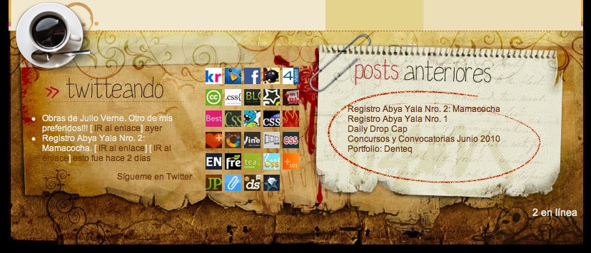
In this post, not only are we giving you samples of website footers for your inspiration, but also guiding you 5 important steps to remember whenever you are designing the footer. 1. Decide On Repeated ContentBe very selective in choosing the content you want to place in the footer. It depends on your need, what your website is about, or what content you want people to re-read in your footer. If you have a blog website, magazine type of website or similar it could be your recent posts, featured posts (in lines with no image thumbnail), recent comments, or social media links. For artists, designers or companies it could be their services, portfolios (in small thumbnails), testimonials, contact form or recent tweets. 2. Add Logo(s) If Necessary
People nowadays are really concerned about feeling safe and secure when they visit websites and want to make sure that they are browsing the right sites. For e-commerce websites, it will be a great idea to place some logos such as Verified Merchant, Verisign Secure, McAfee Secure, or others. And if you have partnership, sponsors or even awards recognition, why not placing their logos on your footer as well? This will help you get respect from your website visitors. 3. Add The Interesting Point(s)Say good bye to the old boring website footer. You have done a great job with the header and content (body) of your web design, now it’s time to spice up the footer. A few interesting things you could add can be icons, illustrations or just about anything fun. Though, remember to match them with the website layout or the website concept and try not to add many icons. 4. Space Things OutNow that you have everything you need for the website footer, let’s add some space between the sections. Although it might not have as much content as you have in the body content, it is always better to have them spread out rather than looking so packed in. 5. Do Not Forget Your Copyright LineDon’t let all the content in the footer fool you. It doesn’t matter how much stuff you put as content or how many logos/portfolios you have on your website footer, you still have to put your copyright line somewhere. Be creative, it doesn’t have to be at the bottom all the time. Now let’s take a look at some other website footer designs for your inspiration. 1. Komrade2. Adobe User Group Nederland3. Louden Tax & Bookeeping4. Quoterobot5. DJ Eric6. Bring It To Fruition7. Forrst8. LogicBombMedia9. Swiths10. Cog’Aoke11. Pieoneers12. Logo Designs Studio13. Real Deal Promotions14. Make Your Mark15. Randoman16. Go My Pages17. Ready Made Designs18. Agencia de Publicidade19. Pixlogic20. MV Designs
|
| You are subscribed to email updates from 1stwebdesigner - Graphic and Web Design Blog To stop receiving these emails, you may unsubscribe now. | Email delivery powered by Google |
| Google Inc., 20 West Kinzie, Chicago IL USA 60610 | |













Comments (0)
Post a Comment