1stwebdesigner |
| 5 Ideas To Help You Become Better Web Designer Posted: 08 May 2010 03:00 AM PDT
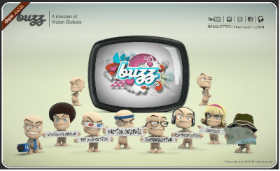
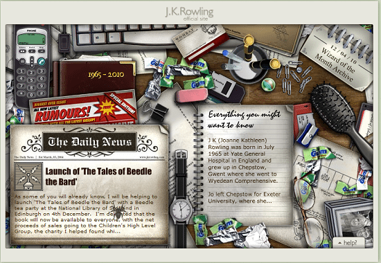
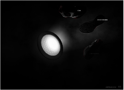
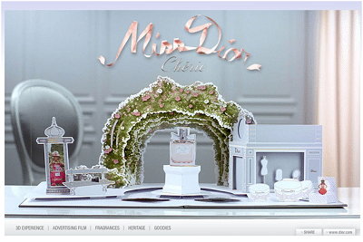
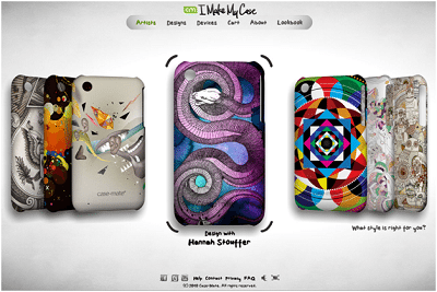
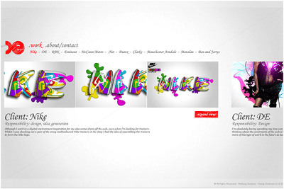
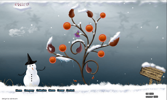
To understand and use these concepts, we can take a look at some of the most common design ideas to watch out for in the coming days. These highlight some important tips with examples that can be used for web design. I am sure, many talented designers are already aware about these tips; however, one tends to overlook them! Use of attractive graphics and displaysThere are many websites that stand apart from the rest. A web designer can use a creative layout and concept to attract users. This helps to capture the initial attention of users. Yet, one can never be sure whether it keeps a user on the page for a good amount of time to convey the intended message. In this case, website interactivity can help to engage users on a page. Users stay on a page when we provide them some actions to be performed to explore a site rather than providing simple text-based content. Using interactivity on a website helps to capture initial attention of users along with presenting information in a way which encourages user to perform desired action on the page. For example, a product website can include quotes from customers that lend authenticity to a website. This gains faith from users. A common way to display the customer testimonials is through the use of quotes with the name and designation of the customer. Though the product has many good customer testimonials, this display cannot guarantee to capture the attention of the users. Instead, an interactivity that displays the quotes and customer photographs is surely an attention-grabbing idea. It would not only present the content in an engaging manner through the creative use of flash interactivity; but also give a personal touch to the existing customers which would encourage other customers to have their testimonials out there. Another great example of engaging users to explore the website is Wrangler’s site. We all know about the popularity of the brand Wrangler. This website displays the products in a very unique way. It engages user to perform actions like unzip the jacket, drag a shirt to view the shirt design, etc. to browse the website further. The visuals then unfold in a very interesting manner. The collection can be viewed only after the user performs some action on the website! A website can even enhance its display in a unique manner to connect with the users. This website has made a creative combination of interactivity and animation to present information about the company. Buzz, the integrated design studio has displayed each and every section about the website in a unique interactive way. With every click, the animated figures amuse users while presenting the information. Jim Carrey is a personality who needs no introduction. His website also reflects his unique, creative talent. There is an interesting use of displays in terms of photographs and forms. The use of interactivity is done cleverly as with each click, something new unfolds on the page. To know more, you must explore it yourself! So, have you already started thinking of something unique and different to allow users to explore your site? Well, just hold on a second! This is just the start. Read further to explore few more design trends which are picking up :) Enhancing the common elementsIt is also seen that creative websites have a great emphasis on color and layout. This means that there are many elements that may not even get that much attention, such as a site map that is not always presented in a creative way. We can take another example which will highlight why one needs to enhance these finer elements on a website. A normal site map that is seen on most sites contains details in a text and link format. The trick is to break away from this tradition. Present the site map details in a creative way with images and interactivity to make a user want to view the site map. I am sure that there is no one here who does not know about J.K.Rowling and her famous Harry Potter series. Have you ever explored her site? Her site is also as creative as her Harry Potter books. Check out a screen shot of her website below. The website contains a visually appealing layout as seen in the example. The elements that are spread out are keys to the site map. There is the use of many interactive features which contain details about the site. The tabs such as Biography, Wizard of the Month, Tales of the Beedle and the Bard and even the contact tab are used very creatively into this layout. In this website, one can witness a creative usage of product display. The product features are shown in a unique manner rather than the typical forms of layout. The central portion can be moved around with a cursor which changes the placing of the light to display the various features of the product. Dior is a brand that has a large fan-following. Their website itself reflects the exclusivity of the brand. This example showcases different Dior perfumes with a creative touch. Instead of showing the products in a regular manner, there is an interesting display of the fragrances. The setting is quaint and makes a user want to explore the website further. The different elements are highlighted with the use of color and interactive elements. Have you ever observed this kind of trend before? If not, start looking around. You would definitely find many such creative site maps. Induce action from usersEven when a website is creatively designed, the final aim of the website is to make a user perform a desired action on the page. This action could be to register for a free trial or enquire about a service. This is when a web designer needs to think, 'what next?' to move on to the next level. If you have a website which thrives on advertisement revenue, then it is quite probable that the page would have many advertisements. In such cases most of the advertisements fail to capture user attention in the crowd of advertisements. These become a blind spot for most of the users. This is when website interactivity can be used to capture the attention of the users. You might be thinking how can interactivity helps in advertisements? Well, I have already said that now we need to think creatively! And nothing is impossible in the world of creativity! :) Instead of having a plain banner, a user can be attracted to view it by having the banner designed as peel-off interactivity. This means, a user needs to peel off the first layer to reveal the message beneath. It can be very effective particularly for a teaser campaign. Imagine your first layer of peel-off says "Please don't look beneath me! It would be difficult for you to resist the offer!" Don't you think a user would have an urge to see what is beneath? Definitely, at least I will! Once the user peels off the banner, it sees the actual advertisement of the offer or the service. Mobile phones are a rage and everybody is on the lookout for an exclusive design. This example is about a website where one can create one’s own design and order for a mobile case based on the design. Therefore, this website uses interactivity to display the same. All a user needs to do is click to select graphics, colors, etc. to create a mobile case of his/her choice. This is a unique idea to engage users whilst they try new designs and highlight the company profile. This website showcases works of an interactive designer. The portfolio can be viewed by clicking and dragging, which makes a user perform an action on the page. The presentation is sleek which adds to the aura of the designer. Engage users whilst they perform an actionThere are numerous websites which provide various services for different kind of users. For example, if you go to a shopping website, there are all kinds of things which are sold on such sites. The website design for such topics may not direct users to appropriate items they are looking for. A user may not have time or patience to look through various categories and find out the required information. For example, a photography website can have tabs such as nature photography, useful cameras for nature photography, wildlife photography, etc. If these elements are presented together, it can make a user visit all the tabs in search for information. A user thus gets engaged whilst referring to these tabs and is motivated enough to perform an action. Let us look at a website which has used interaction to its best to showcase its summer and fall collections. Its collection is displayed through the circular leaf design on a plant. Won't you like to go through the complete collection by clicking its various circular leaves? This is a unique way to engage users to encourage them to go through the complete new collection! Isn't it? This website is creatively designed to bring about an interest amongst users to explore it further. Here, the F&N product flavors can be viewed with mere clicks. As a user clicks the can, the different flavors are revealed with each click. This turns out to be an engaging factor for users whilst the product information is shared. Adding Interactivity to WebsitesAfter reading through the above points you would have definitely agreed that interactivity is the way to achieve your aims for website design. Interactivities are just great and they add the "WOW" factor on your website. But creating such interactions would take months and we don't have that much time on hand, isn't it? Well, then I have some good news to share with you! My experience as a web designer states that creation of such interactivities does not take months and also do not require knowledge of Flash. If I tell you that adding interactions to your website can be done in minutes and without any programming, would you believe me? I know some good software tools such as Raptivity Web Expert which allows creation of interactivities using simple wizard-based customization. This completely eliminates the time spent in programming! By paying close attention to websites, one can fine great samples of interaction which would engage you and make you think that web design is no longer a simple HTML page but a canvas which can be painted creatively and differently! Do you know any such creative website? Do share them in the comments below. I would love to hear from you! |
| You are subscribed to email updates from Graphic and Web Design Blog To stop receiving these emails, you may unsubscribe now. | Email delivery powered by Google |
| Google Inc., 20 West Kinzie, Chicago IL USA 60610 | |




Comments (0)
Post a Comment