1stwebdesigner |
| Expert Tips on How to Build a Multicultural Website Posted: 19 May 2010 01:00 PM PDT
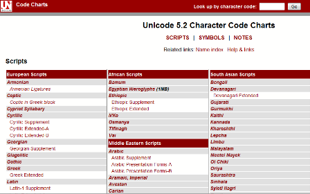
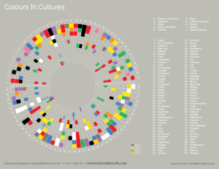
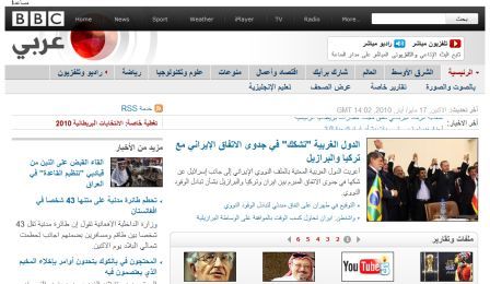
Arabic, for example, has around 300 million native speakers around the globe, and as an official language in 26 countries (the third most after English and French), it's clear that Arabic is a language that shouldn't be ignored for those seeking to make serious inroads into international markets. Using UnicodeFancy graphics and cool colour schemes will certainly help sell your site to the masses – but ultimately, the old adage that content is king certainly rings true for most websites. With that in mind, even if the plan is to build your website in English only, if you design using Unicode from the start, you will be well positioned to adapt your pages for other languages later on. Unicode is the only sensible character-set option that enables websites to support different scripts. UTF-8 is compatible with over 90 written languages ('scripts') and has a range of over a hundred thousand different characters. Importantly, UTF-8 is supported by the most common browsers (Explorer, FireFox etc) and Operating Systems (Windows, Linux, MacOs), whilst the likes of Apple, Microsoft, IBM and other industry lynchpins have all adopted it as a standard. Even if you don't plan to use a non-Latin script on your site such as Arabic, the German alphabet, for example, contains an additional four characters: Ä, Ö, Ü and ß. Many other European alphabet systems use even more characters – which is why using Unicode is important. Green Hats: Cultural and Colour ConsiderationsIf you are setting up a website primarily to be aimed at audiences in the US or the UK, that's great. But what if your strategy changes later on? It's much easier to develop the aesthetics of your site from the start, rather than re-designing it later on. Clearly, you can't structure the aesthetics of your website to please everyone. But you can choose a culturally sensitive colour scheme – remember that different colours can mean different things in different cultures. For example, in the United Arab Emirates and other Arabic cultures, green signifies holiness or luck, whilst blue represents immortality and is deemed a 'protective' colour. Orange has religious connotations for Protestants in Northern Ireland, and whatever you do, you might want to avoid placing a green hat anywhere on your website, as this means that a man's wife has been unfaithful to him in China. A light-coloured background with dark text is a safe bet across the world – it's easy to read. Any other graphics, patterns or colour schemes you use should be chosen to reflect any markets you plan to enter: as a general rule of thumb, it's best to avoid anything that is potentially divisive, such as religious, political or sexual symbols. A picture of a partially clad lady may go down a storm in the West, but in many eastern cultures, a dim view may be taken of this. Layout & NavigationNot all languages read from left to right. Arabic is one such language that reads in the opposite direction (right-to-left) and as such, this can throw up some issues when converting your design for specific markets. If your navigation bar is vertically positioned on the left-hand-side of your English language website, then in Arabic users will obviously have to read from the right to left which means the navigation bar may not appear in your preferred position in relation to the direction the user is reading. Of course, it's not the end of the world if you have to shift the navigation bar to the other side of the page for your Arabic site, but for simplicity – and uniformity – you may favour a horizontally positioned navigation bar instead. This means the rest of your design and layout templates can remain the same across all your sites. Bandwidth BarriersThis may be hard to believe, but not all countries have high-speed broadband internet access yet. Much of South America, Africa and even parts of Asia are still on internet connections that most people in Western countries would deem 'slow'. With that in mind, you may want to avoid really heavy graphics and bandwidth-sapping Flash animations – it's unlikely web users will hang around for ten minutes for a picture to load on their screen. This doesn't mean you should build text-only websites, but it does mean you should perhaps provide two options for web users: a simple HTML only version and a normal, flashy 'bells and whistles' version. Multilingual SEOYou might have the most beautifully designed website in the world, but if nobody can find it on the World Wide Web, then is there any point in it being there? Visibility is everything on the internet, which is why search engine optimisation (SEO) plays such a crucial part of any web content strategy. The issue of SEO is probably best left for another article, but for those who already optimise their English language site, it's worth bearing in mind one golden rule of thumb when optimising your site for international markets: never translate your keywords directly. If you're translating your website content yourself or using a translation agency, the keywords for which you rank highly on Google.com or Google.co.uk should be researched for each target country. A translator won't know what people use to search for products or services locally, they may use synonyms, abbreviations or colloquialisms. And there you have it…the basics of multicultural web design! |
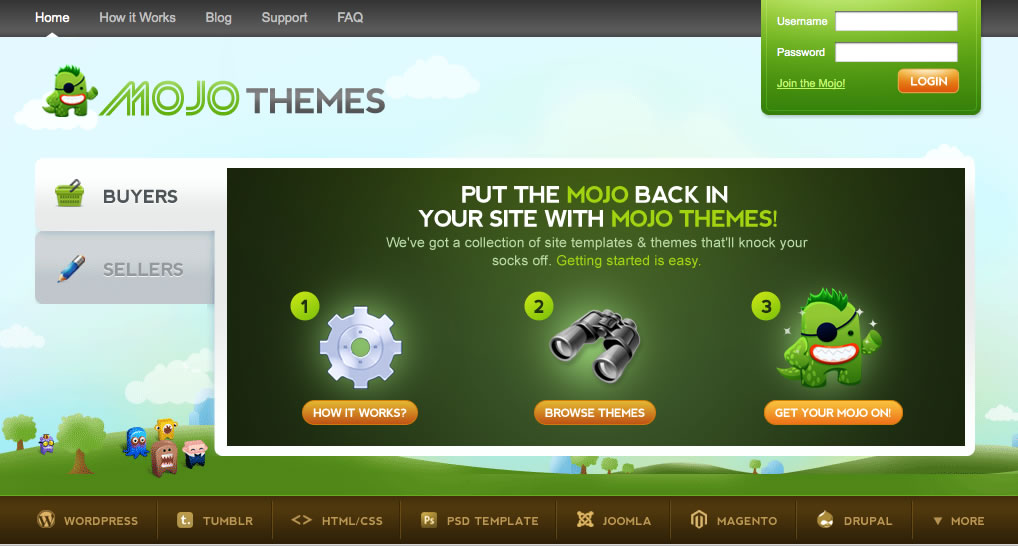
| An Interview with Mojo-themes + Giveaway Posted: 19 May 2010 03:13 AM PDT  Today we bring you a fantastic, insightful interview with the co-founder of Mojo-themes JR Farr, as well as a fantastic competition to get you’re hands on some of the fantastic themes already featured on the marketplace! Mojo-themes.com is a relatively new marketplace for web templates ranging from psd all the way up to fully fledged cms compatible versions. If you haven’t already, get it checked out! Today we bring you a fantastic, insightful interview with the co-founder of Mojo-themes JR Farr, as well as a fantastic competition to get you’re hands on some of the fantastic themes already featured on the marketplace! Mojo-themes.com is a relatively new marketplace for web templates ranging from psd all the way up to fully fledged cms compatible versions. If you haven’t already, get it checked out!Mojo-Themes is a pretty awesome name for a marketplace. What was the inspiration for this, and the marketplace itself?To kick things off, we just wanted to say thanks for the opportunity to be interviewed on 1stWebDesigner. We too think what you guys are doing is pretty awesome. Glad to hear you like the name MOJO Themes. Thus far, we've had some great feedback around the name and branding. We plan to continue to bring a fresh feel, along with some new innovative ideas. The name MOJO comes from a company started back in 2008. We've always loved the idea of "bringing the MOJO back". It's a phrase people can have fun with and we feel like it makes us standout a little bit. In terms of the marketplace itself… We had ideas like everyone else but never followed through. Plenty of the typical notepads, email and basecamp messages were stacking up. It was finally time to act on those ideas. After finding some newfound motivation towards the end of last year, we revised the branding, logo and after months of design revisions finally had something to show for it. Everyone involved has a huge passion for what we're doing. We feel like that shines through the product we have to offer. You have a sweet mascot to match your name, in the form of an amusing little green monster. Talk us through this monster.Glad you asked. It's actually a pretty cool story. The owner of FastIcon approached us about doing a custom monster specifically for MOJO Themes. Most people have seen his work through the other monsters he's created but we all wanted something that is one of kind for MOJO Themes. With that being said, we already had a feel of his work and what we wanted. If you could sum it up, we basically said we want a kick-ass green monster, with a Mohawk, eye patch, all topped off with a huge grin. He nailed it.
You certainly can’t be the only one putting all the work into this marketplace. Who else is involved in the running of this service?Haha! Yes, I'm definitely not the only one involved. MOJO Themes is the brainchild of myself (JR Farr) and Brady Nord, where we've spent far too many nights putting every ounce of ourselves into this project. We run a majority of the day-to-day items within the marketplace. From administration duties and design to marketing efforts. On top of that, I have to give a nice plug for our development core. The team we have goes above and beyond. We all work late into the nights, answer support tickets on the weekends, etc. Not only that, but they've turned our ambitious ideas into reality. Recently with the teams skills and determination, we were able to unveil the very first collaboration program called JOINT FORCES, which will finally unite designers and developers. Mojo-themes is a relatively new marketplace only launching 2 months ago. How is it looking so far, and what are your plans for the future of the marketplace?
Yes, we are pretty new still. We really only opened our doors to buyers and sellers in the first week of April. In the first month of being open, we've had an awesome response, learned a lot and already made big improvements based off of the feedback we've received. In terms of the future, we are excited & humbled to see how much we're growing already. It's exciting to picture where we'll be down the road. We plan to use the momentum of MOJO Themes to branch out to into other marketplaces that would be useful to other types of niches. There are several marketplaces out their providing strong competition. What makes Mojo-themes stand out from the rest of the crowd?
We love the competition because we feel like it's what brings innovation within the industry. Our team has some of those most competitive people I've ever met yet we still have nothing but respect for our competitors. Honestly though, we know our competition but focusing on them too much can dictate what you're trying to do. Ultimately, what makes us stand out is we plan on stepping up with our own unique ideas. For example, releasing our collaboration program within the first month of launching. Some ideas may fail and some may be game changers. Bottom line is, we're not afraid to be different. After all, our site is surrounded with fat, furry monsters and called MOJO Themes! Why would you recommend a designer / developer sell their work through Mojo-themes rather than on their own?If you've tried on your own, chances are you know how difficult AND expensive it can be to do on your own. Whether it's time or money there's a lot of investing. You know how to not only worry about designing, developing and supporting a solid product but now you have everything else to do. Bottom line is, our marketplace provides a place for you to focus on what you do best, which is building awesome themes & templates. When you really think about it, you're going to be spending a lot more money or investing way more time doing it on your end. It makes a lot more sense to split the commissions within our marketplace. What advice do you have for designers / developers wanting to sell their files at Mojo-themes?
It's the fine details that matter and going that extra mile. Whether it's in the design, the product description or even making sure the demo URL shows off EVERY function. It's not just about getting your item approved. Once it's up in the marketplace you have to remember potential buyers notice all those small details. The more you put into it, the more you'll get out of it by making more sales. Thank you for taking time to speak with us JR, and giving us an insight into Mojo-themes. Giveaway!And now onto the giveaway! The guy’s over at Mojothemes have agreed to allow us to give away $20 credit on their marketplace to five of our lucky readers for free! This allows you to purchase a theme from their constantly growing marketplace! To enter, simple follow these 3 simple steps.
Winners will be announced 7 days from now on 26th May and will be contacted through their twitter account by Mojo-themes support. Good luck to all participants! |
| You are subscribed to email updates from Graphic and Web Design Blog To stop receiving these emails, you may unsubscribe now. | Email delivery powered by Google |
| Google Inc., 20 West Kinzie, Chicago IL USA 60610 | |






Comments (0)
Post a Comment