1stwebdesigner |
| 40 Fantastic Pricing Tables for Your Inspiration Posted: 24 May 2010 01:43 PM PDT
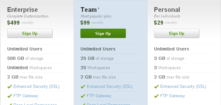
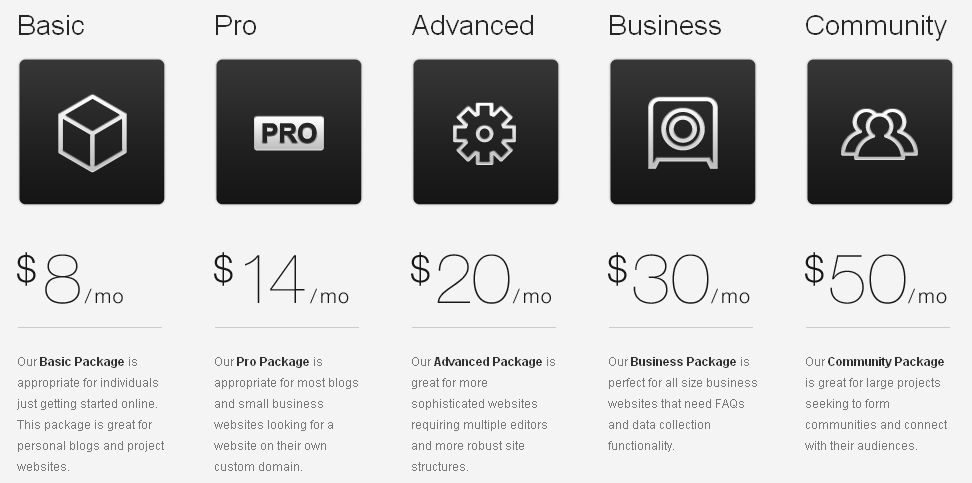
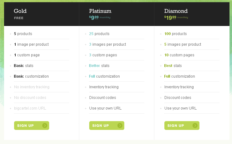
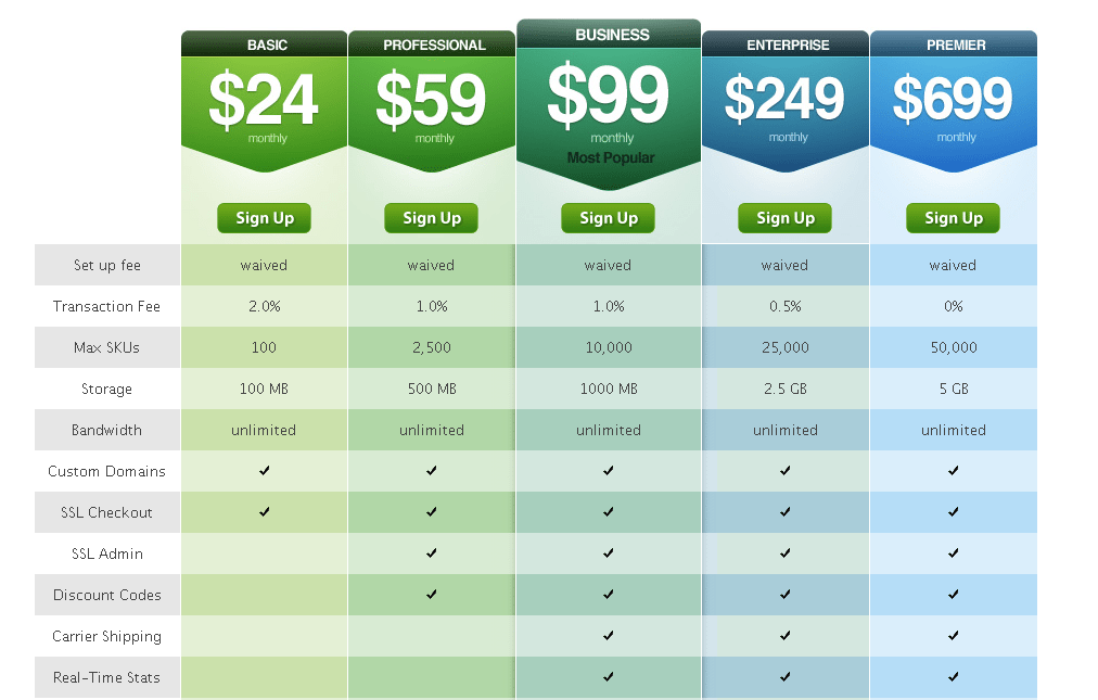
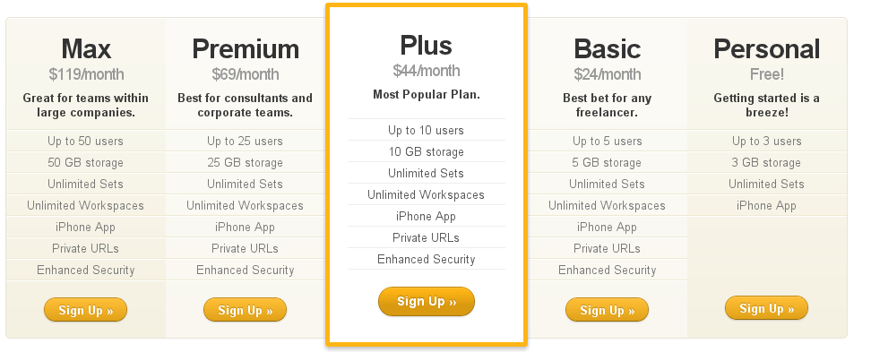
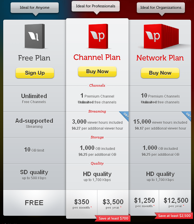
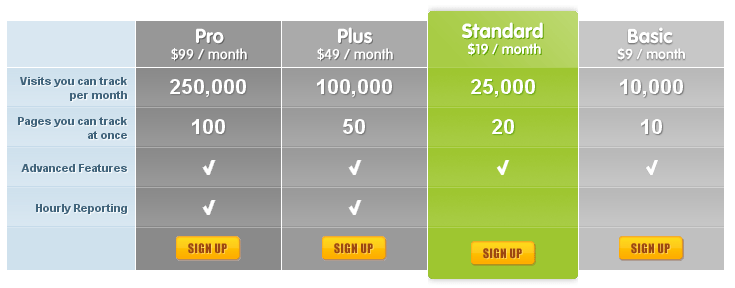
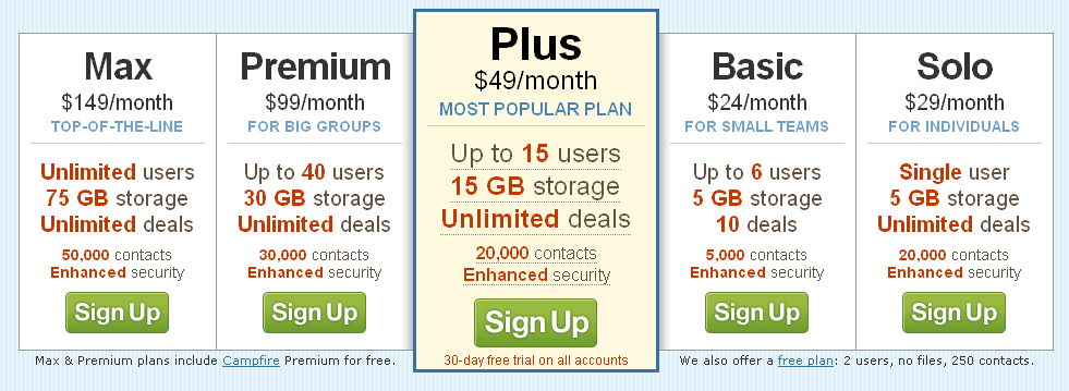
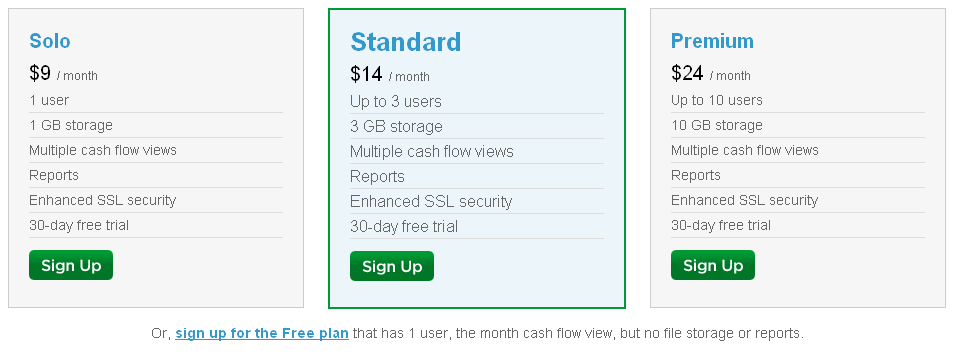
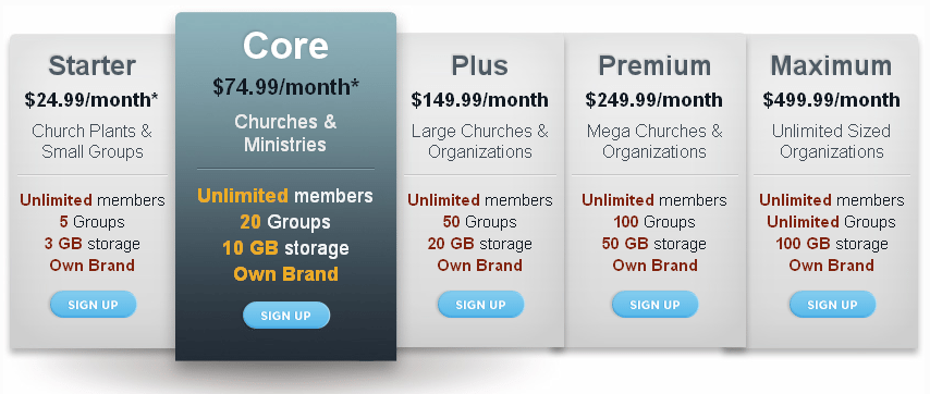
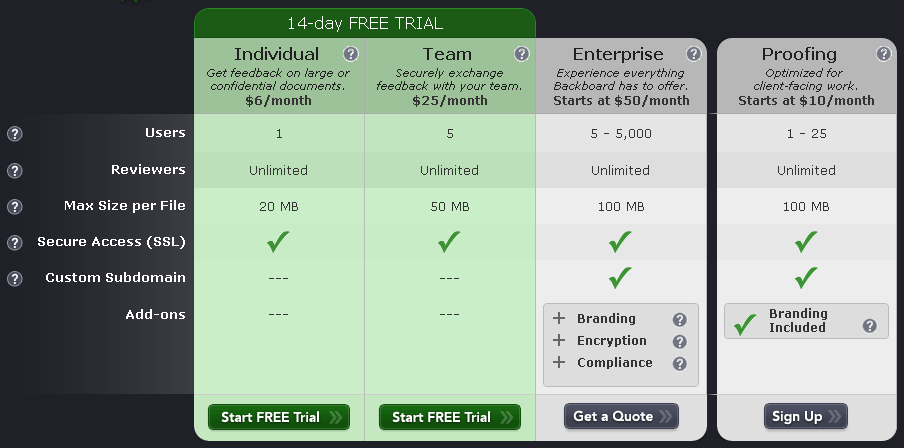
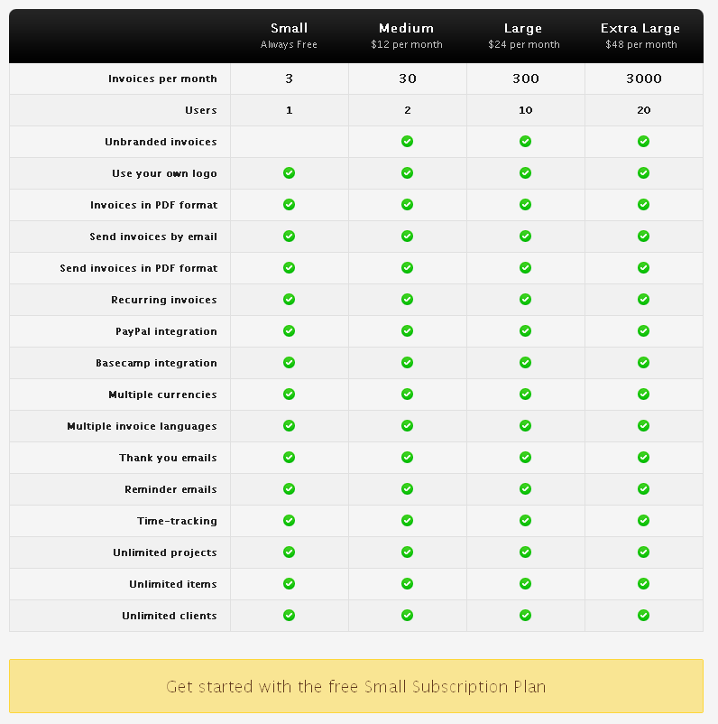
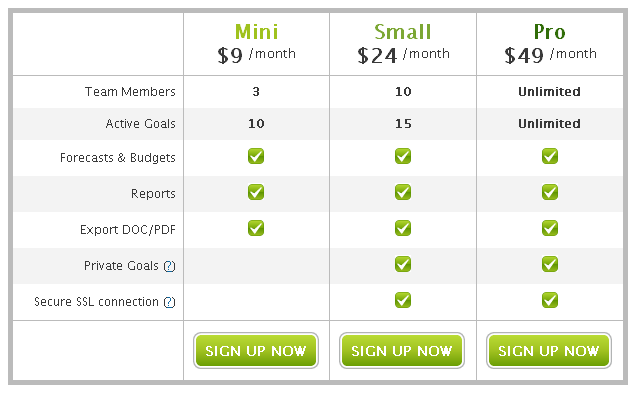
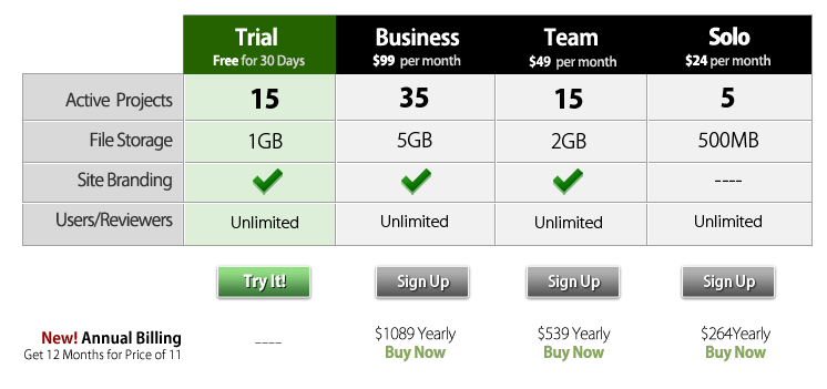
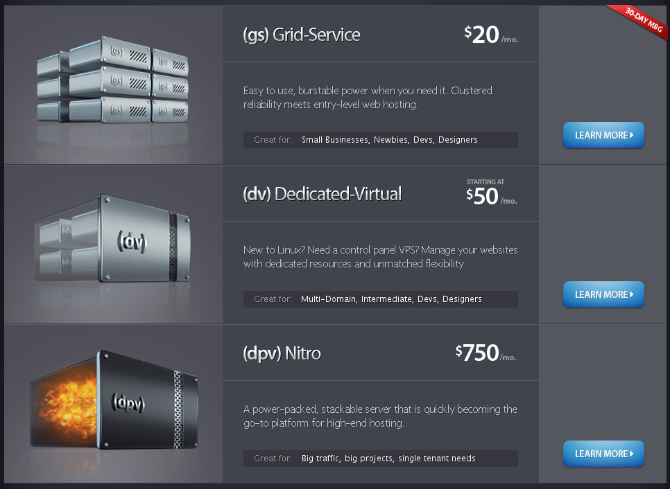
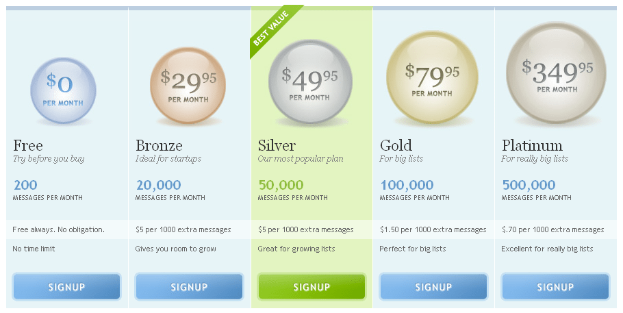
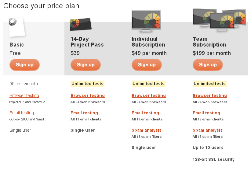
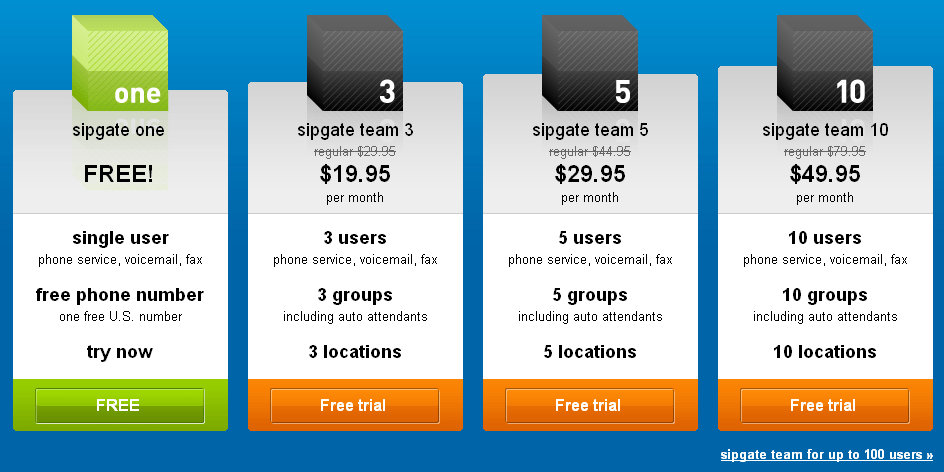
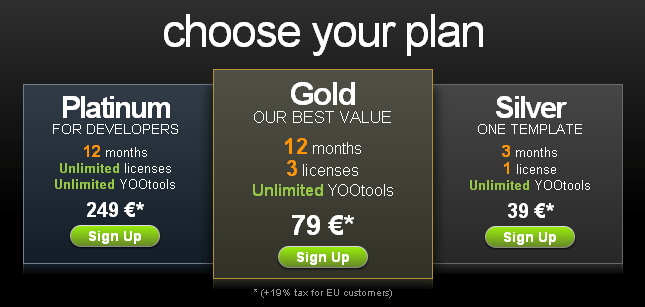
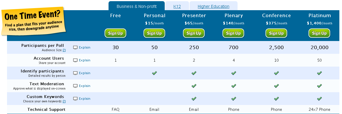
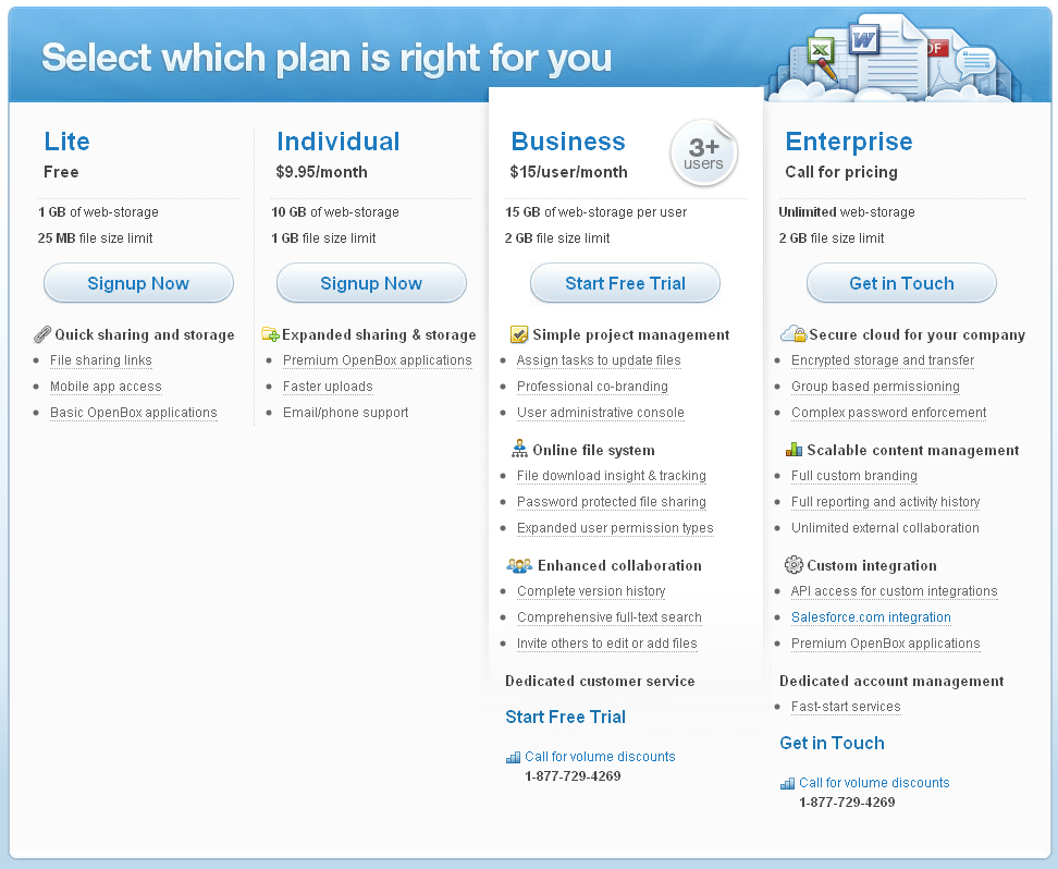
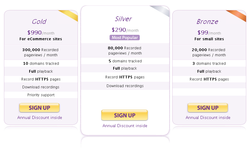
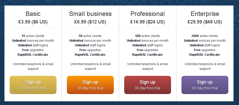
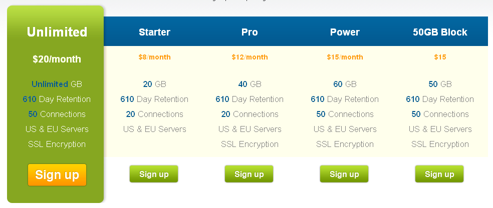
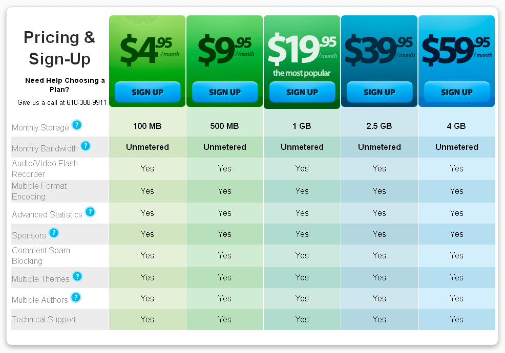
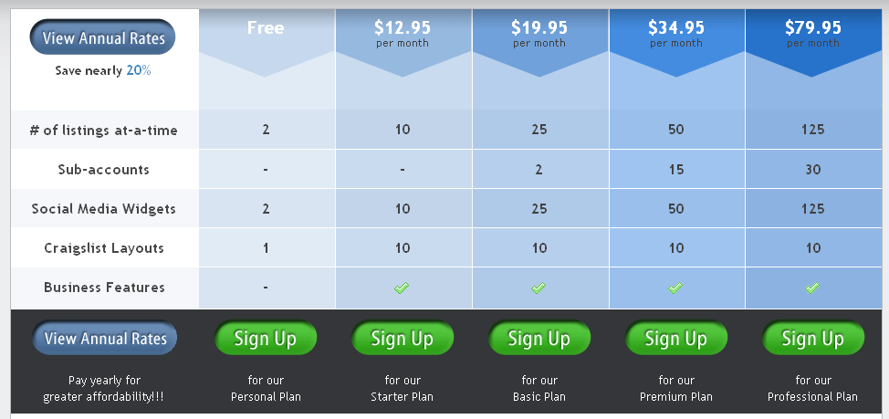
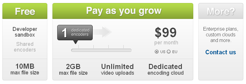
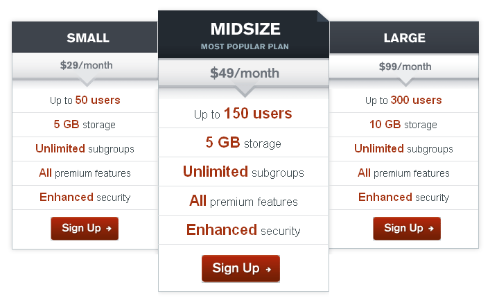
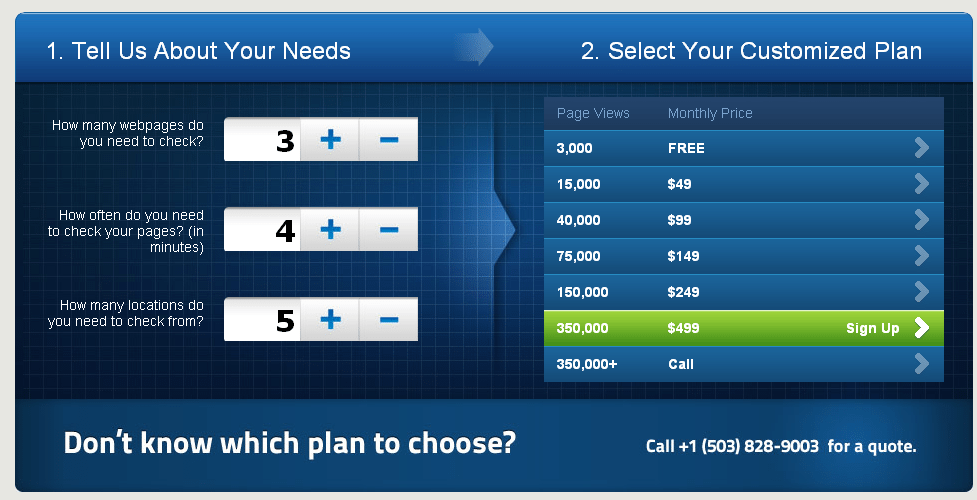
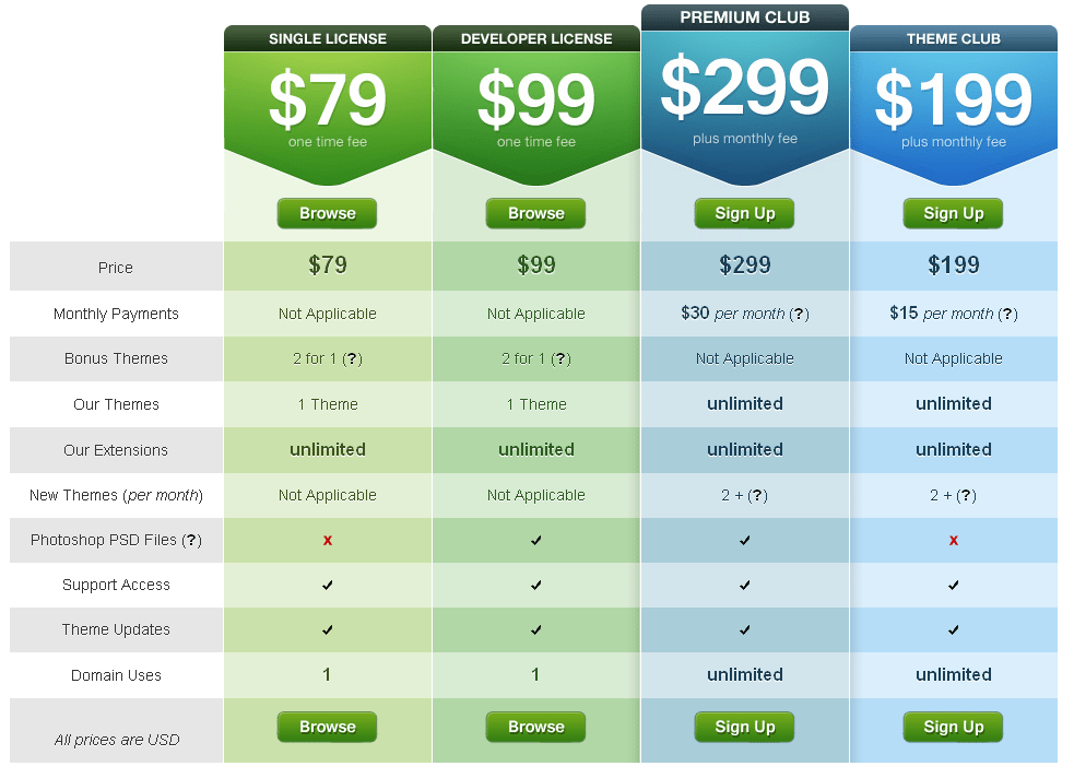
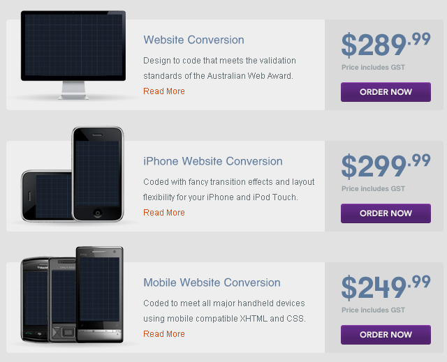
It follows then, that the pricing plan’s on your website shouldn’t be neglected, and should offer the most important information to the end-user, in an intuitive easy-to-use way. Below are 40 fantastic examples of pricing tables / plans that show how successful companies are engaging their users in their pricing plans, from simple tables, to feature lists, to make your own plan tools. Each example briefly examines the pricing plan, so you can see for yourself what it is doing. One HubOnehub goes with a common column layout with a highlighted column displaying their most popular plan. SquarespaceSquarespace makes use of simple, yet bold icons, alongside beautiful typography to create a beautiful column style pricing table. BigcartelBig cartel uses simplicity and elegance to get its pricing plans across, as well as subtly highlighting what the free plan misses out. ShopifyShopify uses a bold approach with a staggered gradient of color from green to blue to show the progression of their plans. Simple ticks are used to show the features of each plan. FormstackFormstack puts emphasis on its popular plan by giving it bright colours compared to its sister grey plans. NotableNotable uses a very simple and easy to read table, with a larger button, and wide stroke around their popular plan. Mailchimp Due to Mailchimps way of pricing, their tables appear in different formats, split into different sections. Live StreamLivestream keep their pricing table relatively clean, with more information available upon hovering over sections. WuffoWuffo uses its playful font and bright colours to attract you into their pricing table. CrazyEggLike others, CrazyEgg focuses on their popular plan with the use of colour compared to grey columns. HighriseHighrise uses a simple and easy to read table, with a larger button, and wide stroke around their popular plan. PulseAppPulseApp uses three simple columns with very little visual graphics to emphasis the sign up buttons. LighCMSLightCMS has an absolutely stunning pricing table which hits you with its bright gradient of colour, but beautiful simplicity. The table is left uncluttered with common features between the plans all listed below. CobblestoneCobblestone differs from some other pricing tables in highlighting its popular plan with a dark blue again grey, compared to bright colours against the light grey. BackboardBackboard draws its users in by highlighting plans with a 14day free trial, and driving home pricing after this. Invoice MachineInvoice Machine keeps to simplicity by using a simple table, and ticks to show exactly what features each plan comes with. PlanHQPlanHQ’s simple table gets across simple information on the products information, and puts emphasis on the sign up buttons. Concept ShareLike others, Concept Share puts it’s emphasis in colour on the free trial plan, to attract users into the features of the program by using it rather than tabling all the features. MediatempleMediatemple opts for less of a table approach, and more of a box approach showing three of their plans, with learn more buttons. Mailer MailerMailer Mailer emphasises its preferred plan with a “Best plan” ribbon, and a contrasting coloured button. LitmusLitmus uses a progression of images to emphasis where the quality is in their pricing plan with a gradual increase in screens in the heading images from left to right. SipgateSipgate emphasises its free plan with a different colour to the premium add-ons. YoothemeYootheme emphasises the gold plan by using gold colours as well as brown in its larger centred popular plan box. The ResumatorThe Resumator puts emphasis on its sign-up buttons, with its featured plan receiving a border, and different coloured button for emphasis. Poll EverywherePoll Everywhere uses a feature table with prominent sign up buttons to showcase it’s different poll plans. BoxBox.net uses takes use of white and blue beautifully in its pricing table, subtly highlighting their popular plan by raising it above the rest ever so slightly. ClicktaleClicktale takes a different approach than other sits by ordering its most expensive plan far left, and the cheapest far right; a complete contrast to the normal. UsabillaUsabilla goes with a simple table with two bright colours, green and orange highlighting the price, and the sign up button. CannybillCannyBill has opted to make user interaction more noticeable, with table columns zooming on mouse over. NewsGroupDirectThis site opts to feature its most expensive plan on the left, highlighted with a bright green to instantly attract the eye. TypekitTypekit opts to make its popular plan stand out by subtly increasing the size of everything in the column. Podcast peoplePodcast people follows in shopify’s footsteps by using the gradient of columns from green to blue. VflyerThe downward arrows used by vFlyer help to draw the user’s eye down the page to the features, and beyond to the sign up buttons. Simple but effective. PandaStreamDue to panda’s business model, they have to opt for custom pricing decided by the user. Their easy to use drag bar is beautifully implemented. GroupsiteGroupsite uses the bright contrast of red and dark blue to attract your eyes through their pro pricing plan. Browser MobSimilarly to Panda, Browser Mob is more of a custom pricing plan, so with so many to offer, they’ve made it easier to choose, by allowing the user to input what they need, and the result showing their most suited plan. GlasscubesGlasscubes makes sure emphasis is strong on signing up, offering you the opportunity to do so at the bottom, and top of each pricing column. Their buttons aren’t too bright, so you don’t feel pushed into it. HellothemesHellothemes subtly draws focus to its featured plan with a heightened column, and beautifully done left and right shadow that add’s a bit of depth. VartoVarto opts for a vertical pricing table for its 3 pricing plans that render beautifully with some great imagery. Further DiscussionThis is simply a list of websites that I’ve come across, with impressive pricing tables in lets say, the last month. I’m certain there are plenty more fantastic examples out there, so if you know of some, don’t hesitate to discuss them below! |
| Client Tactics: Freelance Contract Basics Part 3 Posted: 24 May 2010 02:59 AM PDT
Customizing the Contract.For ease of use, I’ve included the contract in several forms. The form I use is actually the .AI Illustrator file. Why? Because I am lazy resourceful. In illustrator, use the find and replace text tool Edit>Find and Replace to Select and change the following fields.
Enter the text as written above and click “Match State” so that Illustrator will only find the instances of the words in capital letters. Change each one of the fields to your corresponding information and you’re done. Obviously if you use the included .DOC format then all you will have to do is hit Ctrl+F to and search for the above keywords and replace them as needed. The Legal Disclaimer.This contract and schedule is only intended to be a starting point for your own custom contract and schedules. You are free to edit this anyway you like. I am not an attorney, once you have the contract to your liking, run it by a local attorney. They will make sure that everything is up-to-par and can suggest any additional information that may need to be included for your local requirements. Just as it’s a good idea to have an accountant, it’s also a good idea to have an attorney you can get advice from time to time. |
| You are subscribed to email updates from Graphic and Web Design Blog To stop receiving these emails, you may unsubscribe now. | Email delivery powered by Google |
| Google Inc., 20 West Kinzie, Chicago IL USA 60610 | |











Comments (0)
Post a Comment