1stwebdesigner |
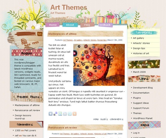
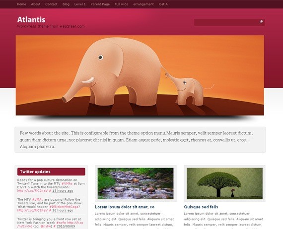
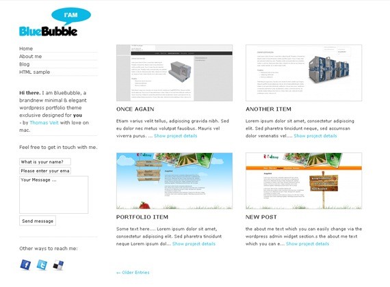
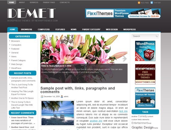
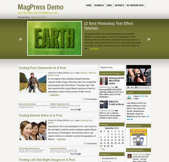
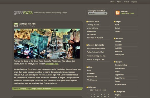
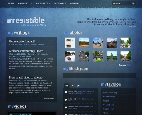
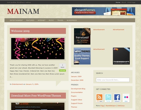
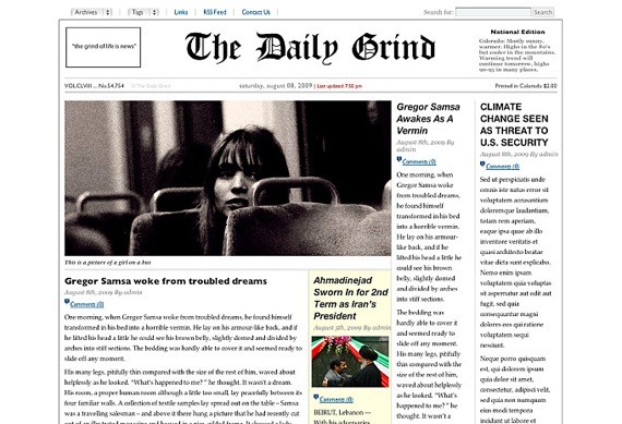
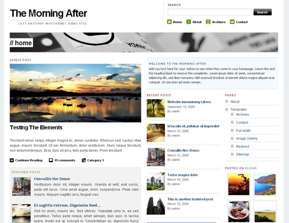
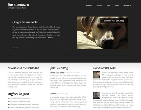
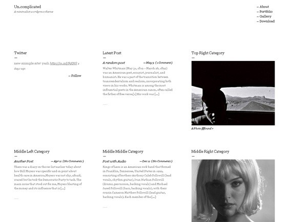
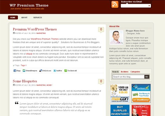
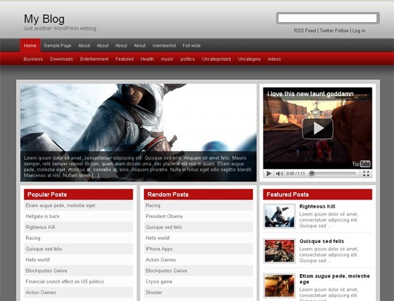
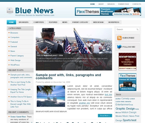
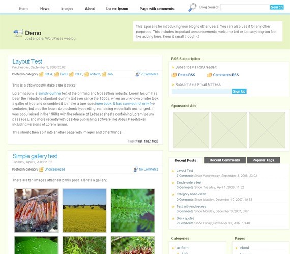
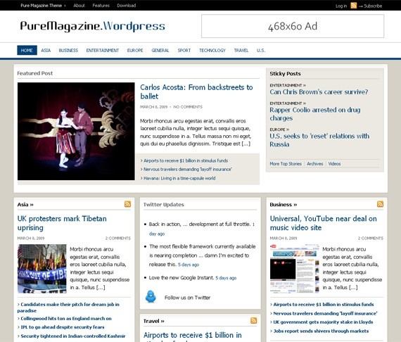
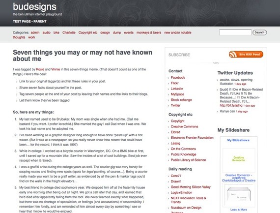
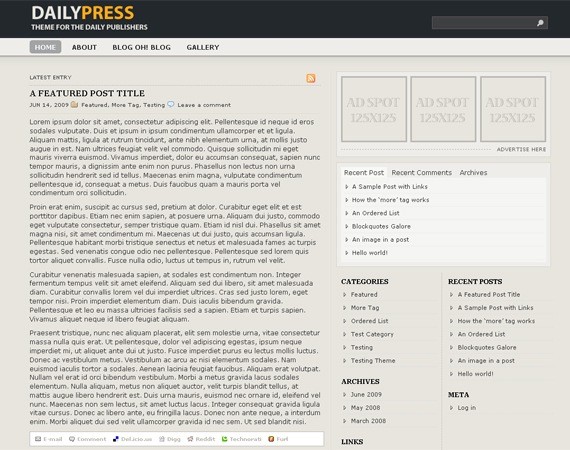
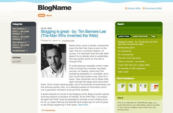
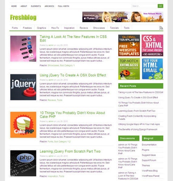
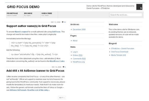
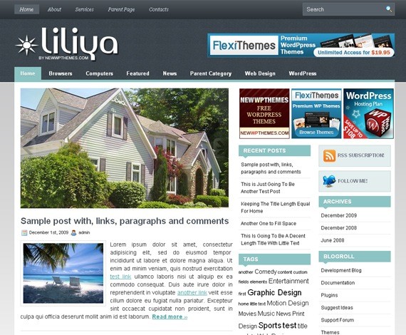
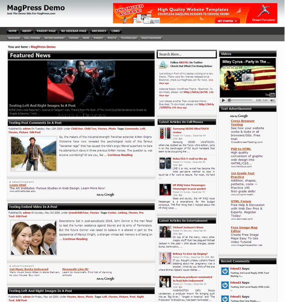
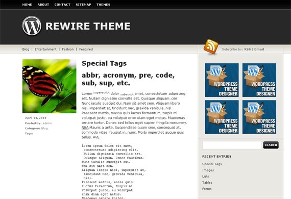
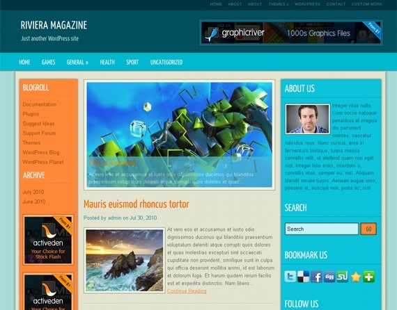
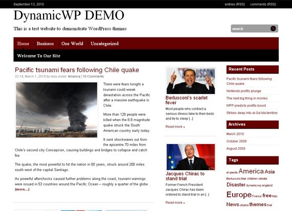
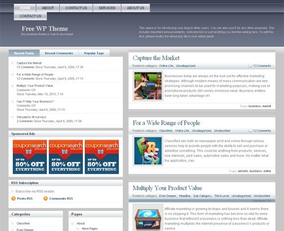
| 40+ Truly Functional And Free 3 Column WordPress Themes Posted: 16 Sep 2010 02:00 PM PDT
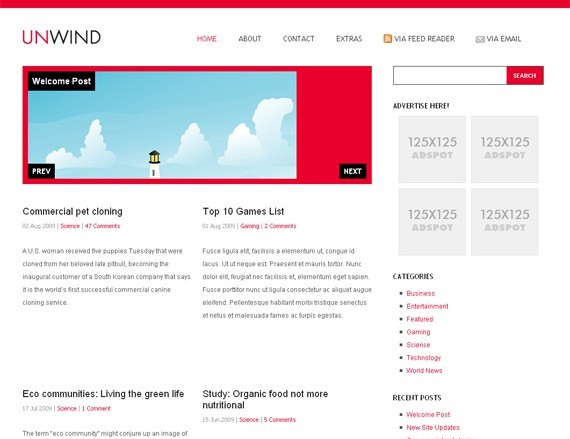
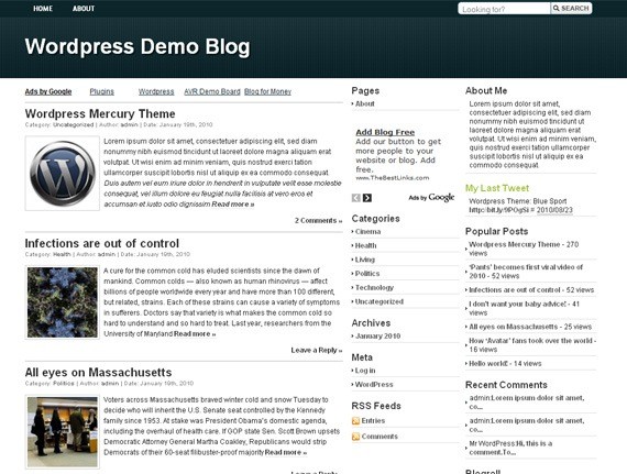
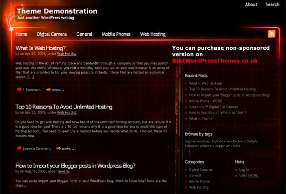
1. Artwork (Demo) |
| Upcoming and OnGoing Web Design Trends of 2010 Posted: 16 Sep 2010 03:00 AM PDT
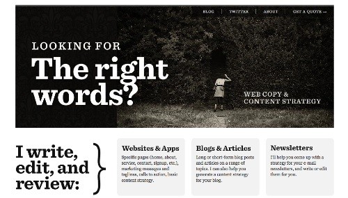
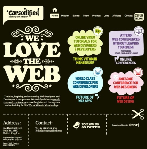
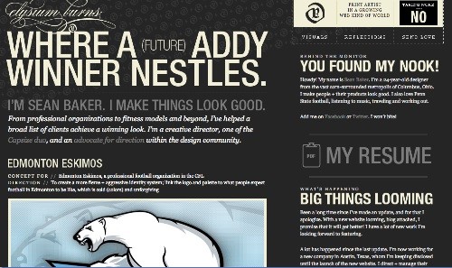
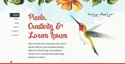
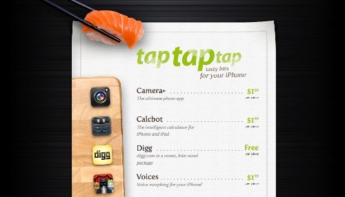
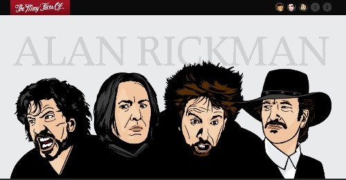
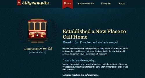
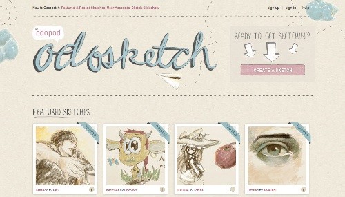
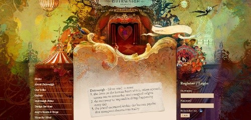
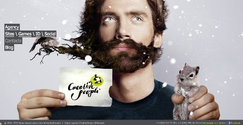
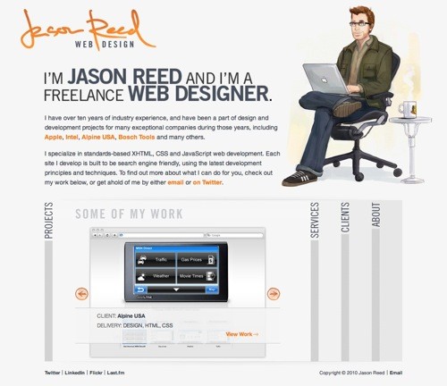
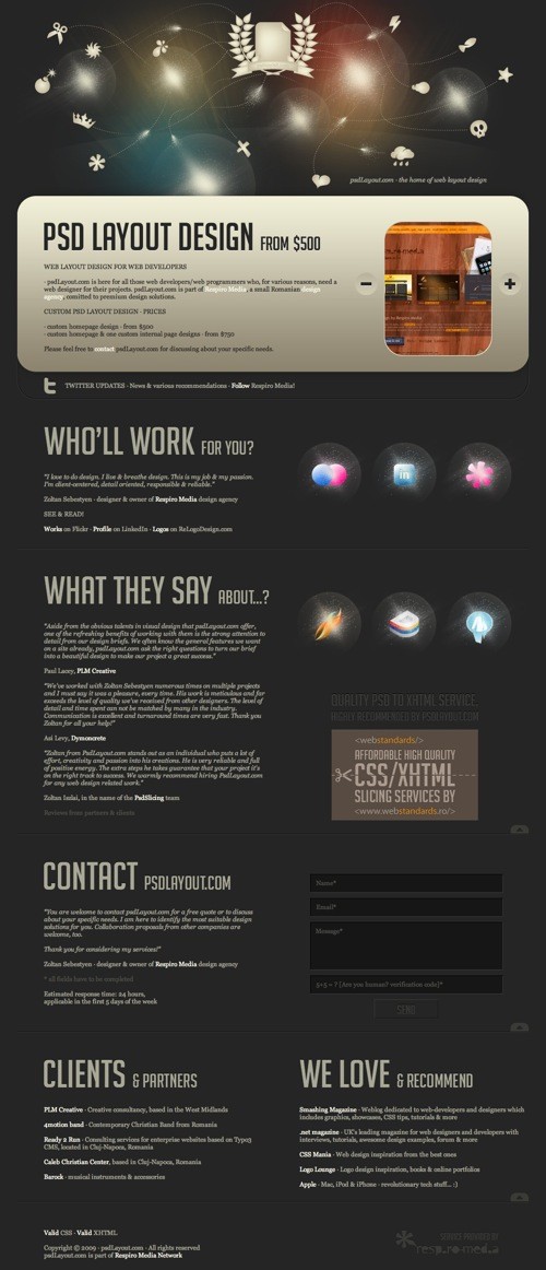
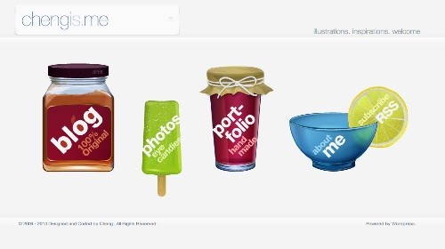
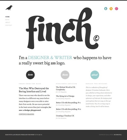
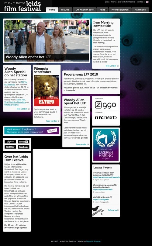
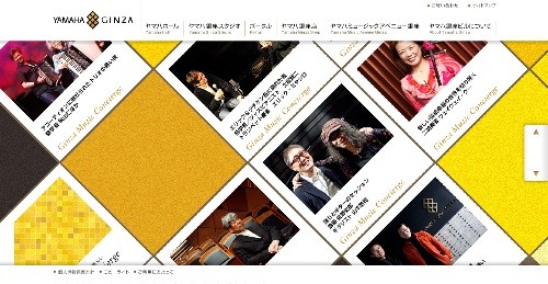
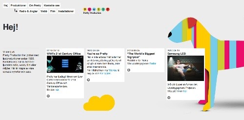
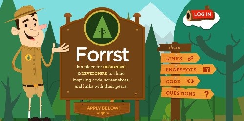
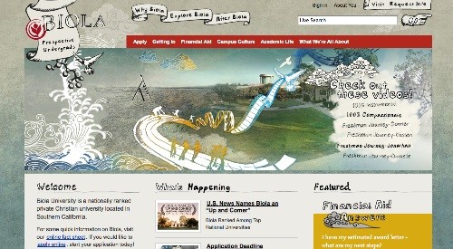
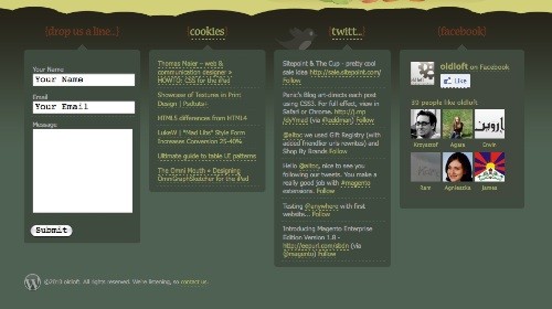
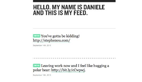
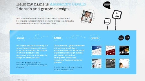
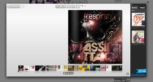
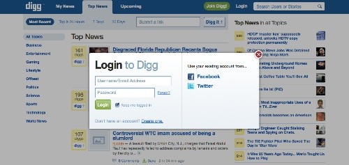
Although the year of 2010 will be over in 3 more months, the revolutions in web design this year have led designers to achieve extra ordinaries web designs, while continuing to set the unlimited parameters of it. Below are the 13 main points of web design trends of 2010 which we think will keep to continue, and some more inspirations to help you set new ideas for your upcoming web design projects or perhaps redesign your own website/blog. Be creative, unleashed your concept. 1. Huge headline and imagesYou have probably realized that many websites today are using huge headlines and/or images. By doing this, designers are focusing the big headline and images to grab users attention and invite them in. It creates a great visual impact which will help your visitor to remember your website. Furthermore, you can use these on your web designs to communicate the site’s tone or to create an immerse experience to the visitors. 2. Customized typographyTypography in web designs today has expanding from a boring standard fonts to beautiful customized fonts. By using Typekit (it’s a subscription-based service for linking to high-quality Open Type fonts from some of the worlds best type foundries), you can easily use real fonts on the web. Say good-bye to the standard fonts and pick a beautiful readable fonts to convey the purpose of an e-commerce website or portfolio. 3. Print design influenceSerif fonts, more graphics, grid systems, and more of other print design aspect have become the inspiration that influenced web design in this year. The point of getting influence from print design is that it has had to be high impact to grab attention and communicate clearly. 4. CSS3 & HTML5 capabilitiesWith CSS3 & HTML 5, web designers can take new advantages to help them load the web faster and create a better navigation. On CSS3, designers will no longer need to use images to create the effects. In fact, it will never be easier to create rounded corners, borders backgrounds, text and box shadows, and opacity property. While HTML5 will introduce more semantic tags like "header", "footer" and "nav" as well as the much anticipated canvas element. 5. More visual effectsPay attention on the background of most web designs these days. Designers are gradually replaced the backgrounds with patterns or subtle and textured background. Not only because it looks nicer and more modern web 3.0 feel, but it also creates a certain visual effects for the website tone and feel as might be expected on the design concept. 6. Mobile compatible designMobile generations in has started since the release of smart phones a few years back. This year, more and more smart phones with CSS and JavaScript supported has created the new trend for web design and directing many websites each day to go mobile as well. 7. Single page layoutSay that you don’t have much information to give out to your visitor but still need a website a short info about you and your company’s services, and having several pages is just a waste. With single page layout, designers can avoid creating the unnecessary pages and focus on the single layout which will be more effective both for the visitors and the user or designer. 8. Minimalist & creativeAs a replacement for busy and complex web designs in the past years, huge white space in web designs has creating a simple and minimalist concept in this year. It’s clean, engaging, memorable, and yet creative. 9. Multi column / grid systemAlthough grid system is not something new anymore, designers are taking more advantages from this system, creating multi column web design layouts to make it easier to use. This also allows them to fit in more content as it will help you to save more spaces on the layout. 10. Custom illustrations & clean iconsMore and more companies realized how essential it is to grab their customer’s attention. Not only they have the web designed with certain ideas to fit the company’s concept, but in recent years many companies are gradually changing the lead images from photo images to custom illustrations and icons. These unique customized illustrations and icons are obviously what the customers will capture and remember. 11. Social media is a mustThere are just no end with social media. At least everyone has Facebook account. It’s another way to interact to your visitor, so put up your social media links on your footer, sidebar or wherever you think fit on your website design. As many of them prefer to connect with you through the website they check on daily. 12. IntroductionA website is the new way to get to know a person in this internet era. Having an introduction boxes or headline is now the trend in web design. With average 30 seconds time for your visitor to look over your website, this introduction is the best way to let them know a bit about who you are and what you or your company (can) do. 13. Modal boxes / Light boxesThey called it the new generation of pop-up windows. Modal boxes or also known as light boxes, is an alternative to present pictures, text, or videos. It’s clean, crisp, focuses the user on the information which are being presenting, and more user-friendly than pop-up windows. So, which points above have you applied on your designs? Or do you think we miss other point of the upcoming and on going web design trends for this year? Let us know your thoughts on the comments. |
| You are subscribed to email updates from 1stwebdesigner - Graphic and Web Design Blog To stop receiving these emails, you may unsubscribe now. | Email delivery powered by Google |
| Google Inc., 20 West Kinzie, Chicago IL USA 60610 | |














Comments (0)
Post a Comment