

1stwebdesigner |

| jQuery Carousel Plugins: Best Resources, Tutorials And Examples Posted: 05 Jul 2010 02:00 PM PDT
In this post you're going to find different types of premade carousel plugins and tutorials how to make your own unique carousel gallery whenever you wish, find also some little inspiration at the end of article as bonus! 1. jCarouseljCarousel is a jQuery plugin for controlling a list of items in horizontal or vertical order. The items, which can be static HTML content or loaded with (or without) AJAX, can be scrolled back and forth (with or without animation). Check out 15+ examples, tutorial how to set it up and all configuration options. Works with all major browsers. Here's the circular dynamic carousel example. 2. jCarousel LitejCarousel Lite is a jQuery plugin that carries you on a carousel ride filled with images and HTML content. jCarousel Lite is not a replacement for jCarousel; rather it is a light-weight (only 2kb) alternative for users whose primary focus is not to build a full-blown image gallery. 3. Agile CarouselAgile Carousel is a JQuery plugin that lets you create a carousel with flexible settings. Some cool features:
Here's an example with intro slide. 4. jQuery CarrouselThe core allows to create your own controls or effects. This plugin transforms and tags into an animated carousel. 5. jQuery Infinite Carousel PluginjQuery carousel plugin where small image thumbnails allow users to jump over to other images. Features:
6. Step Carousel ViewerStep Carousel Viewer displays images or even rich HTML by side scrolling them left or right. Users can step to any specific panel on demand, or browse the gallery sequentially by stepping through x number of panels each time. A smooth sliding animation is used to transition between steps. 7. Just Another CarouselA jQuery content carousel that works with any size content and supports mouse input. Features:
8. LoopedCarouselLoopedCarousel is a plugin made for jQuery that is not only a looping carousel, its main goal is to be extremely easy to implement. No more messing around with CSS to get your carousel to look and function properly. You want to show 5 items? Tell it “items: 5″ and so. 9. jQuery CarouselGreat looking plugin with various types of use. 10. RoundaboutRoundabout is a jQuery plugin that converts a structure of static HTML elements into a highly customizable turntable-like interactive area. In its simplest configuration, Roundabout works with ordered- and unordered-lists, however after some quick configuration, Roundabout can work with a set of nested elements. 11. How to Create a jQuery Carousel with WordPress PostsThis post will give you a quick run down of how to easily add a simple and easily customizable carousel with WordPress posts from a specified category. 12. jQuery Carousel Gallery for WordPressThis plugin builds on the built-in WordPress gallery, and replaces any gallery inserted using the tag with a neat jQuery powered carousel. 13. Making an infinite JQuery carouselIn this tutorial you will make an infinite JQuery carousel. The infinite effect will be made by changing position of the items, when the user clicks right(next) the first item will be placed after the last item and when he clicks left(previous) the last item will be placed before the first item. You can check out the demo. 14. jQuery Infinite CarouselScreencast how to create infinite jQuery carousel. Step by step written tutorial also available. Check out the demo and access code. ExamplesBranded07Aaron Hall PortfolioCornyMkg StudioDeluge StudiosGolf WorkingDazzle CatWhat Is XVBret GlassettChris Kaufman Portfolio    |
| How to Create a Cool Slide Out Panel with CSS3 only Posted: 05 Jul 2010 03:00 AM PDT
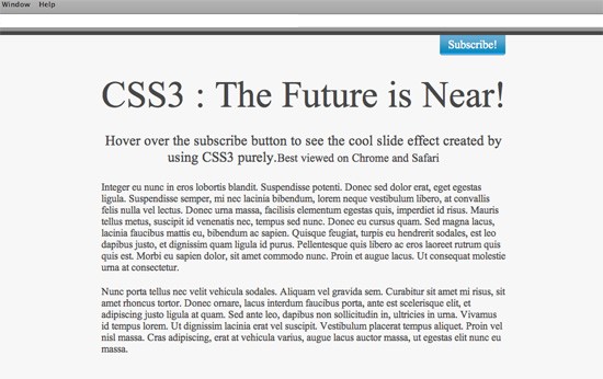
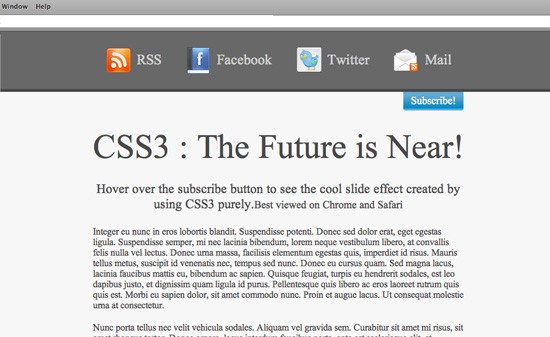
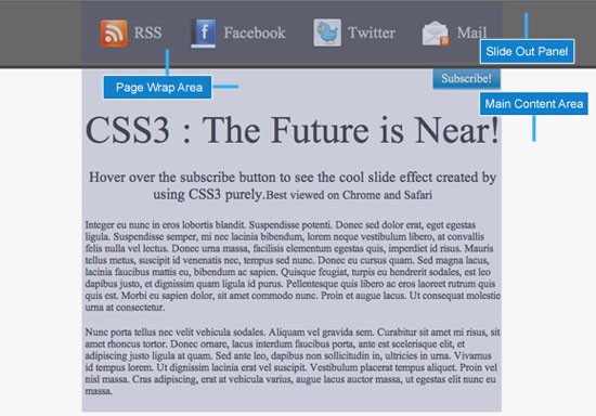
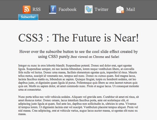
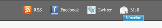
Note: This tutorial uses some advanced css3 techniques which are not yet supported in Firefox. To get the full version, you should see the live demo in a web-kit engine for example Safari and Chrome. You can download the source code here. The final demo can also be seen here. Step 1: Analyzing the GoalA slide out panel can be used for various ways. Its uses depend on the requirement of the site. One may use it for a slide out login box or for just listing the subscribing options for the site. We are going to assume a scenario where we want a subscribe option for the viewers on the top right hand corner of the screen: Now once the viewer hovers over the subscribe button on the top right hand corner, the whole hidden panel will come sliding down with a very smooth animation effect revealing the subscribing options to the visitor. Step 2: Creating the xHTML skeletonNow that we know what we want to achieve, lets plan out how the xHTML architecture of the whole layout is going to be. We would basically need two parts of the layout. One part will be the top one, which will be our hidden panel and will contain the subscribing options. The second part will be the main content area for the whole layout. This area will contain everything which will be visible to the viewer. Here is how our code for the website layout is going to be: <!--<span class="hiddenSpellError" pre=""-->DOCTYPE html PUBLIC "-//W3C//DTD XHTML 1.0 Transitional//EN" "http://www.w3.org/TR/xhtml1/DTD/xhtml1-transitional.dtd"> xmlns="http://www.w3.org/1999/xhtml"> <head> <meta content="text/html; charset=utf-8" http-equiv="Content-Type" /> <meta http-equiv="X-UA-Compatible" content="IE=EmulateIE7" /> <link href="css/styles.css" rel="stylesheet" type="text/css" /> </head> <body> <div id="slide-out"> <div id="subscribe" class="page-wrap"> <ul> <li><a class="<span class=">rss</a></li> <a class="<span class=">" href="#">RSS</a> <li ><a class="fb" href="#">Facebook</a></li> <li><a class="twitter" href="#">Twitter</a></li> <li><a class="mail" href="#">Mail</a></li> </ul> <div class="clear"></div> <a href="#" class="button">Subscribe!</a> </div> </div> <div id="main-container"> <div class="page-wrap"> <h1>CSS3 : The Future is Near! <h3>Hover over the subscribe button to see the cool slide effect created by using CSS3 purely.<small>Best viewed on Chrome and Safari</small> Integer eu nunc in eros lobortis blandit. Suspendisse potenti. Nunc porta tellus nec velit vehicula sodales. Aliquam vel grav </div> </div> </body> </html> The body is divided into two parts, the slide-out and the Step 3: Styling the basic layoutThe style-sheet just contains some simple styling of the page. As explained above, there will be one slide-out division, one main container and one page-wrap class. These forms the basic styling elements of our page which give it the look we want. The CSS for styling the basic layout of the page is as follows: @import url('reset.css'); body{ color: #484848; background-color: #f7f7f7; } .clear { clear: both; } h1{ font-size: 58px; margin-bottom: 25px; height: 68px; } h3{ font-size: 22px; margin-bottom: 25px; } p{ text-align: left; margin-bottom: 20px; } #slide-out { background-color: #686868; height: 73px; color: #fff; position: relative ; padding-top: 25px; } .page-wrap { position: relative; margin-right: auto; margin-left: auto; width: 635px; } #main-container{ border-top:thick solid #484848; padding-top: 60px; text-align: center; } .button{ background-image:url("../images/button.png"); color:#FFFFFF; display:block; font-size:18px; height:28px; padding-top:5px; text-align:center; text-decoration:none; width:105px; } #subscribe ul li a{ background-repeat:no-repeat; display:block; float:left; font-size:24px; height:38px; margin: 0px 20px; padding: 10px 0px 0px 55px; color: #d3d3d3; text-decoration: none; line-height: normal; } #subscribe ul li a:hover{ color: #fff; } .rss{ background-image: url('../images/rss.png'); } .fb{ background-image: url('../images/facebook.png'); } .twitter{ background-image: url('../images/twitter.png'); } .mail{ background-image: url('../images/mail-rss.png'); margin: 0px; } After we have applied the basic styling to our page, it would look somewhat like this Now that the basic styling of the page is done, we have to set the stage for the panel to hide and show. To achieve that, the first thing we need to do is get the subscribe hyperlink to the bottom right corner of the slide-out division such that it is just peeping out of it. To do this, we have to manipulate the button class in the style-sheet a bit. We are going to make its positioning absolute and then give its right attribute a value of 0px. This will push the subscribe button to the right of the division as shown in the image below. Now we have to just push it down such that it sticks to the foot of the slide-out division. To do that we just have to assign a Now that our subscribe button is at its proper place, all we have to do is push the slide-out div out of the screen. To do this, all we have to do is assign a negative margin equivalent to the height of the slide-out div. To prevent the step down bug in IE6, we also have to assign a line-height value of 0 px to the container of our subscribe links i.e. the subscribe box. To negate the 0 line height on the hyperlink elements, we have to assign a normal line height to them too. After modifying our button class, the slide-out id, the subscribe link elements and the subscribe id styles, they will now look like this: #slide-out { background-color: #686868; height: 73px; color: #fff; position: relative ; padding-top: 25px; margin-top: -98px; } #subscribe{ line-height: 0px; } .button{ background-image:url("../images/button.png"); bottom:-63px; color:#FFFFFF; display:block; font-size:18px; height:28px; padding-top:5px; position:absolute; right:0; text-align:center; text-decoration:none; width:105px; z-index:100; line-height: normal; } #subscribe ul li a{ background-repeat:no-repeat; display:block; float:left; font-size:24px; height:38px; margin: 0px 20px; padding: 10px 0px 0px 55px; color: #d3d3d3; text-decoration: none; line-height: normal; } We all hate Internet Explorer 6 a lot because we always have to add some extra code especially for it. In this case also we would have to do the same. To make the layout look the same as in the other browsers, we have to add some IE6 specific styling at the top of our html page, in the head section. <!--[if IE]> <style> #slide-out { padding-top: 10px; } .button{ bottom:-64px; } #subscribe ul li a{ margin: 0px 15px; padding: 10px 0px 0px 55px; } #slide-out{ margin-top: -83px; } </style> <!--[<span class="hiddenSpellError" pre="">endif</span>]--> Now that the slide-out panel is hidden, our task is to enable the hover event on the subscribe button such that the slide-out div reveals itself from the top of the page. You might ask why we have put the subscribe link in the slide-out panel and pushed it outside into the main container, rather than placing it in the main container itself. The reason behind it is that, we have assigned a negative margin to the slide-out div and pushed it out of the screen. To make it visible again, we have allotted a hover event on it which makes it margin back to 0. As the slide-out div is out of the screen, so it is a difficult process to hover over it. Now because the subscribe hyperlink is actually inside the slide-out div, hence hovering over the subscribe link also acts as a hover event of the slide-out dive making its top-margin 0 and revealing it. We can imagine the slide-out div to be a person who is hiding and just his hand is visible to us. When we touch the hand, the person comes out. The hover event which will make the slide-out div pop out of the top of the browser on hovering over the subscribe button will be as follows #slide-out:hover{ margin-top: 0px; } Step 4: The CSS3 Factor!We are almost at the end of our tutorial. The hover event is set. The slide-out div reveals itself when we hover over the subscribe button. But the whole process happens without any animation effect. The only thing required now is to spice up the whole thing with a pinch of CSS3.Using the transition property in CSS3 we will make the effect as a smooth animation rather than the abrupt effect it has right now. We will give the transition property in the slide-out id style as we are changing its styling on hover. After modifying the slide-out id style, it will look like this: #slide-out { -moz-transition: all 1s ease-in-out; -webkit-transition: all 1s ease-in-out; -o-transition: all 1s ease-in-out; transition: all 1s ease-in-out; background-color: #686868; height: 73px; color: #fff; position: relative; padding-top: 25px; margin-top: -98px; } You can change the animation speed by changing the transition speed which is set to 1s at present. This completes our task of enabling a smooth slide out panel from the top of our page without using any javascript. The DrawbacksThe main drawback of this method at present is that CSS3 transition effect is only supported by webkit browsers like Google’s Chrome, Apple’s Safari and Opera. Even though the slide-out panel on hover would work on other browsers like Firefox and Internet Explorer, but the animation wont work in them. The other drawback is that it wont work on Internet Explorer 6.0 because it doesn’t support the CSS hover event. But there is obviously a solution for this. ConclusionThis trick just displays how we can use CSS3 to replace some of the major effects provided by JavaScript libraries like jQuery and MooTools. I believe that with time, these basic transition effects will be replaced with CSS3 transition only. It makes the rendering faster and the load time also decreases as the JavaScript libraries plug-ins are not required. There are many ways of creating a slide out panel and JavaScript libraries really take this to a very high level and provide more functionality than just animation effect. There are many tutorials out there which guide you to create a slide out panel like that using jQuery and CSS together. For further reading related to slide out panels using JavaScript, you can refer to these awesome tutorials
  |


| You are subscribed to email updates from 1stwebdesigner - Graphic and Web Design Blog To stop receiving these emails, you may unsubscribe now. | Email delivery powered by Google |
| Google Inc., 20 West Kinzie, Chicago IL USA 60610 | |
Comments (0)
Post a Comment