

1stwebdesigner |

| How to Enhance Your Website Using Breadcrumbs – Showcase Posted: 16 Jul 2010 02:00 PM PDT
Breadcrumbs, in the simplest form, are horizontally arranged text links separated by a greater than symbol (>). Using breadcrumbs on your website can be really beneficial. It provides a convenient way for users to navigate around the website and also allows users to establish their location on the website. It provides an alternate way for users to navigate the website. For first-time visitors breadcrumbs can be a great way to entice them in exploring the website. Hence, it can be really effective in reducing the overall bounce rate of the website. Different websites use different stylized breadcrumbs that blend in well with their site theme. Below is a showcase of websites with some of the best designed breadcrumbs. 1. Apple StoreThe Apple Store has made use of breadcrumbs in a really creative way. The breadcrumbs are designed in the form of stylized buttons that fits in well with entire site’s theme. 2. The Glasgow CollectiveThe Glasgow Collective has made use of stylish colorful breadcrumbs shaped in the form of a hexagon. 3. NestleNestle has used simple and neat breadcrumbs that blends in well with the theme of the website. The breadcrumbs are arranged in the form of horizontal text links separated by a greater than symbol (>). 4. DeliciousDelicious has presented their breadcrumb trail of keyword tags in a simple and interactive way. The ‘x’ button besides the keyword tags lets you delete items in the breadcrumb trail in order to help you find your bookmarks easily. 5. Crooked TonguesCrooked Tongues has made use of the standard attribute-based breadcrumb trail with a right-pointing triangle replacing the classic greater than symbol (>). 6. IdeoIdeo has presented the breadcrumb trail in a really innovative way. The breadcrumb trail consists of square shaped colorful buttons whose color becomes darker as the breadcrumb advances. 7. Mia & MaggieThis website too has made use of the classic breadcrumb trail in which the greater than symbol (>) is replaced by a forward slash (/). 8. guardian.co.ukguardian.co.uk has made use of simple & colorful hexagon shaped breadcrumbs that matches pretty well the multi-colored theme of the website. 9. CoolspottersCoolspotters uses simple button-like breadcrumb trail that matches well with the website template and also provides an easy way to navigate between the sub-categories of the website. 10. Yahoo! TVYahoo! has made use of interactive button-like breadcrumbs on their Yahoo! TV webpage. Clicking on the inverted triangle brings a drop-down menu displaying different categories of the website. 11. NASANASA has made use of the simple, classic breadcrumb trail consisting of horizontal text links separated by a greater than symbol (>). The color scheme of the breadcrumbs blends in well with the entire entire. 12. Design CollectorsThe Design Collectors have designed simple and classic text-based breadcrumbs with color scheme that matches well the website’s template. 13. BellThe Bell shop uses simple text-based breadcrumb trail in which the text links are separated by a right-pointing triangle. 14. WufooWufoo has made use of the simple text-based breadcrumbs in their own creative way. The breadcrumbs have been integrated with the site’s logo and the classic greater than symbol (>) have been replaced with a right-pointing arrow. 15. Girl ScoutsThe Girl Scouts website have breadcrumbs that are well designed to provide an easy navigation around the website. The breadcrumbs displays various categories and sub-categories of the website. Breadcrumbs are used as a primary navigation on the Girl Scouts website. 16. Bridge55.comBrige55.com uses the classic text-based breadcrumbs that indicates the user’s current location on the website as well as provides an easy way to go back and find similar products. 17. The Hillside GroupThe Hillside Group uses breadcrumbs that are similar to the ones used in the Apple Store website. It has been designed to provide an easy way to navigate around the sub-categories of the website. 18. WowheadThis website has made use of interactive breadcrumbs with drop-down menus that display the various categories, sub-categories and pages of the website providing a convenient, user-friendly navigation scheme. 19. DevloungeDevlounge uses simple button-like breadcrumb trail that enables users to easily navigate around different categories of the web blog. 20. MarTique DesignsMarTique Desings uses the simple, classic text-based breadcrumbs in which the greater than symbol (>) is replaced by a forward slash (/). 21. TechRadarThis technology website uses the classic text-based breadcrumbs in which the greater than symbol (>) is replaced by a right-pointing triangle. The breadcrumbs indicate the user’s current location on the website as well as enables the user to easily navigate between the sub-categories of the website. 22. BPThis website too uses the classic text-based breadcrumb trail that enables users to easily navigate around the website. The color scheme of the breadcrumb blends in well with the entire website.     |
| Creating a Neon Blink Effect for your Forms using CSS3 and jQuery Posted: 16 Jul 2010 03:00 AM PDT
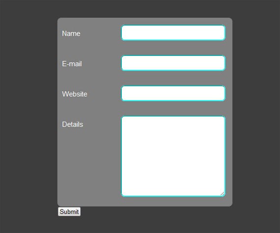
Note: In this tutorial, we have made use of @-webkit-keyframes which works only in browsers using the Webkit layout engine like Chrome and Safari. For browsers like Firefox and Opera, where there is no alternative, we will have to gracefully degrade the effect, which in this case will be just a box-shadow on focus. Internet Explorer (till version 8) cannot render most of what we will learn here, but IE 9 does seem to be very promising from what I’ve seen in the recent platform preview. You can see the live demo of what we are going to build here. The source code of our experiment is also available here to download. Step 1: Before We Start Coding AwayMake sure you download the latest release of jQuery (version 1.4.2 at the time of writing), if you feel the need for a local copy, otherwise one always has the option of using the Google API(if working online), in this case the AJAX libraries. To include the latest release under the “1″ branch, add the following line of code in the head tag above all the other scripts which make use of jQuery. <script type="text/javascript" src="http://ajax.googleapis.com/ajax/libs/jquery/1/jquery.min.js"></script> This line fetches the latest version under the “1″ branch. To be more specific, that is if you want the latest version under “1.4″ branch, just change the “1″ to “1.4″. In my code, I’ve made use of a local copy of jQuery 1.4.2, which I’ve provided in the source files. The naming of the files is as follows:
Put all the files in the same folder, along with the local copy of jQuery (if any), if you are following the exact code I’ve written. Let’s begin! Step 2: Creating the Form Layout in xHTMLThe next step would be to create the form layout in xHTML. Following are the contents of index.html. <!DOCTYPE html PUBLIC "-//W3C//DTD XHTML 1.0 Transitional//EN" "http://www.w3.org/TR/xhtml1/DTD/xhtml1-transitional.dtd"> <html xmlns="http://www.w3.org/1999/xhtml" class="no-js"> <head> <meta content="text/html; charset=utf-8" http-equiv="Content-Type" /> <title>Form Tutorial</title> <link rel="stylesheet" type="text/css" href="style.css"> <script type="text/javascript" src="jquery-1.4.2.min.js"></script> <script type="text/javascript" src="highlight.js"></script> </head> <body> <div id="page-wrap"> <form id="myform" method="post" action="#"> <div> <div class="field"> <label for="personname" >Name</label> <input class="inputfield textfield" name="personname" type="text" /> </div> <div class="field"> <label for="email" >E-mail</label> <input class="inputfield textfield" name="email" type="text" /> </div> <div class="field"> <label for="website" >Website</label> <input class="inputfield textfield" name="website" type="text" /> </div> <div class="field area"> <label for="details" >Details</label> <textarea class="inputfield textarea1" name="details" ></textarea> </div> </div> <!--div class="clear"></div--> <input class="submitbutton" type="submit" value="Submit" /> </form> </div> </body> </html> Let’s understand the code above. The xhtml body consists of a page-wrap inside which we wrap our <form>, so that it can be centered in the CSS styling, as shown below. Each label, input and textarea is wrapped inside a (class: field), so that firstly, we can format it as we want and secondly, we can use jQuery to highlight the parent of the focused textfield/textarea to enhance the visual factor. These are optional and can be modified as required. Each textfield/textarea is given a class inputfield with the textarea having an additional class of textarea1, so that we can adjust the height of the textarea in the CSS, and for the same purpose, we have also given an additional class area to its parent div. Step 3: Basic CSS StylingNow we provide some basic CSS styling to the bare xHTML page as follows. Put the following piece of code in style.css. *{ margin:0; padding:0; } textarea, input{ outline:none; } body{ background:#3D3D3D; } #page-wrap{ width:350px; min-height:500px; height:auto; margin:0 auto; position:relative; padding-top:50px; font:15px Arial; } #myform{ width:375px; -moz-border-radius: 8px; /* FF1+ */ -webkit-border-radius: 8px; /* Saf3+, Chrome */ border-radius: 8px; /* Opera 10.5, IE 9 */ margin:0 auto; position:relative; } #myform label{ top:10px; position:relative; color:white; } .field{ background:gray; padding:15px 15px 0 10px; height:50px; width:350px; } #myform div:first-child{ -moz-border-radius-topleft: 8px; -moz-border-radius-topright: 8px; -webkit-border-top-left-radius: 8px; -webkit-border-top-right-radius: 8px; border-top-left-radius: 8px; border-top-right-radius: 8px; } #myform div:last-child{ -moz-border-radius-bottomleft: 8px; -moz-border-radius-bottomright: 8px; -webkit-border-bottom-left-radius: 8px; -webkit-border-bottom-right-radius: 8px; border-bottom-left-radius: 8px; border-bottom-right-radius: 8px; } .area{ padding:15px 15px 0 10px; min-height:195px; } .inputfield{ padding:0 10px 0 10px; float:right; width:200px; font:15px Arial; border:2px aqua inset; -moz-border-radius: 8px; /* FF1+ */ -webkit-border-radius: 8px; /* Saf3+, Chrome */ border-radius: 8px; /* Opera 10.5, IE 9 */ } .textfield{ height:25px; padding-top:5px; } .textarea1{ padding-top:10px; padding-bottom:10px; height:150px; max-height:200px; max-width:250px; } Here, the CSS3 border-radius property is very essential in the inputfield class since the box-shadow property, which we are going to add later on, has to follow the border-radius property, according to the specification. Elsewhere, the use of border-radius is just to improve the look and feel of the form, and the usage is optional. The outline is set to 0 for textarea and input fields to remove the default focus highlighting in browsers like Chrome and Safari. The code above is just how the form will appear at first sight and will look like this. Now, let’s style the Submit button, such that it blends with the rest of the form. Add the following piece of code to your CSS file. .submitbutton{ border: 0px; float:right; width:75px; height:40px; font:20px Arial; position:relative; top:20px; right:10px; -moz-border-radius: 8px; -webkit-border-radius: 8px; border-radius: 8px; -moz-box-shadow: 0px 0px 30px #3cdfdf; -webkit-box-shadow: 0px 0px 30px #3cdfdf; box-shadow: 0px 0px 30px #3cdfdf; background-image: -moz-linear-gradient(top, white, #3cdfdf); /* FF3.6 */ background-image: -webkit-gradient(linear,left top,left bottom,color-stop(0, white),color-stop(1, #3cdfdf)); /* Saf4+, Chrome */ filter: progid:DXImageTransform.Microsoft.gradient(startColorStr='white', EndColorStr='#3cdfdf'); /* IE6,IE7 */ -ms-filter: "progid:DXImageTransform.Microsoft.gradient(startColorStr='white', EndColorStr='#3cdfdf')"; /* IE8 */ } .submitbutton:hover{ background: #3cdfdf; color:white; } The CSS3 elements used above are border-radius, box-shadow and gradient properties. We have added linear gradients to the background image of the Submit button, using White and #3cdfdf (aqua-blue) for which we use -moz-linear-gradient property for Firefox 3.6+ and the -webkit-gradient property for Chrome 4+ and Safari 4+, as shown above. For Internet Explorer, we have made use of filter (IE 6,7) and -ms-filter (IE 8+) properties. Unfortunately, there are no available alternatives for Opera. On hover, we just change the entire background-color to #3cdfdf (aqua-blue) and the text color to White. After adding the above code, the Submit button, in its full glory, will look somewhat like this. Step 4: Spicing it up with CSS3 -webkit-animationNow it’s time to dive into the newer elements of CSS3, the -webkit-animation feature. Add the following lines of code to the CSS file. @-webkit-keyframes pulsate { 0% { -webkit-box-shadow: 0px 0px 0px #3cdfdf; border:2px aqua inset } 25% { -webkit-box-shadow: 0px 0px 35px #3cdfdf; border:2px aqua inset } 50% { -webkit-box-shadow: 0px 0px 0px white; border:2px white inset } 75% { -webkit-box-shadow: 0px 0px 35px white; border:2px white inset } 100% { -webkit-box-shadow: 0px 0px 0px #3cdfdf; border:2px aqua inset } } .inputfield:focus{ -webkit-animation-name: pulsate; -webkit-animation-duration: 1.5s; -webkit-animation-iteration-count: infinite; -moz-box-shadow: 0px 0px 30px #3cdfdf; box-shadow: 0px 0px 30px #3cdfdf; } Many of you may not be aware of this feature, which is why I’ll try and explain in detail how it actually works. Keyframes are defined using the CSS “@-rule” and the syntax is: To insert multiple frames, just use percentage(%) as shown in the above code. “x%” implies x% of the total time elapsed. The total time is the one which we will specify in -webkit-animation-duration when we use the animation. In the above code, we use two colors, #3cdfdf and white, to create an animation named pulsate. Here, a definite pattern has been defined, using box-shadow, for alternating pulse effect and the border property to go along with it, but you can play around with the values, and use any CSS property to create your own animation effortlessly. To use the animation, all you have to do is add the following three lines (see code above for example usage): -webkit-animation-name: animation-name; We have made use of -moz-box-shadow for Firefox 3.5+ and box-shadow for browsers which support it, like Opera 10.5+. Now, when you focus on a textfield or textarea, it should glow as shown below. Step 5: Adding jQueryThis is merely an optional part to give it a nice finishing touch. Just add the following lines of code in highlight.js. $(document).ready(function(){ var globalParent=null; var mouse_is_inside=false; /*The snippet below is activated when an inputfield is focused*/ $('.inputfield').focus(function(){ globalParent=$(this).parent('div'); globalParent.click(); }); /*This following part will be activated when the inputfield loses focus*/ $('.inputfield').blur(function(){ globalParent.click(); }); /*Following part will be activated when the user clicks anywhere inside the container div of the inputfield*/ $('.field').click(function(){ if(!($(this).is('.dummy'))){ $('.dummy').css('background-color','gray'); $('.dummy label').css('color','white'); $('.dummy').removeClass('dummy'); $(this).css('background-color','black'); $(this).children('label').css('color','#3cdfdf'); $(this).addClass('dummy'); } }); /*The following code checks time and again whether the mouse is inside the form or not*/ $('form').hover(function(){ mouse_is_inside=true; }, function(){ mouse_is_inside=false; } ); /*If user clicks anywhere outside the form, all highlighting is removed*/ $('body').click(function(){ if(!mouse_is_inside) { $('.field').css('background-color','gray'); $('.field label').css('color','white'); $('.dummy').removeClass('dummy'); } }); }); The parts of the code have been documented as to which part corresponds to which functionality. This is a simple jQuery code, which selects the container div of the focused inputfield and changes its background-color to Black, and also changes the corresponding label color to #3cdfdf (aqua-blue). Even if one clicks anywhere inside the container div, its background-color changes to Black and all the other siblings will have their background-color changed to Gray, i.e., not more than one div will be highlighted at the same time. As soon as the inputfield loses its focus, the background-color is reverted back to Gray, and the label color to white. Here, we need to use jQuery in order to select the Parent of an element, which is not possible using only CSS (at the time of writing). After including the jQuery code, field highlighting will occur as shown below. ConclusionThis may look a bit difficult at first sight, but it’ll hardly take more than 40 minutes to implement it. To use such an effect in a website, one will have to be very specific about the target users as of now, since Chrome and Safari users hardly make up for 20% of the total internet users and is more common amongst the younger generation. I had mentioned before we started that for browsers which do not support CSS3, we will have to gracefully degrade the effect according to the capability of the concerned browsers, rather than completely scrapping it. CSS3 is the Future of Web, and it is already here. So gear up! All advices and suggestions will be welcomed with open arms… :-)   |


| You are subscribed to email updates from 1stwebdesigner - Graphic and Web Design Blog To stop receiving these emails, you may unsubscribe now. | Email delivery powered by Google |
| Google Inc., 20 West Kinzie, Chicago IL USA 60610 | |
Comments (0)
Post a Comment