

1stwebdesigner |

| How to Create a Mobile Version of your Website Posted: 21 Oct 2010 02:00 PM PDT
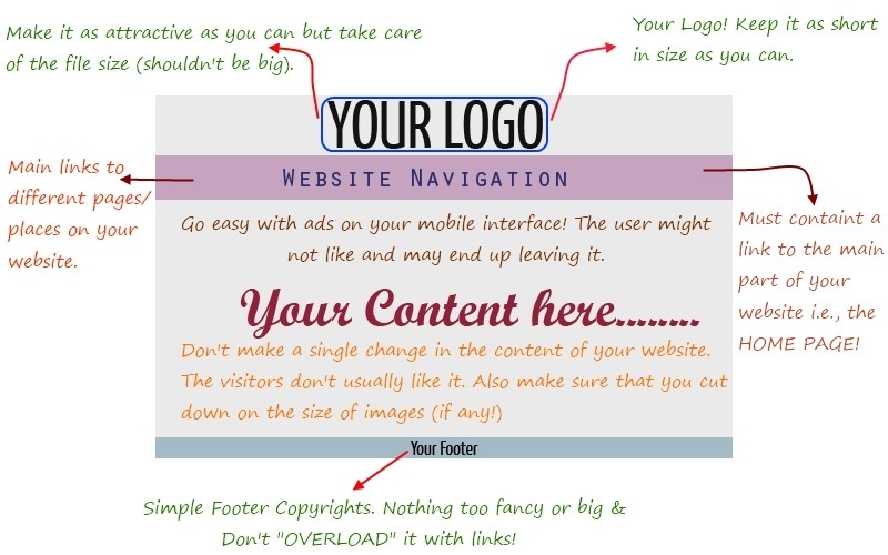
Today, we'll be discussing some key aspects & techniques that a web developer/designer must follow to have a clean & professional looking mobile version of any website. So let's get started! Mobile interfaces are usually small and so a developer has to adjust in pre-defined dimensions. To start with, below is a layout of a very basic "mobile-website". LAYOUTLet's discuss the different elements of the layout above:
One of the main things in the layout. You should try to make it as attractive as you can but at the same time take care of its size. Make sure that the size doesn't exceed 2 KBs of size because images always take forever to load on mobile networks and you don't want your site to load incompletely for different people!
One of the most important things in the design. No matter what, you need to have the links to main pages/places/things on your website on this bar and this should always be at the top. As you know, typing on most mobile devices using the small QWERTY or the virtual QWERTY keypads is not easy to work with at all. Therefore, creating a thorough navigation for your website is a key aspect to making your website mobile friendly.
This is the main thing on your mobile website. People actually come to websites on their mobile devices just to view the content. So make sure that you don't make any single change to your content for mobile devices otherwise you might just end up losing a user. While on Mobile Devices, people are usually on the go, so they don't really have much time to view content. As a solution to this, you should cut down your content to some major value points but at the same time you should provide your user with a Link to the main article containing all of your content. (If you have an active blog then you can ignore this as you can't really cut down content for each post separately every day!!) We all know that images in content are a must. But in the mobile version of your website, you should make sure that you don't have much graphics because most mobile phones would take forever to load heavy images. So use images and graphics as little as possible, only where contextually relevant. And if you do wish to put images on your mobile website, it should be in .JPEG or .GIF or .PNG format as these files are pretty much light-weight. Plus make sure to compress your pictures to avoid zooming. And one more, today nearly all current devices display images, however, users may browse with the images turned off. So always use the ALT text property for the images which is a recommended practice. Also, you must properly size your images to avoid a situation where the reader/visitor has to zoom into the image to see it properly.
There's an old saying, "A Man is not recognized by the clothing he's wearing but by the condition of his shoes!" This goes true for many websites. I always see blogs, marketing websites etc. OVER-LOADED with "garbage and dirty" Hyper-links in Footer. Like me, many others don't like it and on mobile websites where the screen size is small, this could be one thing where you could lose a client or a reader. So make an attractive Footer! So if you want your applications/website's mobile-interface going successful, you should lay focus on its Layout. It should just be error-free as "Web-Browsing on Mobile Devices" will be the next big thing.
CODINGThis is one thing where many new mobile-interface developers hesitate. Below are some tips that can help remove that hesitation:
Use proper code and make sure that its 100% valid because most mobile browsers aren't as good as their PC (Personal-Computer) counterparts so you should make sure that it's valid.
It's not always easy to discover how your layout will look on all mobile browsers as there are far too many mobile devices used for web browsing and to track them all can be a big pain. One way to address/bypass this problem is the use fluid layouts that will automatically adjust to the screen size. To accomplish this avoid setting widths in pixels and use percentages or ems instead. For instance, instead of: width: 400px; use width: 100% or width: 1.0ems You can find more about the fluid mobile layouts and also download some pre-built ones by going to this link: Perfect multi-column CSS liquid layouts – iPhone compatible
You can always target various mobile devices for better user-experience. For example, for targeting users browsing your site using Handheld devices you can use this in your website's <head>: <link rel="stylesheet" href="handheld.css" type="text/css" media="handheld"/> You can find more about these media types at this link: W3.org – Media Types.
For your mobile website to go successful, don't use Javascript or Flash or any other of those fancy scripts available out there. Because majority of mobile devices fail to interpret these and end up either freezing the device or just doing something stupid! If you really want to use these then should give your user a Polite Option so that your user knows what his/her mobile handset is loading and opening up (and if anything goes wrong, it's their fault and not yours because you already warned them).
This is one thing that almost everyone should take care of! Don't fill up your mobile page with ads. And this is not only for the mobile page but also for the original website. It's an old saying, "One rotten Apple in a basket makes all others dirty". It goes true for these websites which are full of ads. These websites don't care about User-Experience but only care about the money that comes into their pockets (because CPM is high on mobile devices). So my suggestion, just don't fill it up with ads! “Just don't make your page with colourful ads.”
For making your brand successfull you should also include an automatic “Mobile Browser Detection & Redirection” server-side script (eg. PHP). You might also use this as User Agent detection, where a server makes a decision on what to serve based on how an incoming browser describes its capabilities. You might also want to use this as an alternative or fallback method to the previous one Mobile Browser Detection in PHP. Other implementations feature real-time JavaScript requests to databases like DeviceAtlas or WURFL that also supply information on what a device can do. A mobile version is not complete until it's automatically triggered for every mobile user!
Yes! You read it correctly. If you have a really high user-base, make a dedicated application targeting various mobile interfaces. Facebook, Gmail, Twitter, Yahoo and many other big-companies have done this and this is why they have been so successful. If you make an application for specific handsets then you no longer have to care about all the Fancy scripts etc. because you can then enhance the application your own way (you can't change the mobile browser but definitely your own application). MOBILE SITE BUILDERSYou must have seen those Fancy Website builders out there, haven’t you? Well, now we have websites which help you create websites for mobile interfaces as well! For users who use WordPress as their platform, there are many free as well as paid plugins available out there. Some of them are listed below: So we have pretty much gone through all the aspects and the techniques of “Mobile Website-Designing”. If you have any questions about anything regarding “Mobile Website Designing” then feel free to point that out in the comments!     |
| Checklists: Why are They Important in Getting Things Right Posted: 21 Oct 2010 03:00 AM PDT
Was it a new drug? Not really. But if it was, there would certainly be an incredible amount of media attention, with the company/organization who invented it receiving incredible recognition. That single thing that contributed to lowering complications and death rates was…a checklist. It was a 19-point checklist that was used before beginning surgery that made sure people did the essential things, like give anesthesia and check for other basic problems before operation. What most people often assume when dealing with complex procedures (like a surgery) is that we often get the basics right. This is not true. There is a worrying rate of doctors/surgeons forgetting about some basic things that need to be done, things that contribute to some major complications in the long run (like we’ve seen above). A simple list of things to-do solves this problem. But are checklists limited only to the medical industry? Checklists are used everywhere to avoid errors. Take the aviation industry. Before takeoff, they have a simple, easy-to-understand checklist which makes sure the essential things are being done (essential = if they don’t get done, there could be a big chance for a crash). Checklists and the Web Design IndustryThe web design industry is getting more complicated every day. We must make sure small, but critical things are being done, like making sure the right conditions are set depending on the client we’re dealing with, then also be certain we’re doing everything our client requires during the project and so on. Have you had a time when you missed something while designing a project for a client? Yeah, I thought so. It was usually a mistake where you thought ‘Gosh, I can’t believe I missed that!’ The truth is, our memory is limited. We can’t possibly remember every single detail. Even doctors, as we’ve seen in the previous examples, make some basic mistakes and need a checklist to remind them to do the essentials. I think web designers can do the same and dramatically decrease the rate of errors they make. The “essentials” are the foundation of the whole project we’re trying to get done. The thing is, we usually get bored if we do a particular thing for a prolonged period of time. And essentials are the things we need to do all the time. So our mind starts considering them as boring and focuses on other, more ‘fancy’ things, thus hindering our progress in the longrun. In his book, The Checklist Manifesto, Atul Gawande describes also how checklists are also being used in the building industry. He says that everything those people do is made into one enormous list of items that are being checked after they get done. That way they keep the failure rate at below .1%. Types of ChecklistsThere are basically 2 types of checklists you can use: a) DO-CONFIRM checklist With the DO-CONFIRM checklist you do the job from your memory or your experience. But after a certain period, you stop. You pause, take the checklist and confirm everything was done as supposed. This type of checklist is often used in the aviation industry in procedures like handling a disaster. When you’re handling something unexpected, you’re usually in ‘fight or flight mode’ so the chances of missing something are pretty big. Using this type of reminder checklist is a great way to make sure everything is being done in the right order. b) READ-DO checklist What is a READ-DO checklist? It’s the typical checklist when you first READ what you have to do, and then you do it and check you’ve done the task. Or read what you do, check the task and start doing it. You don’t go through a series of tasks and then use the checklist to see if you’ve done those tasks in the proper order like with the DO-CONFIRM type of list. Many checklists don’t need to be done in the proper order. You can do the things you’re supposed to do in random sequence. It really depends on your situation. But please know that the tasks on the checklist aren’t always required to be done in their proper order. There is not a universal approach to creating checklists so try out some of the ideas above (plus, make your own depending on your situation) and see what works for you. Ideas for Web Design ChecklistsYou can try and use a checklist when you’re dealing with a client. For example, after you’ve finished the deal and are ready to start working you can use the DO-CONFIRM checklist and see if all things are done as needed. Price point? Checked. All terms clear? Checked. Discussed what will happen if client is not satisfied with the end design? Checked. Another idea is to use a READ-DO checklist when starting to work. There might be several things you need to do before you start working like checking all suggestions the client gave you are being put in place. Or whether you’ve checked the websites the client gave you for ideas. Checklists can also help in emergency situation. For example, if something urgently came up, you may want to make sure your client and co-workers are notified etc. Remember out example with the aviation industry? You don’t need to make a checklist for everything though, that would be stupid. First, try to identify things where you consistently make 1 or more errors, skip 1 or more things before or after starting work etc. Then try making a checklist for a week. After a week, reflect and see if that list helped you in reminding you of some of the things you used to forget. If yes, continue using it. If no, ditch it. Is There Any Good Software for Creating Checklist?So far TaDaLists is the simplest one/best I found. It’s a free online application and makes the process of creating/organizing checklists very easy. To create a new checklist in TaDaLists, just click on “Create a new list” and enter the name: You can then add the necessary items to that particular list. To remove an item from a list, just click on ‘Edit’ and then on the X sign next to each item. If you want to make checklists offline, you can try and download a template for the office application you use like Microsoft Word or Excel freely available on office.microsoft.com. Have you found this post to be useful? Please let me know in the comments section below.   |


| You are subscribed to email updates from 1stwebdesigner - Graphic and Web Design Blog To stop receiving these emails, you may unsubscribe now. | Email delivery powered by Google |
| Google Inc., 20 West Kinzie, Chicago IL USA 60610 | |
Comments (0)
Post a Comment